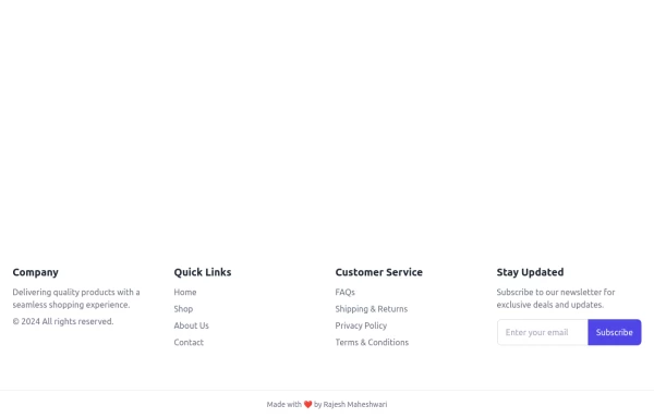
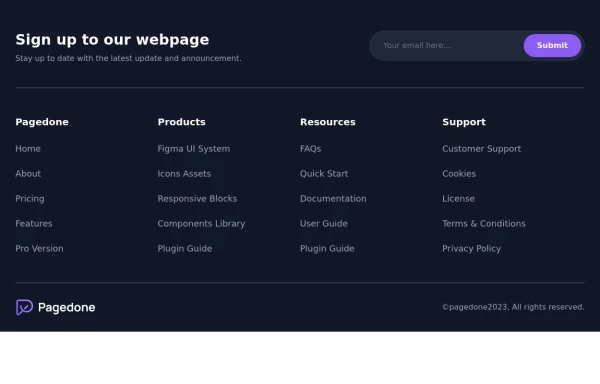
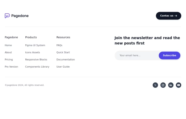
Pre-footer Newsletter
Use this example with a Newsletter section before the footer, a sitemap, the logo of your brand and social media accounts.
This tailwind example is contributed by Pagedone, on 02-May-2024. Component is made with Tailwind CSS v3. It is responsive.

Author Pagedone
Related Examples
-
 3 years ago13.2k
 -
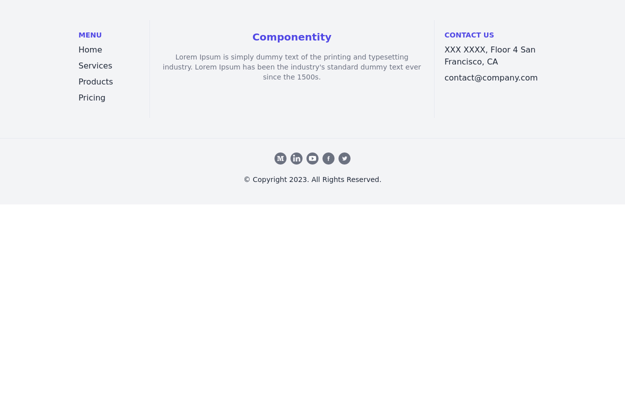
 Footer
Footer with responsive desing
11 months ago1.2k -
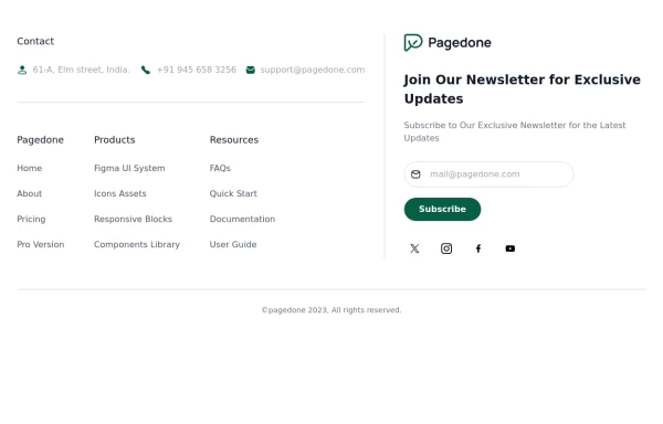 Tailwind Footer Template
Following is the Tailwind CSS template for creative footer with contact information like address, email, phone number and a newsletter with social icons and site links.
1 year ago3k -
 Responsive Footer
This a full responsive footer made with tailwind
1 year ago2.4k -
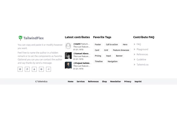 Footer, TailwindFlex v2
Another footer version of tailwindflex.com Example users randomly picked: Samuel & Prajwal
1 year ago1k -
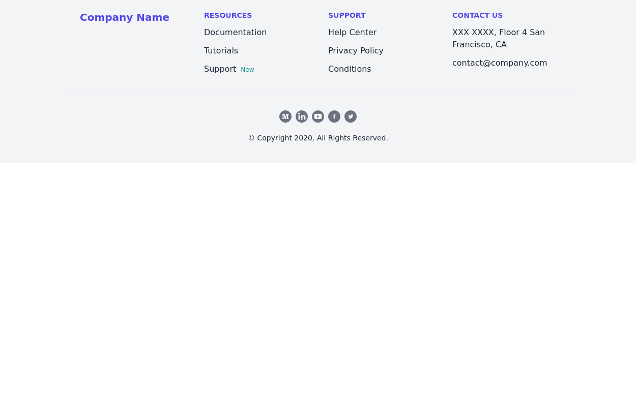
 Dark Footer with subscribe form
Use below exmaple of Tailwind CSS Dark Footer with Newsletter Subscription Form with brand logo and site links.
1 year ago2.9k -
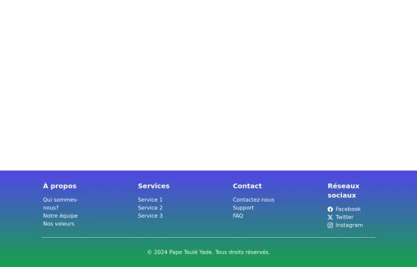
 Footer - Modern minimal style
clean and uncluttered, following a minimalist approach
2 years ago4.4k -
 3 years ago14.8k
 -
 3 years ago10.8k
 -
 beautifull portfolio page
I create a portfolio page
1 year ago2.1k -
 home page
Hero Section: Gradient background with noise texture Animated floating image Gradient text effect Call-to-action buttons Features Section: Three feature cards with gradient headers Hover animations Clean iconography Stats Display: Full-width gradient background Clean stat presentation Testimonials: Three testimonial cards with user avatars Star ratings Border accents Hover scaling effects Call-to-Action (CTA) Section: Gradient background Centered content Multiple action buttons Footer: Four-column layout Social media icons Newsletter signup Copyright information Design Features: Vibrant gradient color scheme Smooth hover animations and transitions Responsive layout for all screen sizes Modern typography Subtle floating animations Clean, card-based design
8 months ago1k -
 Newsletter form with Pre-footer CTA
Get started with this example with a CTA section before the footer, a sitemap links, the logo of your brand, a newsletter sign-up form, and the copyright notice.
1 year ago2.6k


Explore components by Tags
Didn't find component you were looking for?
Search from 3000+ components