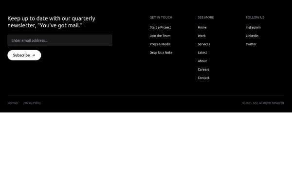
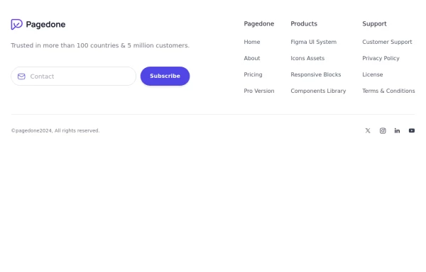
Newsletter form with Pre-footer CTA
Get started with this example with a CTA section before the footer, a sitemap links, the logo of your brand, a newsletter sign-up form, and the copyright notice.
This tailwind example is contributed by Pagedone, on 02-May-2024. Component is made with Tailwind CSS v3. It is responsive.

Author Pagedone
Related Examples
-
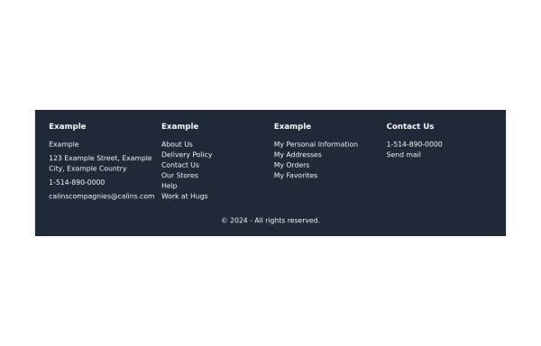 footer
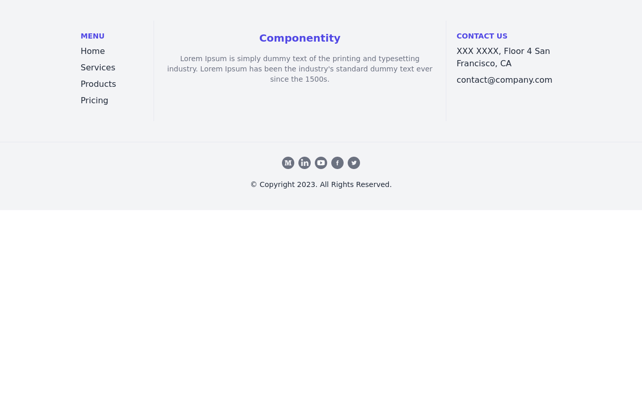
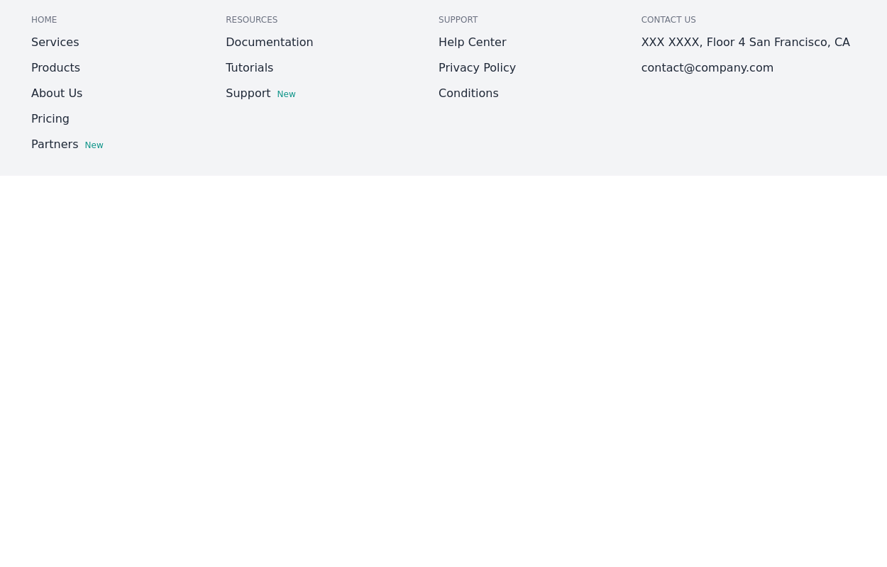
Footer with contact info, navigation, account links, and social media icons.
1 year ago3.3k -
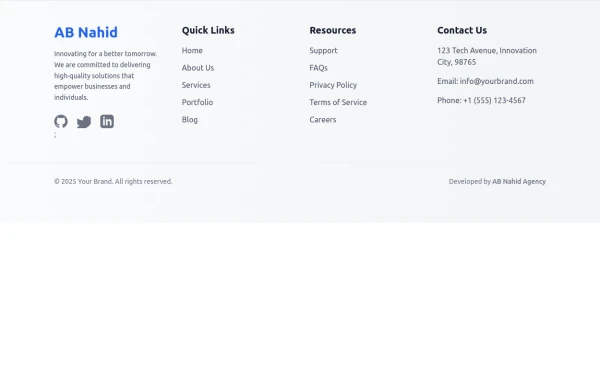 Responsive Light Mode Footer Component
This is a fully responsive and reusable light-mode footer component designed by ABNahid Agency. Built with a clean structure and optimized for modern web applications, this footer features essential sections, including About, Services, Contact, and Social Links. Ideal for personal portfolios, business websites, or startup platforms—plug and play in your React or HTML project.
7 months ago590 -
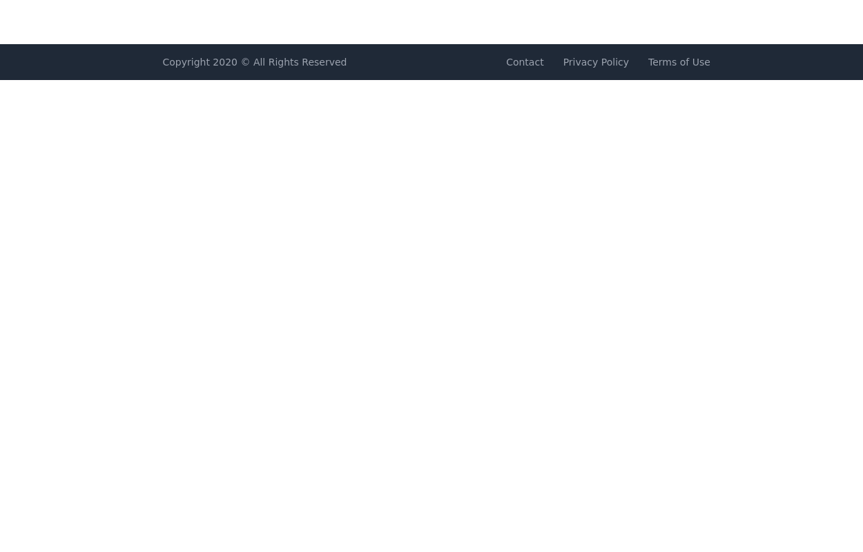
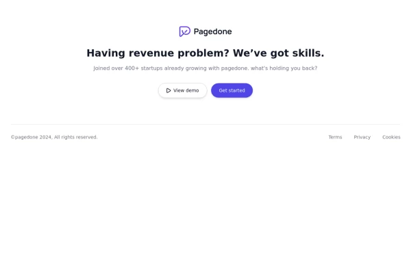 Centered footer with CTA
Use this Tailwind CSS footer compoent for simple footer with center aligned everything and with CTA buttons.
1 year ago2.2k -
 11 months ago1.3k
 -
 3 years ago13.3k
 -
 3 years ago13k
 -
 1 year ago3.9k
 -
 Footer for blog
https://github.com/tailwindow/component
3 years ago18.6k -
 e-commerce website landing page template with Tailwind CSS.
A clean, responsive e-commerce & blog template built with Tailwind CSS. Features light/dark mode, dynamic featured posts, hero, CTA, and SEO-ready sections.
2 months ago555 -
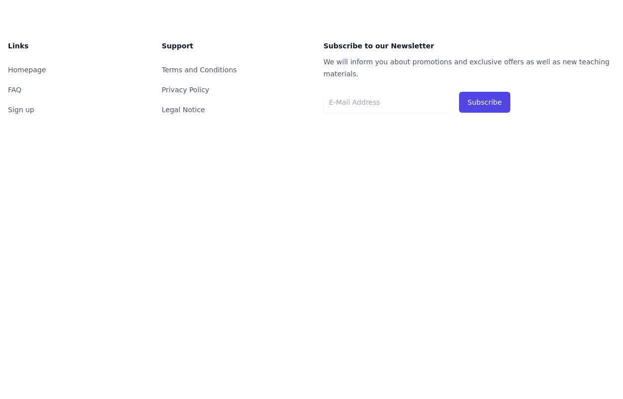
 Four columns with subscribe form
Use this example for four column footer with subscribe form, brand logo, sitemap links and social media accounts.
1 year ago2.5k -
 3 years ago11.7k
 -
 Simple tailwind footer
Simple tailwind footer with newsletter
3 years ago10.5k


Explore components by Tags
Didn't find component you were looking for?
Search from 3000+ components