Minimal responsive footer
This tailwind example is contributed by Mr Robot, on 10-Dec-2022. Component is made with Tailwind CSS v3. It is responsive.

Author Mr Robot
Related Examples
-
 3 years ago15k
 -
 Footer for blog
https://github.com/tailwindow/component
3 years ago18.6k -
 3 years ago13.3k
 -
 3 years ago16.1k
 -
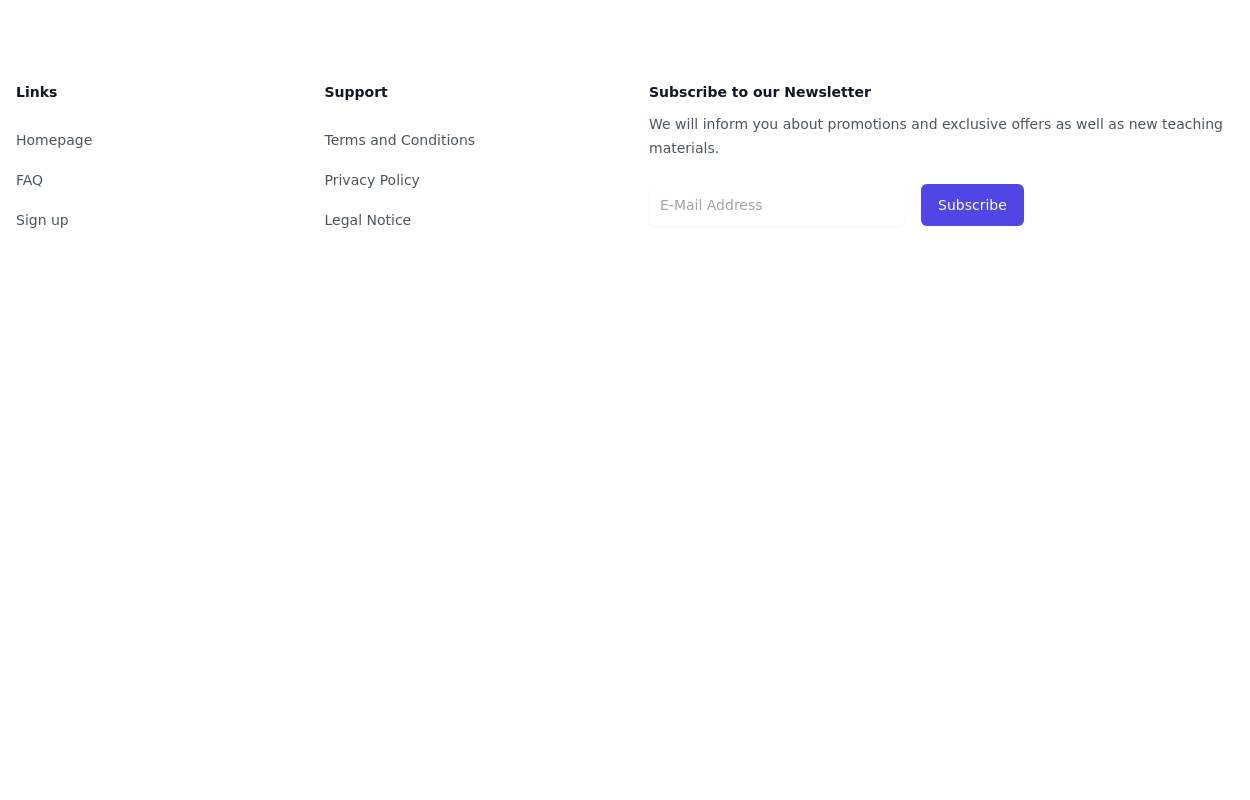 Simple tailwind footer
Simple tailwind footer with newsletter
3 years ago10.4k -
 Basic footer
Simple footer with follow us section
1 year ago2.3k -
 Newsletter with address location
Use this example to first show brand logo card, then show address locations of your company, a newsletter sign-up form.
1 year ago3k -
 1 year ago3.9k
 -
 Centered footer with CTA
Use this Tailwind CSS footer compoent for simple footer with center aligned everything and with CTA buttons.
1 year ago2.2k -
 Simple centered footer
Use this example for simple footer with horizontal sitemap links, brand logo, and social media accounts.This example can also be used as a tailwind sticky footer.
1 year ago3k -
 3 years ago11.7k
 -
 Footer version Ousmane
Ce footer est associer a un menu de navigation qui apparait sous le mobile donc avec sa plus besoin de gerer les menus sous le mobile.
4 months ago261


Explore components by Tags
Didn't find component you were looking for?
Search from 3000+ components