Minimal CTA section
This tailwind example is contributed by Laurits, on 17-Dec-2022. Component is made with Tailwind v3.4. It is responsive. similar terms for this example are CTA,banner

Related Examples
-
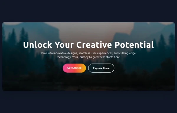 Hero Section
Responsive Hero Section for you Project Background Image: A stunning, high-quality Unsplash photo that creates a unique visual impact. Overlay: Semi-transparent black overlay with blur effect for readability and a modern aesthetic. Content Area: Centered with a gradient background overlay for contrast, bold headline, engaging subtext. Buttons: Vibrant gradient and clean border with smooth hover animations to draw attention. Responsive Design: Looks great on all screen sizes with adaptable padding and font sizes.
2.5k -
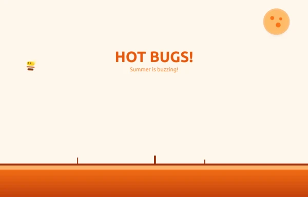 Bug Beach Day Heatwave
This playful animation brings sweltering summer insects to life with pure HTML and Tailwind CSS. Watch as: 🔥 Glowing Fireflies pulse with heat-radiant light, their wings shimmering in the desert sun 🐞 Overheated Ladybugs scuttle across cracked earth, their red shells reflecting the blazing heat ☀️ A Wobbling Sun dominates the sky, emitting pulsing heat waves across the animated landscape
1.6k -
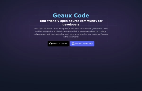 Geaux Code CTA Section
CTA with background patterns
2.6k -
 12.8k
12.8k -
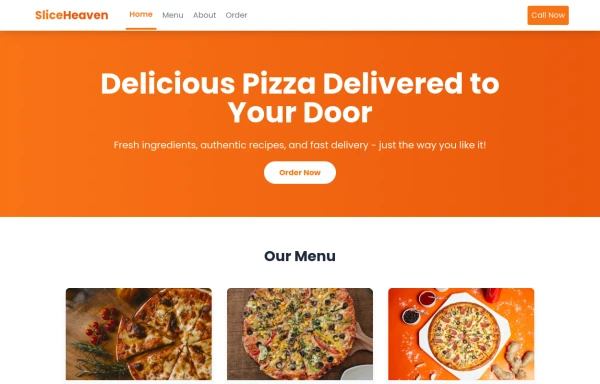 SliceHeaven
delivering pizza
1.6k -
 Responsive About Section with Tailwind CSS
Built a sleek and fully responsive About Section for my portfolio using Tailwind CSS! 🚀 Designed for smooth adaptability across all screen sizes with a modern and minimal aesthetic. Perfect for showcasing skills, experience, and a personal touch!
-
 14.1k
14.1k -
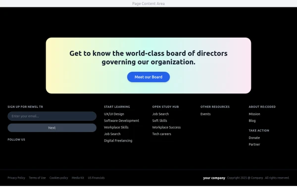 Modern Dark Footer with Overlapping Gradient CTA
A comprehensive, dark-themed website footer component built with HTML and Tailwind CSS. It features a visually distinct overlapping section with a colorful gradient background containing a prominent call-to-action (CTA) block. The main footer area utilizes a multi-column grid layout for organized navigation links, a newsletter signup form, and social media icons. A final bottom bar includes legal links and copyright information. The design is responsive and adapts its layout for different screen sizes.
1.3k -
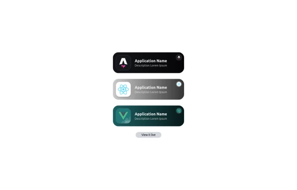 Applications Showcase
This is a stylish and interactive application showcase component designed for web use. It features the following elements: Background Styling: The main container has a rounded-rectangle shape (rounded-3xl) with a subtle white base overlaying a high-resolution background image, styled with background-size: 600px for an artistic touch. The image itself dynamically serves as a backdrop, giving the component a layered appearance. Main Icon: A small circular icon, located at the top-right corner, appears with smooth hover effects: Enlarges to double its size (scale-[2]). Rotates (rotate-[410deg]). Moves diagonally upwards-right (translate-x-3, -translate-y-3). These transitions occur over a duration of 1 second (transition duration-1000). Overlay Gradient: A transparent gradient overlay (bg-gradient-to-l) adds a polished depth effect, transitioning from black (from-black/80) to lighter shades. App Icon and Info: Icon: The app icon is a smaller, bordered square image (rounded-2xl) with hover shrink animations (group-hover:scale-95). Text: A bold application title (text-md font-semibold) with hover-animated underline effects that gradually expand from left to right. A short app description styled as secondary text. Call-to-Action Button: Below the card is a subtle, rounded button (rounded-full) encouraging interaction. It features: A hover effect with color inversion (gray to black). A lift effect (hover:-translate-y-1) when hovered. This component is perfect for modern app showcases, offering a dynamic, user-friendly visual experience. It ensures a professional look while engaging users through smooth animations and clear calls to action.
3.5k -
 carde Iptplus
Iptplus carde
429 -
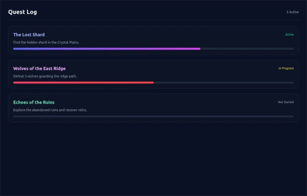 asimple game Quest Log
asimple game lay out Quest Log
1.1k -









Browse by topic
Explore components by Tags
Jump straight to the UI pattern you need.
Can't find it?
Didn't find the component you were looking for?
Search across 3,000+ community-built components and grab the code in seconds.