Features section
This tailwind example is contributed by ariaw, on 28-Oct-2025. Component is made with Tailwind CSS v3. It is responsive. similar terms for this example are Services,Why choose us

Author ariaw
Related Examples
-
 1 year ago3.1k
 -
 3 years ago11.2k
 -
 SaaS Feature Section
It has a Gradient text headline and CTA buttons
2 years ago9.4k -
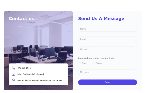 tailwind contact form
tailwind contact form
1 year ago3.5k -
 Animated Feature Grid Component with Tailwind CSS
Animated feature grid component built with Tailwind CSS. Features smooth hover animations, gradient cards, dark mode support, and responsive design. Perfect for showcasing product features.
2 months ago411 -
 Feature: Switch-Special
Here a special feature-showcase. I hope you like it ;)
1 year ago1.7k -
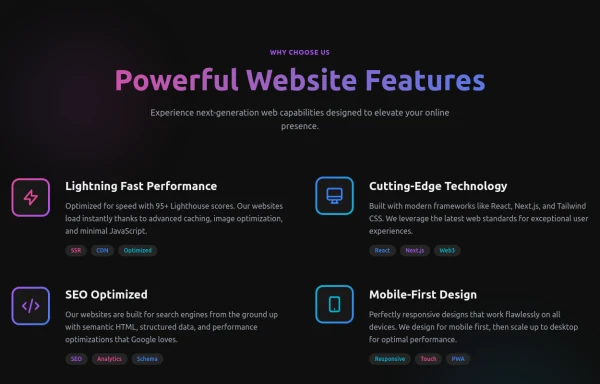 Powerful Website Features
Open Layout Design: No traditional boxes - content flows naturally Gradient Accents: Vibrant color gradients for visual interest Animated Icons: Subtle floating animations on feature icons Hover Effects: Soft glow backgrounds appear on hover Tag System: Color-coded tags for each feature's attributes Dark Theme: Sophisticated dark background with perfect contrast
8 months ago1.2k -
 House Cleaning Website Services Section
House Cleaning Website Services Section Photo by @candjstudios & @framesforyourheart on Unsplash
1 year ago7.6k -
 8 months ago999
 -
 Work Showcase Cards
Highlight your top projects or products with these cards, featuring images and brief descriptions. This example has a subtle hover effect.
2 years ago12.5k -
 Feature Card
Shows off a feature, great for homepages and grid layout, or can be used in dashboards for "example use" grids. Enjoy! Part of the Coastal UI collection.
10 months ago432 -
 CTA Responsive
Gradient Style CTA
7 months ago586


Explore components by Tags
Didn't find component you were looking for?
Search from 3000+ components