Feature: Switch-Special
Here a special feature-showcase. I hope you like it ;)
This tailwind example is contributed by Matti, on 06-Dec-2024. Component is made with Tailwind v3.4. It is responsive. It supports dark mode. similar terms for this example are Services,Why choose us

Related Examples
-
-
-
 Modern E-commerce Product Card with TailwindCSS
This product card is designed for e-commerce platforms using TailwindCSS. It features a discount badge, product image carousel, quick view and quick order buttons, ratings, product name, brand details, dynamic pricing with a strike-through original price, and a prominent add-to-cart button. The clean and professional layout is perfect for showcasing products on online stores.
-
-

-
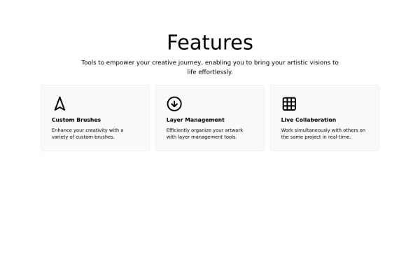
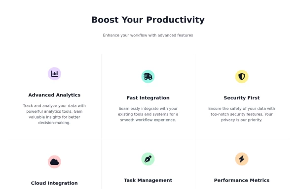 Feature Showcase Section with Font Awesome Icons
showcase the features of a product or service. The features are presented in a grid.
7.4k -
 Experiance & Explanation
Here my beautiful component that is being seen and used more and more. Hopefully you like it and find it useful too
2k -
 10.9k
-
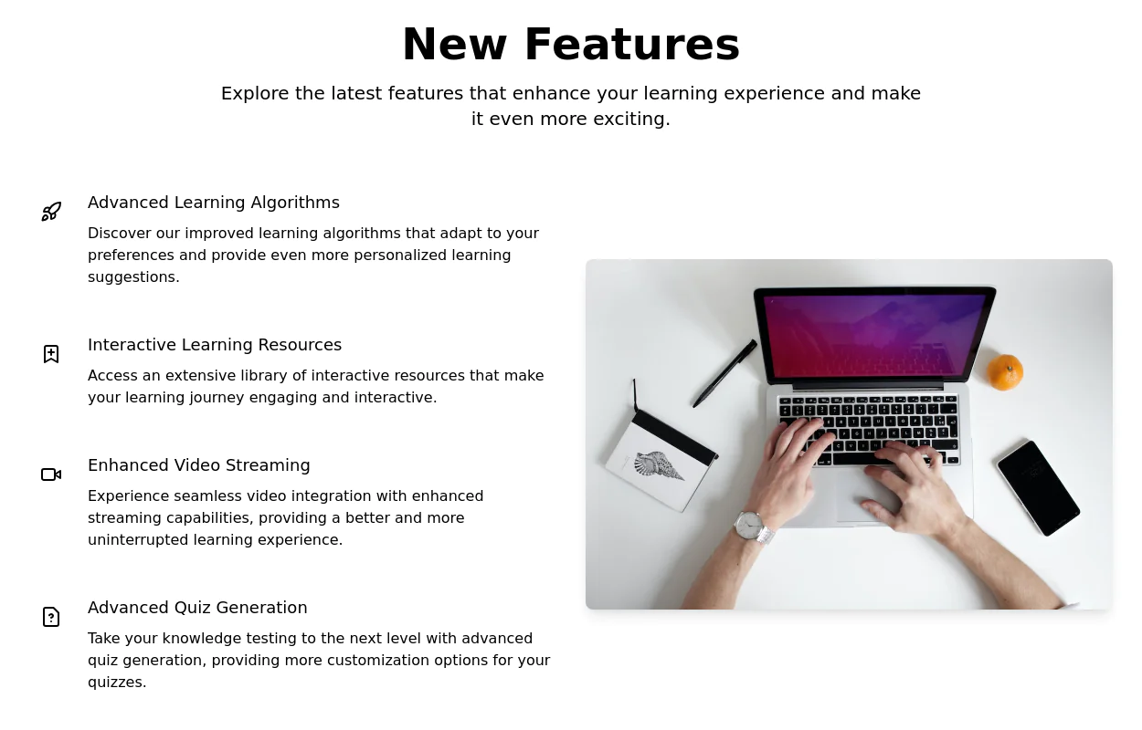 Product Feature Section
present multiple product features in a grid layout. Each feature is represented by an icon, title, and description.
10k -
 Responsive Features Cards Section
A modern and fully responsive services section featuring premium glassmorphism cards, interactive hover effects, smooth animations, and a clean multi-column grid layout. Perfect for SaaS, startups, agencies, portfolios, business websites, and landing pages. Built with semantic HTML and easy-to-customize CSS for seamless integration into any modern web project.
254 -
 11.5k
-



Browse by topic
Explore components by Tags
Jump straight to the UI pattern you need.
Can't find it?
Didn't find the component you were looking for?
Search across 3,000+ community-built components and grab the code in seconds.