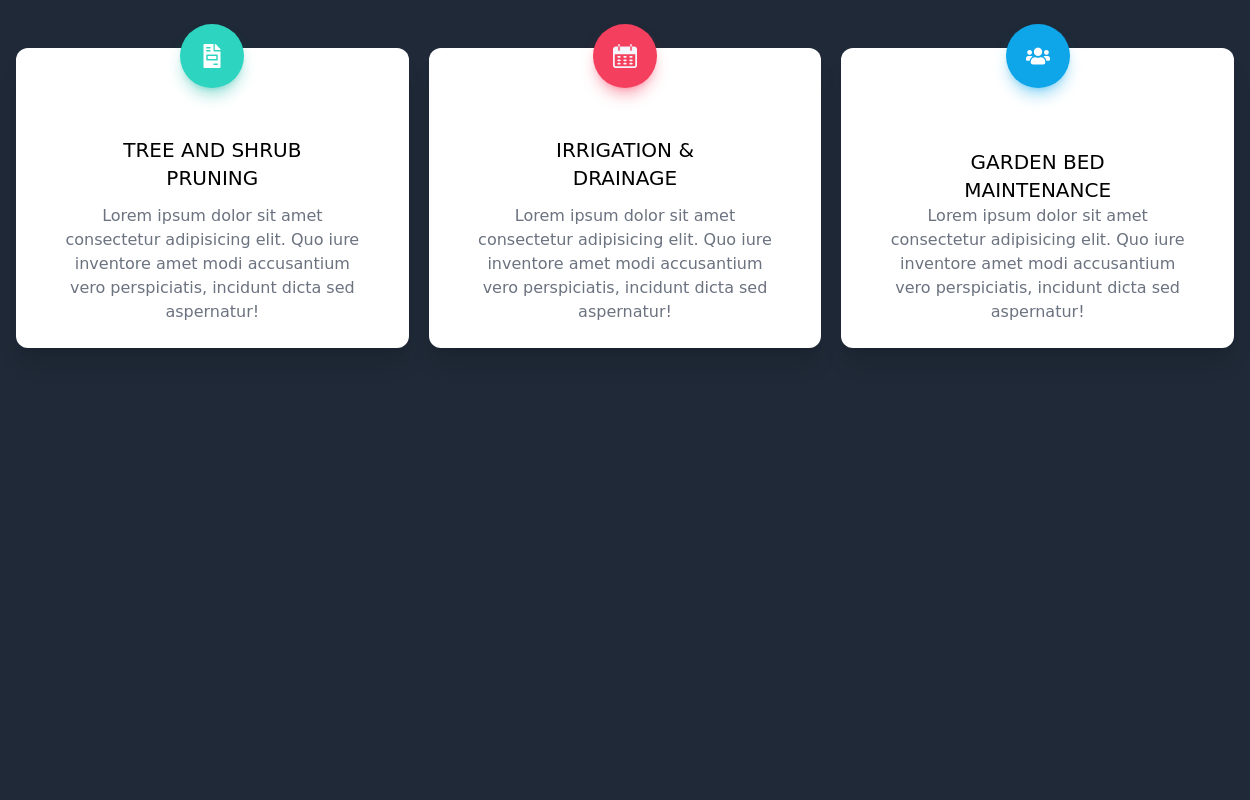
House Cleaning Website Services Section
House Cleaning Website Services Section
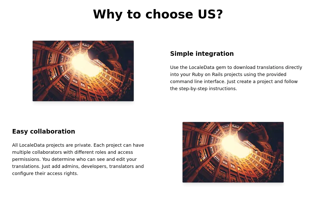
Photo by @candjstudios & @framesforyourheart on Unsplash
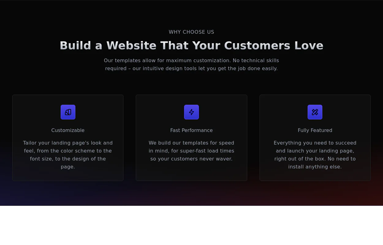
This tailwind example is contributed by $@(\/)(\/)¥, on 15-Mar-2024. Component is made with Tailwind CSS v3. It is responsive. It supports dark mode. similar terms for this example are Services,Why choose us

Author $@(\/)(\/)¥
Related Examples
-
 Product page
Product Information Card component that provides comprehensive details about a product, including an image, name, description, price, availability, color and size options, and a product description.
3 years ago48.6k -
 2 years ago14.9k
 -
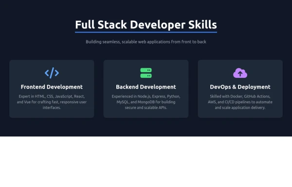
 Product Feature Section
present multiple product features in a grid layout. Each feature is represented by an icon, title, and description.
2 years ago9.5k -
 2 years ago16.6k
 -
 Flour mill website landing page template
flour mill and services template website which comprise of many sections like about us, featured products, why us, visit us
1 year ago15.1k -
 3 years ago14k
 -
 2 years ago6.2k
 -
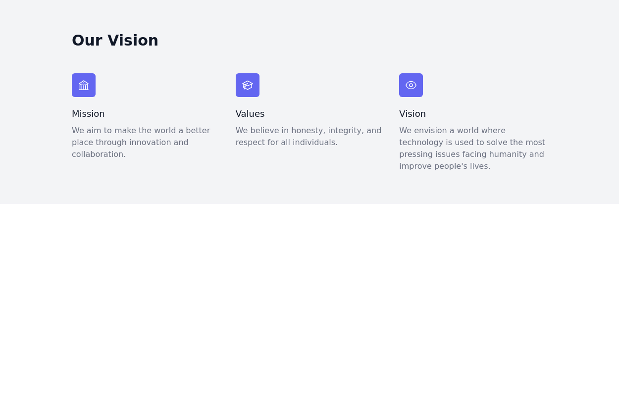
 Why choose us section
list your product features beautifully
2 years ago28.8k -
 Responsive products grid
Responsive product card grid using tailwind CSS.
3 years ago45k -
 2 years ago17.4k
 -
 2 years ago12.3k
 -
 8 months ago1.2k


Explore components by Tags
Didn't find component you were looking for?
Search from 3000+ components