Responsive Features Section
This tailwind example is contributed by Abdul Baset Bappy, on 19-Jun-2025. Component is made with Tailwind v3.4. It is responsive. similar terms for this example are Services,Why choose us,Info, Show info, Statistics

Related Examples
-

-
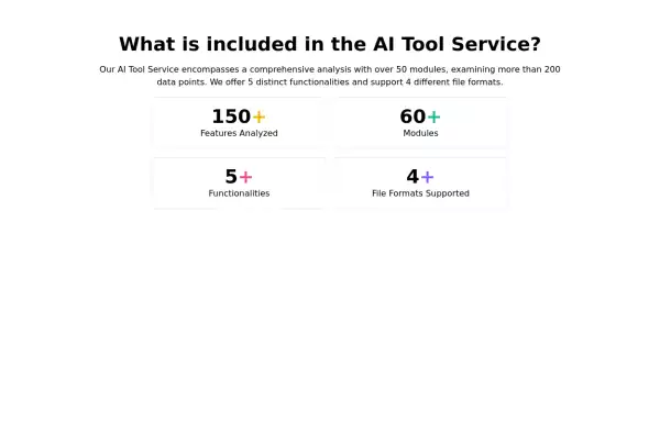 Feature overview cards
The component is designed to be responsive, featuring a title, a brief description, and a set of cards presenting key metrics.
5.8k -
 AI Trends Showcase
A clean and modern intelligence feed component for showcasing AI, technology, startup, and research updates with automatic rotation, smooth navigation, and responsive layouts. Perfect For Showcase AI, technology, and innovation stories using a premium editorial-style carousel. Designed with a clean dark aesthetic, automatic slide rotation, interactive breadcrumbs, navigation controls, and a responsive layout that works seamlessly across desktop and mobile devices.
322 -
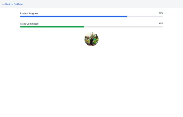 Progress Bar
A progress bar is a UI element that visually represents the completion status of a task or process. It helps users understand how much of a task has been completed and how much remains. Commonly used in forms, file uploads, loading screens, or multi-step processes, it enhances the user experience by providing clear feedback.
1.4k -
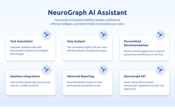 Feature Overview Section with Dark Mode Support
Feature cards with icon
2.4k -
-
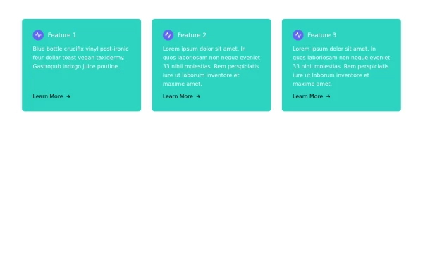 Responsive Card Grid
Tailwind CSS responsive grid for feature listing. The cards have a teal background, rounded corners, and a concise display of feature titles, descriptions, and a "Learn More" link.
2.7k -
-
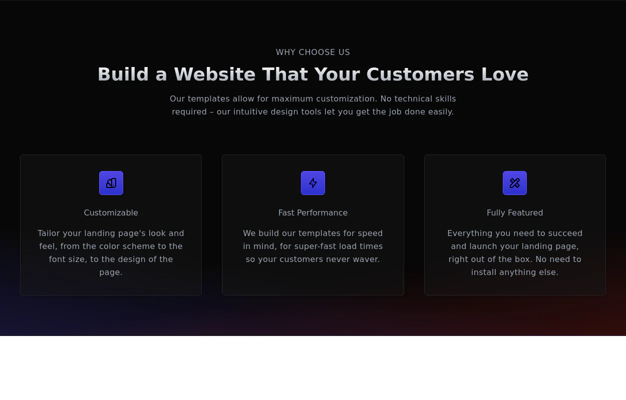 Why choose us section
list your product features beautifully
29.5k -
 Big stat card
Display your statistics boldly
4.5k -
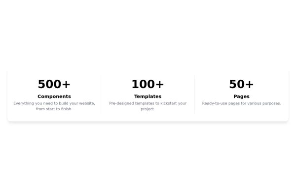 Stats - Big and Bold
display stats of your product
2.8k -
 10.9k








Browse by topic
Explore components by Tags
Jump straight to the UI pattern you need.
Can't find it?
Didn't find the component you were looking for?
Search across 3,000+ community-built components and grab the code in seconds.