Text Overlay Effect
This is a text overlay effect, featuring a subtle background title and a prominent foreground heading. This design enhances visual interest while maintaining a clean, modern aesthetic.
This tailwind example is contributed by Anum Shahana, on 30-Oct-2024. Component is made with Tailwind CSS v3. It is responsive.

Author Anum Shahana
Related Examples
-
 Simple Login & Register Page
Login and Register Page using Tailwind, Alpine JS, and Fontawesome
1 year ago3.2k -
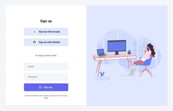 Sign up
sign up page
9 months ago1.4k -
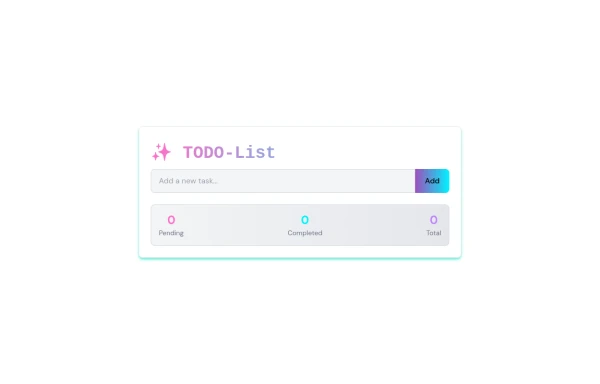
 To-Do List with Tailwind CSS
A simple and responsive to-do list built with HTML, JavaScript, and Tailwind CSS. Features task addition, completion, and deletion. Perfect for beginner projects or component demos.
9 months ago1.3k -
 Todo List
A simple tool to track tasks: add, edit, complete, or delete items to stay organized daily.
9 months ago1.1k -
 background animation
background animation
4 months ago209 -
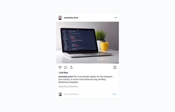 Instagram Post UI Mockup
A static HTML and Tailwind CSS component that visually replicates the user interface of an Instagram post. This mockup includes the post header (avatar, username, options), image area, action buttons (like, comment, share, save), like count, caption, and comment section. It features responsive constraints and supports both light and dark mode, closely mimicking the look and feel of the actual Instagram app. Ideal for UI prototyping, style guides, or frontend development practice.
11 months ago1.5k -
 3d card
the Best 3D card with tailwind css
9 months ago638 -
 1 year ago4k
 -
 products, show, items
display images, card, products
2 months ago287 -
 Why Choose Us - Our Core Strengths
Discover what sets us apart with this engaging "Why Choose Us" section. Highlighting three key pillars—passion, honesty, and continuous improvement—this component features a bold, centered headline with a striking blue accent
11 months ago1.5k -
 Horizon Premium Dashboard Tailwind
Website Dashboard Admin with tailwind CSS CDN
1 month ago248 -
 8 months ago1.6k


Explore components by Tags
Didn't find component you were looking for?
Search from 3000+ components