Elegant Dock
Useful Tailwind classes for constructing a basic Dock (usually used on mobile).
This tailwind example is contributed by Nick Girga, on 05-May-2025. Component is made with Tailwind CSS v3. It is responsive.

Author Nick Girga
Related Examples
-
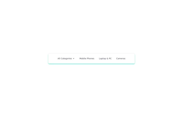 navigation header
responsive navigation header
1 year ago2.6k -
 1 year ago2k
 -
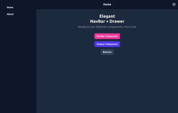 Elegant NavBar + Drawer
A NavBar, a responsive drawer/sidebar, and other useful Tailwind components to get started creating an app. Pure CSS, no JavaScript needed (although this example uses a bit of JS).
9 months ago1.3k -
 Frontend Template Open Source Code Website
This frontend template is designed for a website that provides software services and open-source code to users. It serves as a clean, modern UI for browsing, searching, and downloading open-source projects. Building with HTML, tailwindcss for CSS ,
8 months ago1.1k -
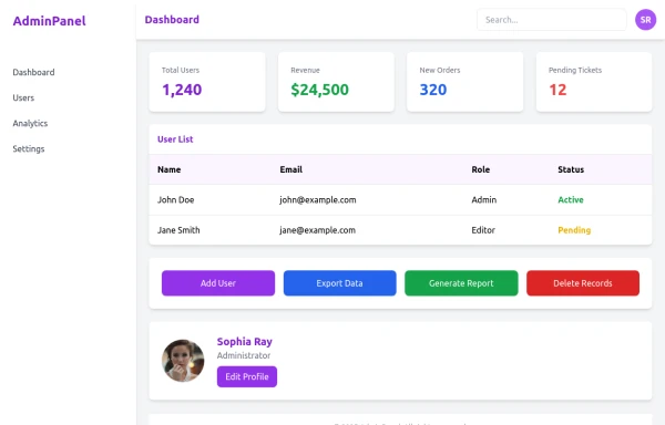 admin panel UI
Premium Admin Panel Pack including sidebar navigation, top navbar, dashboard cards, user tables, quick actions, profile section, and footer. Fully responsive with modern clean design using Tailwind CSS.
8 months ago1.8k -
 8 months ago1.2k
 -
 FLESH & BONE
Stranded in the heart of a cannibal-infested jungle, you must make unthinkable choices to survive. How far will you go to see another sunrise?
3 months ago286 -
 Landi page template
con un cuerpo libre
2 months ago134 -
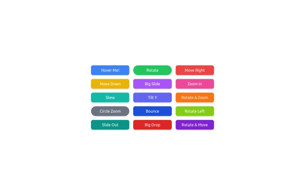 button animation
button animation big
9 months ago924 -
 Hero Section
Modern Gradient Color Scheme - Uses a professional purple-to-teal gradient for visual appeal Animated Elements: Floating decorative circles with subtle animation Fade-in effect for the main illustration Pulsing status indicator Engaging Typography: Gradient text for key phrases Responsive font sizing Clean Poppins font family Social Proof Elements: Client avatars Star ratings Trust indicators ("Trusted by 500+ businesses") Call-to-Action Buttons: Primary gradient button Secondary outlined button Hover effects and transitions Visual Hierarchy: Clear headline with emphasis on transformation Supporting subheading Balanced layout with image Performance Indicators: ROI badge Growth metric badge Responsive Design: Works on mobile and desktop Grid layout that adapts to screen size
7 months ago1.1k -
 Simple Login & Register Page
Login and Register Page using Tailwind, Alpine JS, and Fontawesome
1 year ago3k -
 3 months ago206


Explore components by Tags
Didn't find component you were looking for?
Search from 3000+ components