color blur
blur
This tailwind example is contributed by BocchiChan, on 12-Feb-2025. Component is made with Tailwind CSS v3.

Author BocchiChan
Related Examples
-
 Gradient Flip-Text Button with Hover Animation
This stylish button features a dynamic gradient background that shifts from a calm green gradient by default to a vibrant purple-pink-red gradient on hover. The button also includes an interactive text flip effect, where the text seamlessly transitions on hover, creating a visually appealing and modern UI element. Perfect for adding flair to your websites or applications while maintaining functionality and responsiveness.
1 year ago1.5k -
 Modern Responsive Footer with Tailwind CSS
This sleek and modern responsive footer is built using HTML and Tailwind CSS. It features three sections: brand information, useful links, and social media icons. The footer includes smooth hover effects, subtle fade-in animations, and a fully responsive design that adapts seamlessly to different screen sizes. Perfect for websites looking for a professional and stylish footer section.
1 year ago2.2k -
 Clean AI Chat UI with Tailwind CSS – ChatGPT-Style Interface
A polished and responsive AI chat interface built using modern Web Components and Tailwind CSS. This UI replicates the smooth, minimal experience of ChatGPT with a clean layout, floating input bar, animated scrollable message feed, and mock AI responses. Ideal for SaaS dashboards, AI assistants, or frontend prototypes. Designed with professional spacing, accessible colors, and reusable components. Key features: Responsive layout with mobile support Floating input bar with auto-expanding textarea Tailwind-powered message bubbles with clear sender roles Modern dark theme with subtle gradients and shadows Easily extendable to real AI APIs (e.g., OpenAI)
10 months ago1.9k -
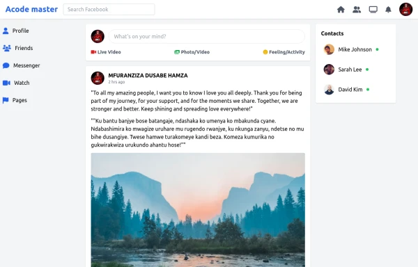 SocialSphere: A Full-Stack Social Media Platform
SocialSphere is a full-stack social media platform inspired by Facebook, built using HTML CSS
9 months ago977 -
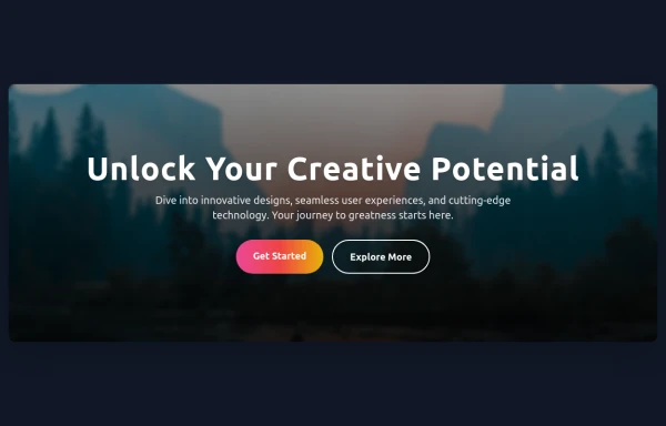 Hero Section
Responsive Hero Section for you Project Background Image: A stunning, high-quality Unsplash photo that creates a unique visual impact. Overlay: Semi-transparent black overlay with blur effect for readability and a modern aesthetic. Content Area: Centered with a gradient background overlay for contrast, bold headline, engaging subtext. Buttons: Vibrant gradient and clean border with smooth hover animations to draw attention. Responsive Design: Looks great on all screen sizes with adaptable padding and font sizes.
8 months ago1.5k -
 Profile Card with Transparent
Dynamic Background: Darker gradient background for better contrast Floating colored blobs for visual interest Profile Image Glow: Added a gradient glow effect behind the profile picture Smoother hover transition Typography Improvements: Larger, bolder name text Subtle hover underline animation for the name Better spacing and hierarchy
8 months ago1k -
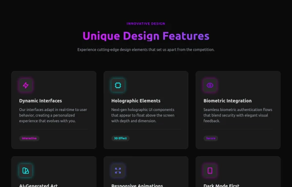 Attractive Feature Section
With Gradient Color 6 Features
8 months ago981 -
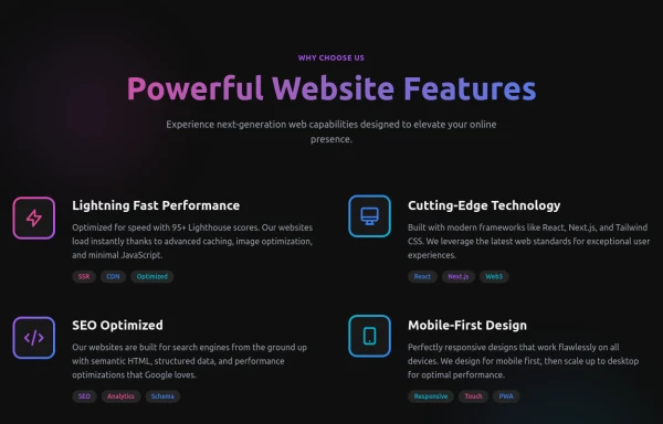 Powerful Website Features
Open Layout Design: No traditional boxes - content flows naturally Gradient Accents: Vibrant color gradients for visual interest Animated Icons: Subtle floating animations on feature icons Hover Effects: Soft glow backgrounds appear on hover Tag System: Color-coded tags for each feature's attributes Dark Theme: Sophisticated dark background with perfect contrast
8 months ago1.2k -
Pixel Blast
Pixel Blast
5 months ago842 -
 Premium Gaming UI Card, Form & Animated Button (Tailwind CSS)
A modern, senior-level gaming UI built with Tailwind CSS focusing on spacing, typography, and calm visual hierarchy rather than noisy effects. This component set includes: A premium gaming card with clear content structure and outcome-focused copy A clean player signup form with accessible focus states and minimal visual noise A custom animated button using a restrained light-sweep effect for premium interaction feedback Designed to resemble real production gaming platforms rather than demo or template UI. Fully responsive, copy-paste ready, and easy to extend for real-world projects.
2 months ago225 -
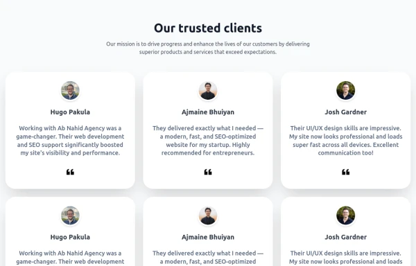 Testimonial Section
A responsive, SEO-friendly testimonial section for Ab Nahid Agency clients
8 months ago754 -
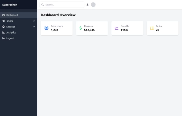 super admin
super admin
11 months ago1.1k


Explore components by Tags
Didn't find component you were looking for?
Search from 3000+ components