- Home
-
Moving Background Animation
Moving Background Animation
This tailwind example is contributed by $@(\/)(\/)¥, on 17-Jan-2025. Component is made with Tailwind CSS v3. It is responsive. similar terms for this example are Front page,Transitions
Author $@(\/)(\/)¥
Related Examples
-
Typewriter effect
using javascript
3 years ago42.7k -
background animation
background animation
2 years ago50.9k -
Typewriter animation effect
Build using only Tailwind CSS; no JavaScript is required. This is a continuous typing effect. If you want to stop it after the text is typed for the first time, then you can remove 'infinite' from [typing: 'typing 2s steps(20) infinite alternate, blink .7s infinite'] from the config file.
2 years ago21.3k -
background animation
background animation
1 year ago3.2k -
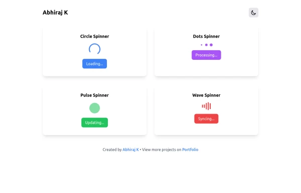
Spinner
The Spinner is a simple and visually appealing component that indicates ongoing processes like loading or data fetching. It's a great way to improve user engagement and reduce frustration during wait times. Different styles and animations (circular, dots, pulsating). Customizable size, color, and speed. Easy to integrate with loading states in any app. Lightweight and responsive.
1 year ago2.2k -
ForK blocks animations
ForK blocks animations
1 year ago1.8k -
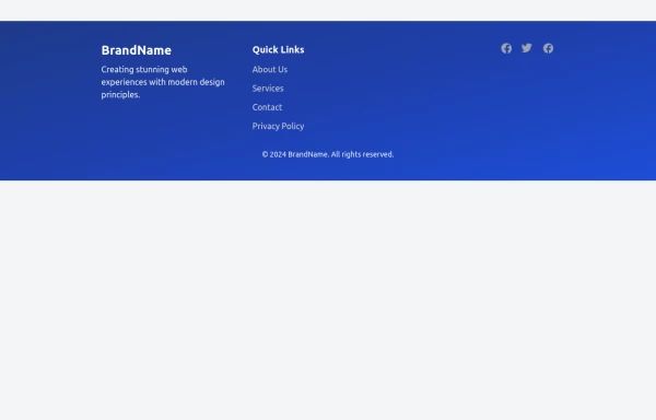
Modern Responsive Footer with Tailwind CSS
This sleek and modern responsive footer is built using HTML and Tailwind CSS. It features three sections: brand information, useful links, and social media icons. The footer includes smooth hover effects, subtle fade-in animations, and a fully responsive design that adapts seamlessly to different screen sizes. Perfect for websites looking for a professional and stylish footer section.
1 year ago2.1k -
Modern Testimonial
A simple and easy to use component for reviews and testimonials.
1 year ago1.1k -
Animated bento box.
A Coastal UI component (coastalui.com). This can be used as part of a bento box, great for showing connectivity between context, could be used beyond just showing tech stacks.
1 year ago1.4k -
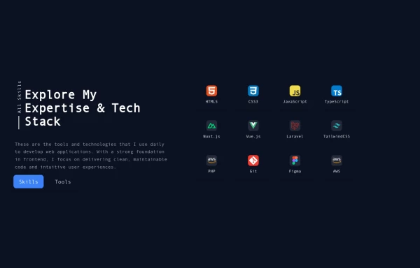
Reusable Skill Showcase Section With Pure Tailwind CSS
A fully responsive and modular "Skills & Tools" section, perfect for any developer portfolio. Built with static HTML and Tailwind CSS, this component can be easily integrated into any project and made dynamic using any frontend framework (Vue, React, Svelte, Angular) or vanilla JavaScript. Customize it to highlight your unique tech stack and create engaging portfolio pages.
11 months ago1.9k -
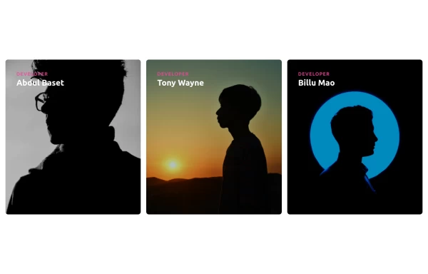
Responsive Cards with Hover Text Reveal Animation - Built with Tailwind CSS
nhance your website with these sleek, responsive cards designed using Tailwind CSS! Featuring a stylish hover animation, the text smoothly reveals when you hover over the card, adding a dynamic touch to your user interface. Perfect for portfolios, team profiles, or project showcases, this design adapts seamlessly to all screen sizes.
11 months ago1.9k -
Feature Card
Shows off a feature, great for homepages and grid layout, or can be used in dashboards for "example use" grids. Enjoy! Part of the Coastal UI collection.
10 months ago432
Explore components by Tags
Didn't find component you were looking for?
Search from 3000+ components

