chip
Interactive and customizable chips or tags to display labels, categories, or filters. Includes options for removable chips with icons and different styles.
This tailwind example is contributed by Abhiraj, on 11-Jan-2025. Component is made with Tailwind v3.4. It is responsive. It supports dark mode. similar terms for this example is tags

Related Examples
-
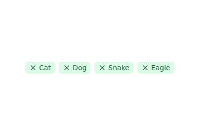 Tags list
click to remove the tag from list
12.1k -
 6.6k
6.6k -
 10.9k
10.9k -

-
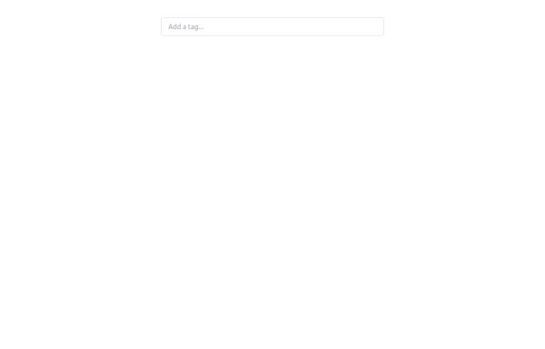 Tag Input field
This code creates a dynamic tag input field using HTML, JavaScript, and TailwindCSS. Users can type tags into the input field and press "Enter" to add them. Each tag is displayed inside the input field as a styled container with a remove button. The tag input is limited to a maximum of 5 tags, and an error message is shown if the limit is exceeded. Users can remove tags to free up space for new ones. The input field and tags are styled using TailwindCSS, ensuring a clean and responsive design.
2.7k -
 Rwandan farmers with Canadian markets through sustainable, fair trade practices.
Key Features of This Website: Professional Design: Clean, modern interface with orange/green color scheme representing mangoes and agriculture Fully responsive layout that works on all devices Comprehensive Sections: Hero section highlighting the Rwanda-Canada mango trade Product showcase with different mango varieties Current market pricing table Detailed farm-to-table process explanation Company information and impact metrics Testimonials from partners Contact form and information Trade-Specific Content: Focus on Rwandan mango varieties suitable for Canadian markets Pricing in both USD and kg units common in agricultural trade Information about certifications and compliance Shipping and logistics details User Experience: Clear calls-to-action for quotes and orders Easy navigation between sections Newsletter signup for market updates Contact information prominently displayed Trust Elements: Certifications and compliance badges Impact statistics showing benefits to Rwandan farmers Testimonials from Canadian partners
-
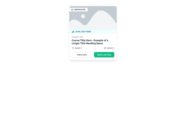 E-Learning Course Card with Badge and Level Indicator
An HTML and Tailwind CSS component mockup for displaying course information. Features include a placeholder image area with an overlaid certificate badge, a distinct level indicator banner below the image, category text, a course title, key details (like duration and learner count placeholders), and primary/secondary action buttons. Designed for e-learning platforms or course listings.
1.6k -
-
-
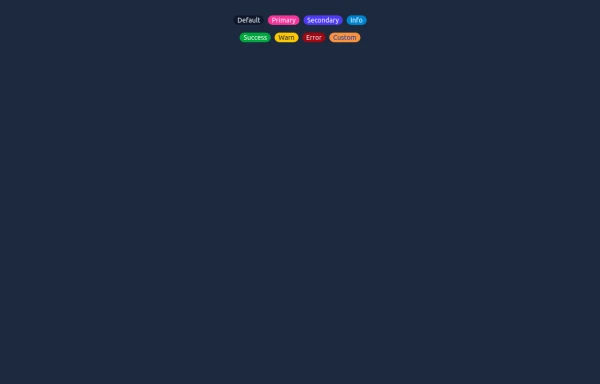 Elegant Badges
Useful Tailwind classes for creating several types of basic badges.
1.4k -

-
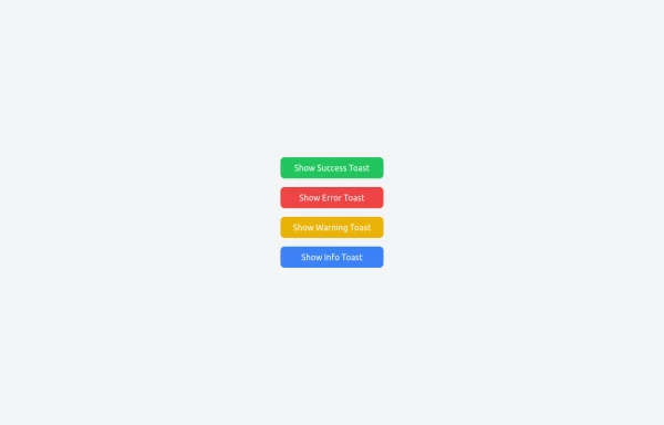 Notifications
Toast Notifications are lightweight and customizable components for displaying short messages or alerts. They are perfect for feedback on user actions, such as form submissions or system updates. Supports different types of notifications (success, error, warning, info). Automatically hides after a specified timeout. Option to include action buttons or close icons. Customizable styles, animation, and position on the screen.
2.2k









Browse by topic
Explore components by Tags
Jump straight to the UI pattern you need.
Can't find it?
Didn't find the component you were looking for?
Search across 3,000+ community-built components and grab the code in seconds.