Footer
This tailwind example is contributed by Abdul Baset Bappy, on 19-Jun-2025. Component is made with Tailwind CSS v3. It is responsive.

Author Abdul Baset Bappy
Related Examples
-
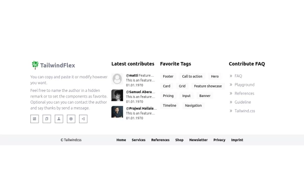 Footer, TailwindFlex v2
Another footer version of tailwindflex.com Example users randomly picked: Samuel & Prajwal
1 year ago1k -
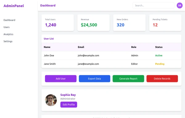 admin panel UI
Premium Admin Panel Pack including sidebar navigation, top navbar, dashboard cards, user tables, quick actions, profile section, and footer. Fully responsive with modern clean design using Tailwind CSS.
7 months ago1.8k -
 Footer with background
Apply background color to your footer to provide immense look of footer area.
1 year ago2.8k -
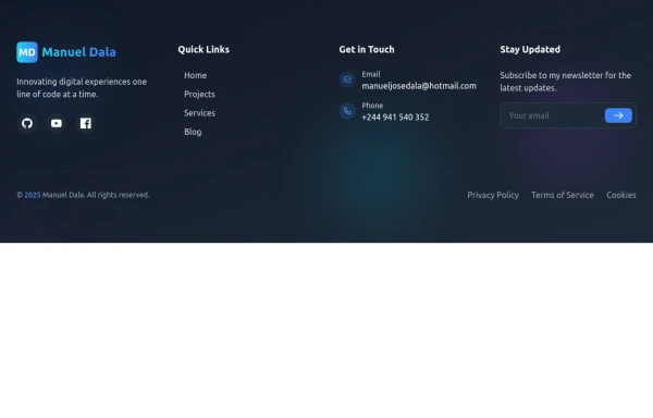
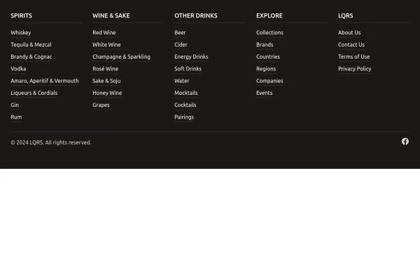 Footer with mobile accordion
A modern dark-themed footer component built with Tailwind CSS, featuring a responsive 5-column grid layout for desktop that transforms into an accordion menu on mobile devices. Perfect for beverage, e-commerce, or corporate websites, it includes organized navigation categories, hover effects on links, social media integration, and a clean copyright section - all styled with a professional stone-gray color scheme.
1 year ago1.4k -
 footer
footer
9 months ago1.9k -
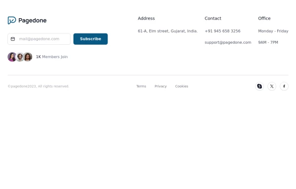 subscribe form in Footer
You can use following subscribe form in your tailwind footer section beside contact information such as email address, phone numbers etc and You can also shows community counts.
1 year ago2.9k -
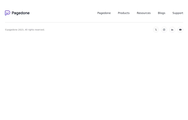
 Horizontal footer with dark version
Use this example for simple horizontal layout of footer in dark version with brand logo, sitemap links and social media accounts.
1 year ago3.4k -
 Horizontal footer with light version
Use this example for simple horizontal layout of footer in light version with brand logo, sitemap links and social media accounts.
1 year ago2.9k -
 2 months ago179
 -
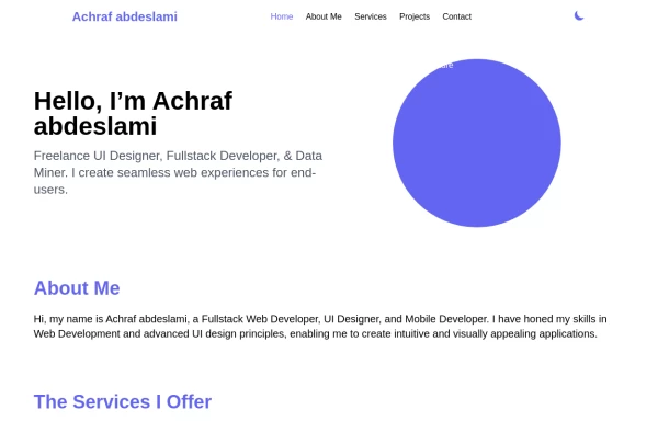 Responsive portfolio with dark mode
responsive and support dark mode .portfolio website
1 year ago3.7k -
 1 year ago2.5k
 -
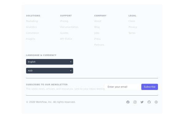 Crafting a Responsive Footer with TypeScript, and Tailwind CSS
This is a well-structured and comprehensive footer section that uses Tailwind CSS for styling and layout. Here’s a brief explanation of what each part does: Footer Container (<footer class="bg-gray-800">): The footer is wrapped in a <footer> element with a dark background using the bg-gray-800 class. The aria-labelledby="footer-heading" attribute is used for accessibility, linking the <footer> to the invisible heading (<h2 id="footer-heading" class="sr-only">Footer</h2>). Main Content Area: The content inside the footer is centered and spaced using utility classes like max-w-7xl mx-auto py-12 px-4 sm:px-6 lg:py-16 lg:px-8. Footer Sections: The footer is divided into several sections using grid layouts (xl:grid xl:grid-cols-5 xl:gap-8), which organize content into columns. Each section (Solutions, Support, Company, Legal) contains a heading with a list of links. These links are styled with Tailwind classes for consistent spacing and hover effects (text-base text-gray-300 hover:text-white). Language & Currency Selector: This section provides dropdowns for selecting language and currency. Tailwind's form utilities (@tailwindcss/forms plugin) are used to style the select elements. Newsletter Subscription Form: A subscription form is provided with an email input and a submit button. The form is styled to be responsive, with focus states for accessibility (focus:ring-2 focus:ring-offset-2). Social Media Links: Social media icons (Facebook, Instagram, etc.) are included, each wrapped in a link with hover effects. Icons are created using SVGs, which are scalable and look sharp at any size. Final Section: The footer concludes with another grid layout, ensuring spacing and alignment for different screen sizes. Customization Tips: Colors: You can easily customize the colors using Tailwind's utility classes (e.g., bg-gray-800, text-gray-400) to match your design. Icons: Replace SVGs with the appropriate icons for your needs. You might use a different icon set or add more icons. Responsive Design: Tailwind's utility classes like sm:, md:, lg:, xl: ensure that the footer is responsive across devices. Adjust the layout or padding if needed. Additional Considerations: SEO: Ensure the links in the footer point to meaningful pages to improve SEO. Accessibility: Consider adding aria-labels to the form elements and social media links to enhance accessibility further. This footer is ready to be integrated into a Tailwind CSS-powered project, offering both aesthetic appeal and functional utility.
1 year ago3k


Explore components by Tags
Didn't find component you were looking for?
Search from 3000+ components