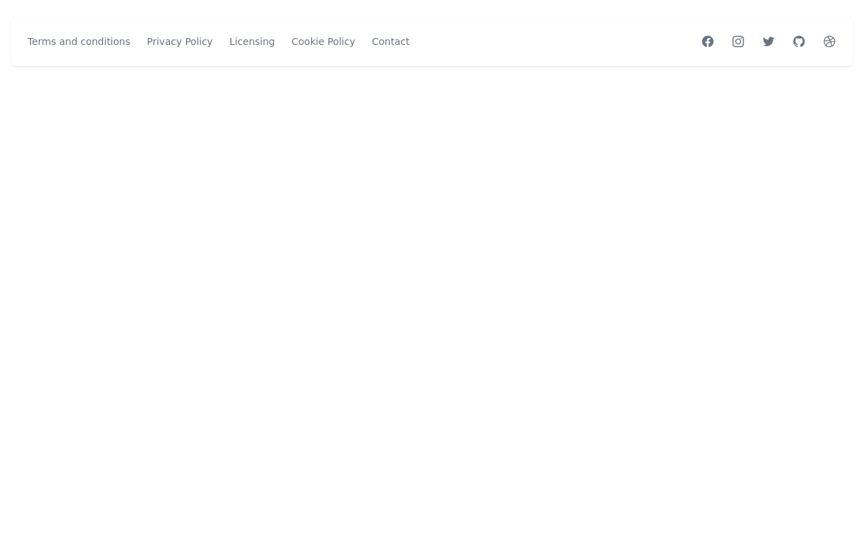
Simple Footer
This tailwind example is contributed by $@(\/)(\/)¥, on 21-Oct-2024. Component is made with Tailwind CSS v3. It is responsive. It supports dark mode. similar terms for this example are Social media links,

Author $@(\/)(\/)¥
Related Examples
-
 3 years ago14.1k
 -
 Modern Responsive Footer with Tailwind CSS
This sleek and modern responsive footer is built using HTML and Tailwind CSS. It features three sections: brand information, useful links, and social media icons. The footer includes smooth hover effects, subtle fade-in animations, and a fully responsive design that adapts seamlessly to different screen sizes. Perfect for websites looking for a professional and stylish footer section.
11 months ago1.9k -
 Modern Dark Footer with Overlapping Gradient CTA
A comprehensive, dark-themed website footer component built with HTML and Tailwind CSS. It features a visually distinct overlapping section with a colorful gradient background containing a prominent call-to-action (CTA) block. The main footer area utilizes a multi-column grid layout for organized navigation links, a newsletter signup form, and social media icons. A final bottom bar includes legal links and copyright information. The design is responsive and adapts its layout for different screen sizes.
9 months ago1.1k -
 modern portifolio
by salvator
8 months ago785 -
 canvas fully covers
canvas fully covers
8 months ago826 -
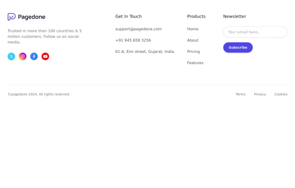 Footer with social media icons
If you want to use colorful social media icons with address location, sitemap links and newsletter.
1 year ago3.5k -
 3 years ago21.4k
 -
 Minimalist iOS 26 Foote
Minimalist iOS 26 Foote
2 months ago73 -
 2 years ago9.2k
 -
 less is more
less is more by salvator
7 months ago1k -
 beautifull footer
We create a Advance animated footer section using tailwindcss and custom css
1 year ago2.4k -
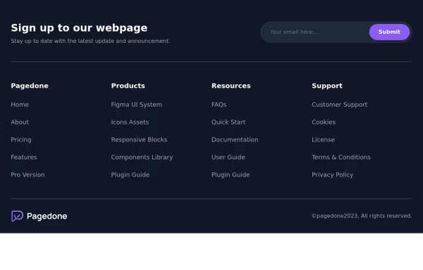 Dark Footer with subscribe form
Use below exmaple of Tailwind CSS Dark Footer with Newsletter Subscription Form with brand logo and site links.
1 year ago2.9k


Explore components by Tags
Didn't find component you were looking for?
Search from 3000+ components