footer
footer
This tailwind example is contributed by Anonymous, on 22-Apr-2025. Component is made with Tailwind CSS v3. It is responsive.

Author Anonymous
Related Examples
-
 3 years ago10.9k
 -
 footer
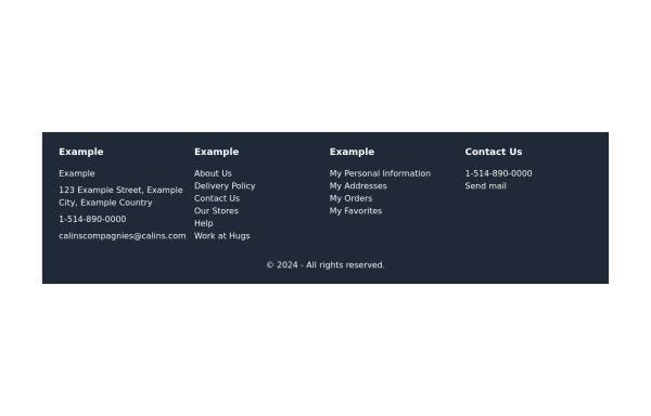
Footer with contact info, navigation, account links, and social media icons.
1 year ago3.3k -
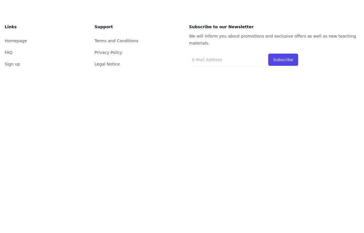
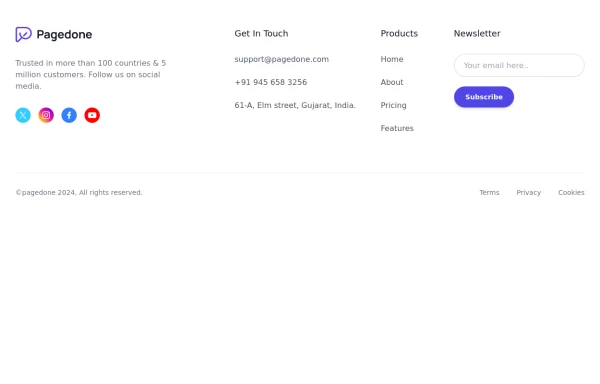
 Dark Footer with newsletter
Use Following Footer for dark vsersion of your website with newsletter, social icons and site links.
1 year ago3k -
 Website Pricing List Card Component
Website Pricing List Card Component with Package Names: Basic Package → Starter Website Premium Package → Business Website Professional Package → E-Commerce Solution Pricing Structure: Increased prices significantly to reflect web development services one-time payment model FAQ Content.
11 months ago1.5k -
 Simple tailwind footer
Simple tailwind footer with newsletter
3 years ago10.5k -
 3 years ago15k
 -
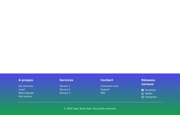 Responsive Footer
This a full responsive footer made with tailwind
1 year ago2.5k -
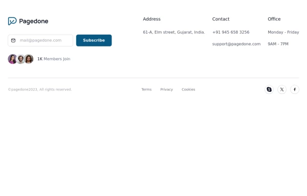 subscribe form in Footer
You can use following subscribe form in your tailwind footer section beside contact information such as email address, phone numbers etc and You can also shows community counts.
1 year ago3.1k -
 2 years ago6.7k
 -
 Footer
responsive footer
2 years ago8.8k -
 1 year ago3.9k
 -
 Footer with social media icons
If you want to use colorful social media icons with address location, sitemap links and newsletter.
1 year ago3.6k


Explore components by Tags
Didn't find component you were looking for?
Search from 3000+ components