Footer with mobile accordion
A modern dark-themed footer component built with Tailwind CSS, featuring a responsive 5-column grid layout for desktop that transforms into an accordion menu on mobile devices. Perfect for beverage, e-commerce, or corporate websites, it includes organized navigation categories, hover effects on links, social media integration, and a clean copyright section - all styled with a professional stone-gray color scheme.
This tailwind example is contributed by Maxim, on 29-Dec-2024. Component is made with Tailwind CSS v3. It is responsive. similar terms for this example is collapsible

Author Maxim
Related Examples
-
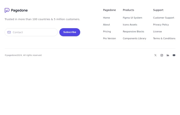 Four columns with subscribe form
Use this example for four column footer with subscribe form, brand logo, sitemap links and social media accounts.
1 year ago2.5k -
3 years ago15.4k
-
 Call to Action (for app stores)
Download app section with Playstore and Appstore button
3 years ago11.6k -
 3 years ago11.5k
 -
 portifolio
skills
9 months ago1k -
 Footer
Simple Dark footer
8 months ago893 -
 Tailwind Footer with dark version
This example can be used if you are looking for four column footer in dark version with sitemap links, brand logo, and social media accounts.
1 year ago3.6k -
 Responsive eCommerce Footer Component with Tailwind CSS
A modern, fully responsive eCommerce footer component built with Tailwind CSS. It includes multiple sections like company info, account links, help center, categories, social media icons, payment methods, and app download buttons. Optimized for seamless mobile and desktop experiences, making it perfect for any online store or business website.
1 year ago1.2k -
 Native HTML Accordion
native html accordion summary details
1 year ago2.5k -
 Modern Responsive Footer with Tailwind CSS
This sleek and modern responsive footer is built using HTML and Tailwind CSS. It features three sections: brand information, useful links, and social media icons. The footer includes smooth hover effects, subtle fade-in animations, and a fully responsive design that adapts seamlessly to different screen sizes. Perfect for websites looking for a professional and stylish footer section.
1 year ago2.1k -
 Footer
A simple footer with link adjustment for smartphones
1 year ago1.5k -
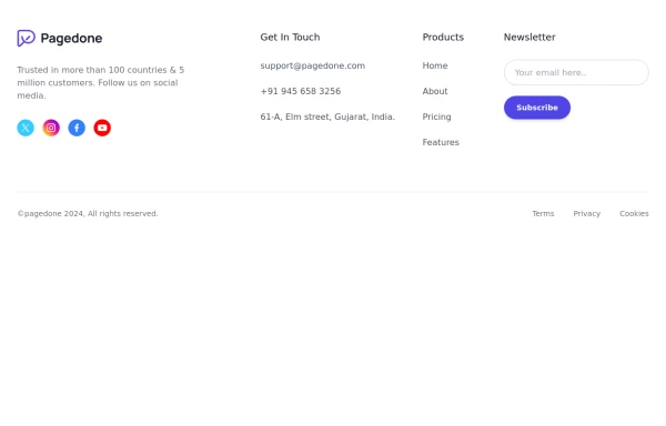 Footer with social media icons
If you want to use colorful social media icons with address location, sitemap links and newsletter.
1 year ago3.6k


Explore components by Tags
Didn't find component you were looking for?
Search from 3000+ components