Horizontal footer with dark version
Use this example for simple horizontal layout of footer in dark version with brand logo, sitemap links and social media accounts.
This tailwind example is contributed by Pagedone, on 02-May-2024. Component is made with Tailwind CSS v3. It is responsive.

Author Pagedone
Related Examples
-
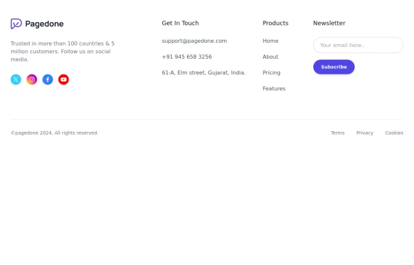
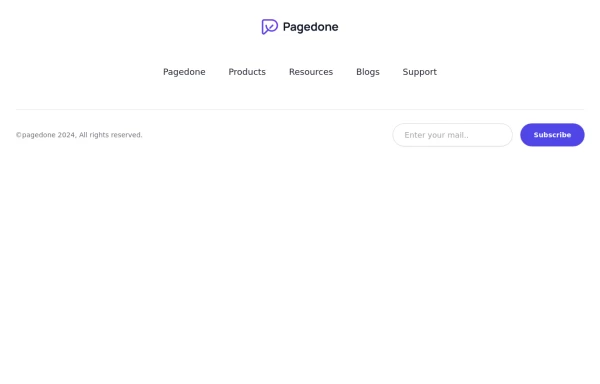 Centered footer with subscribe form
Use this example to center align everything in footer with brand logo, sitemap links and subscribe form.
1 year ago2.5k -
 1 year ago2k
 -
 Footer for blog
https://github.com/tailwindow/component
3 years ago18.5k -
 Responsive Footer
source: https://kitwind.io/products/kometa/components/footers
3 years ago16.8k -
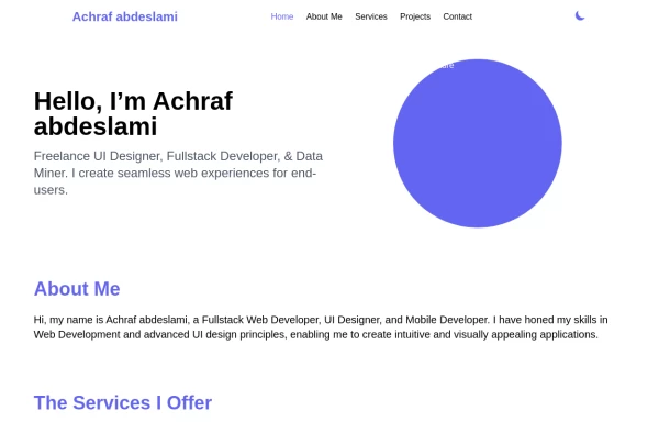 Responsive portfolio with dark mode
responsive and support dark mode .portfolio website
1 year ago3.8k -
 11 months ago1.2k
 -
 3 months ago192
 -
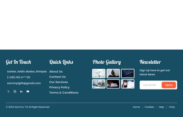
 Footer with social media icons
If you want to use colorful social media icons with address location, sitemap links and newsletter.
1 year ago3.6k -
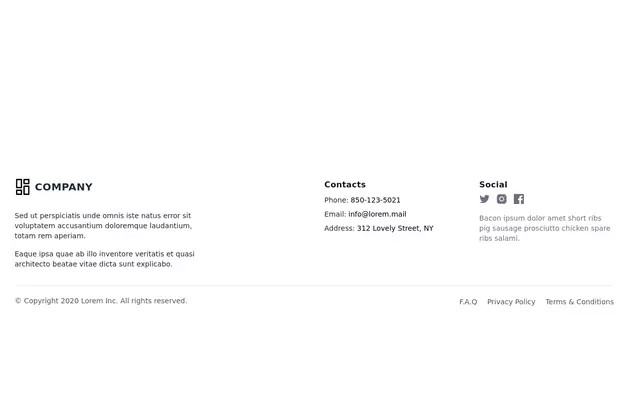
 footer
Footer with contact info, navigation, account links, and social media icons.
1 year ago3.3k -
 Footer
A simple footer with link adjustment for smartphones
1 year ago1.4k -
 canvas fully covers
canvas fully covers
9 months ago928 -
 Minimalist iOS 26 Foote
Minimalist iOS 26 Foote
3 months ago76


Explore components by Tags
Didn't find component you were looking for?
Search from 3000+ components