30 Search results for info:card_in_pvcHBLSid_Id=
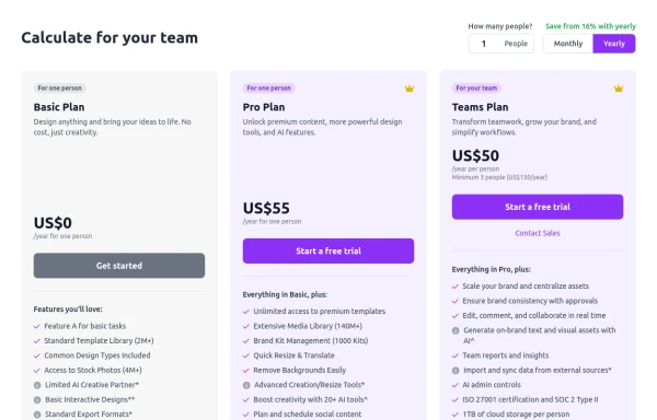
A modern, responsive pricing table component inspired by SaaS layouts, built with HTML and Tailwind CSS. Features three distinct pricing tiers displayed in cards, stacking vertically on smaller screens and transitioning to a 3-column grid on large screens (lg breakpoint). Includes interactive top controls for selecting the number of users and toggling between monthly/yearly billing cycles. Each card uses placeholder content for icons, titles, descriptions, features (with checkmarks/info icons), and distinct call-to-action buttons, making it easily adaptable. Styled with subtle background colors and clear typography for excellent readability.

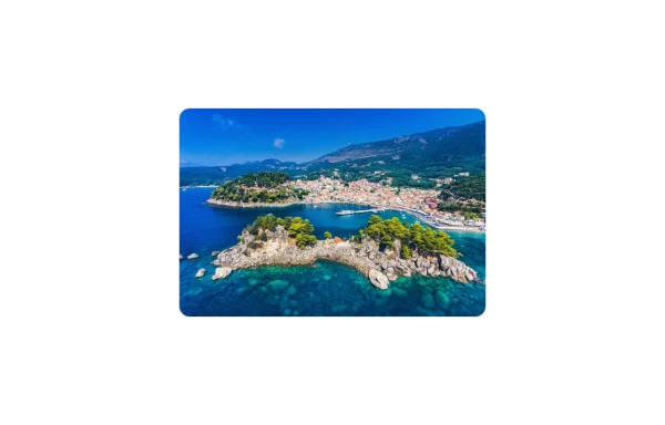
Information card with image

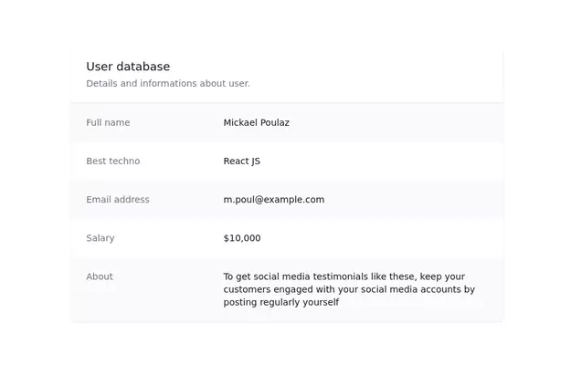


info card with description


Info card with info type section on the corner.


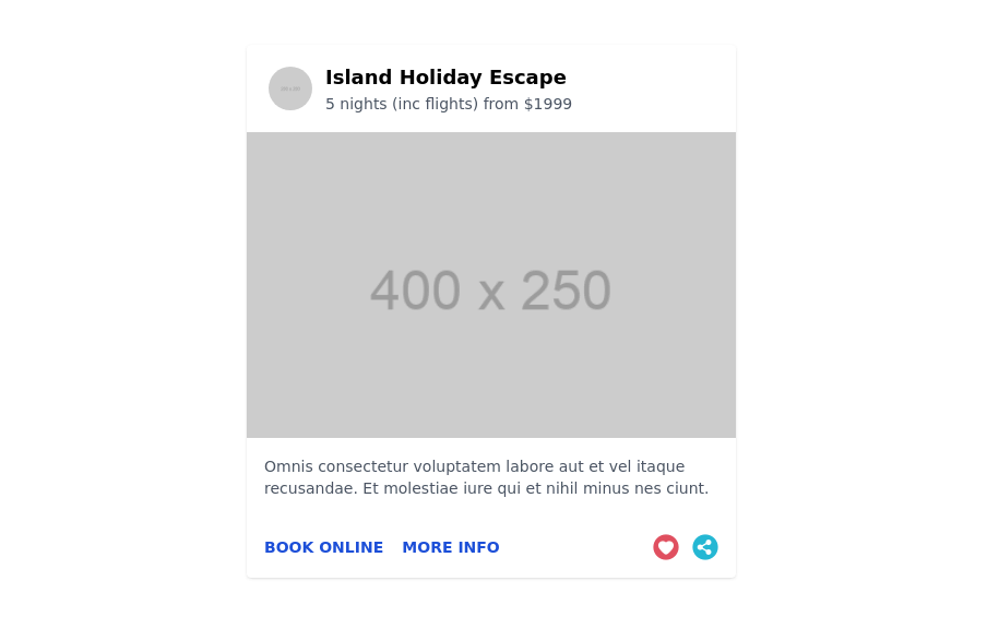
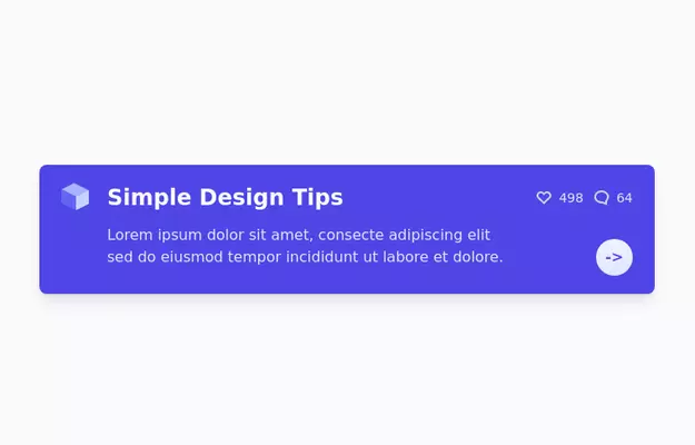
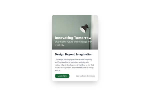
An info card with an image, a short title, and a short description.

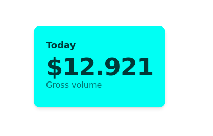
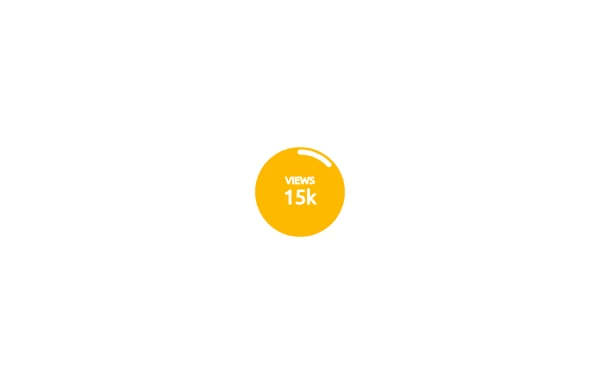
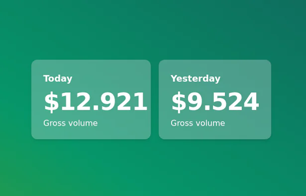
Show stats on your dashboard
Inspired from Mamba UI

Animated info card


An elegant and interactive game info flip card built purely with HTML and CSS. This component flips smoothly on hover to reveal detailed game information on the back, providing a modern and engaging way to showcase your games without using JavaScript. Perfect for gaming websites wanting sleek animations and clean design.

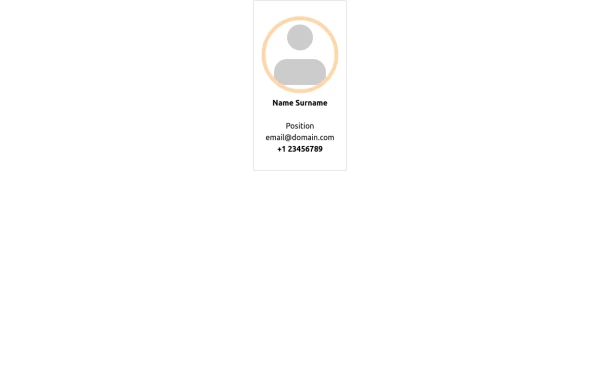
A card to show minimal info for staff member

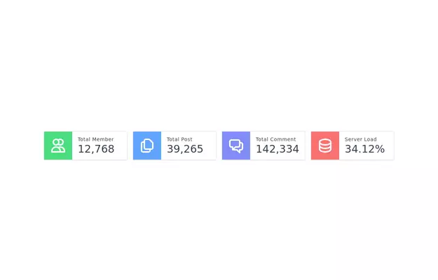
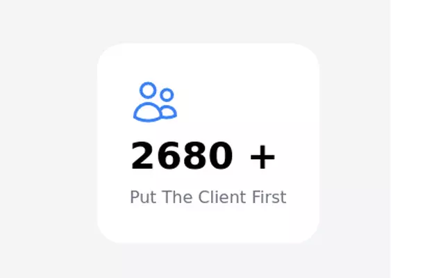
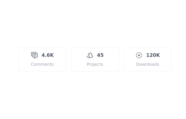
Card groups for showing stats/info.

Card groups for showing stats/info. Change it for responsiveness for small and medium screen


Card groups for showing stats/info. Change it for responsiveness for small and medium screen

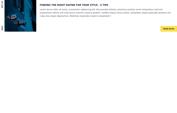
Modern, professional and responsive card component for the blog/services/info

An image. Shows title and description info when hovering. Image zooms and darkens when hovering.

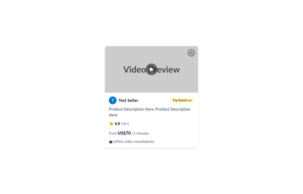
An HTML and Tailwind CSS code snippet for creating a responsive service card component. Ideal for marketplaces, portfolios, or listing pages. Includes sections for image/video preview, seller info, rating, pricing, and additional details. Easy to customize using Tailwind utility classes.
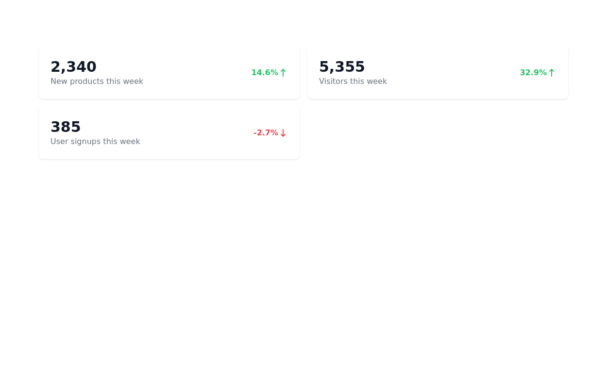

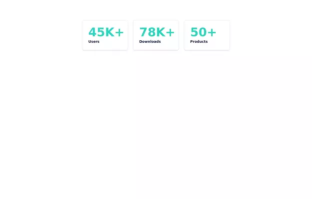
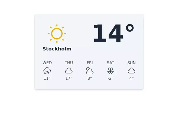
Show various statistics on your website
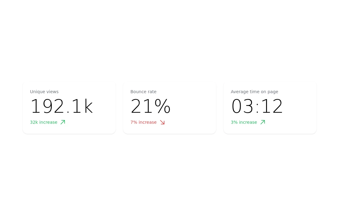


Responsive and minimal design

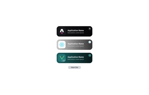
This is a stylish and interactive application showcase component designed for web use. It features the following elements: Background Styling: The main container has a rounded-rectangle shape (rounded-3xl) with a subtle white base overlaying a high-resolution background image, styled with background-size: 600px for an artistic touch. The image itself dynamically serves as a backdrop, giving the component a layered appearance. Main Icon: A small circular icon, located at the top-right corner, appears with smooth hover effects: Enlarges to double its size (scale-[2]). Rotates (rotate-[410deg]). Moves diagonally upwards-right (translate-x-3, -translate-y-3). These transitions occur over a duration of 1 second (transition duration-1000). Overlay Gradient: A transparent gradient overlay (bg-gradient-to-l) adds a polished depth effect, transitioning from black (from-black/80) to lighter shades. App Icon and Info: Icon: The app icon is a smaller, bordered square image (rounded-2xl) with hover shrink animations (group-hover:scale-95). Text: A bold application title (text-md font-semibold) with hover-animated underline effects that gradually expand from left to right. A short app description styled as secondary text. Call-to-Action Button: Below the card is a subtle, rounded button (rounded-full) encouraging interaction. It features: A hover effect with color inversion (gray to black). A lift effect (hover:-translate-y-1) when hovered. This component is perfect for modern app showcases, offering a dynamic, user-friendly visual experience. It ensures a professional look while engaging users through smooth animations and clear calls to action.


slider with navigation buttons and info about image


Badges for showing information about stuff

