Info Card
Information card with image
This tailwind example is contributed by Brandon D, on 19-Sep-2022. Component is made with Tailwind CSS v3. It is responsive.

Author Brandon D
Related Examples
-
 3 years ago20.1k
 -
 3 years ago19.9k
 -
Spinner with card
Use this animated loading indicator when content inside of a card is still loading.
1 year ago3.2k -
 1 year ago1.3k
 -
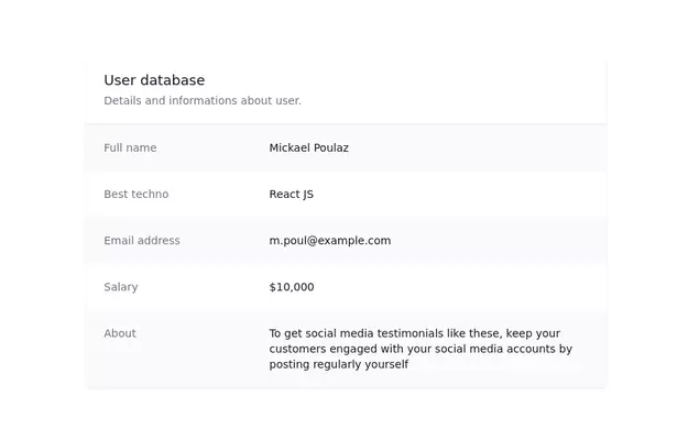
 User Profile Card
Useful for testimonials and reviews section
3 years ago10.8k -
 Beautiful and Responsive Card Component
Modern, professional and responsive card component for the blog/services/info
1 year ago1.1k -
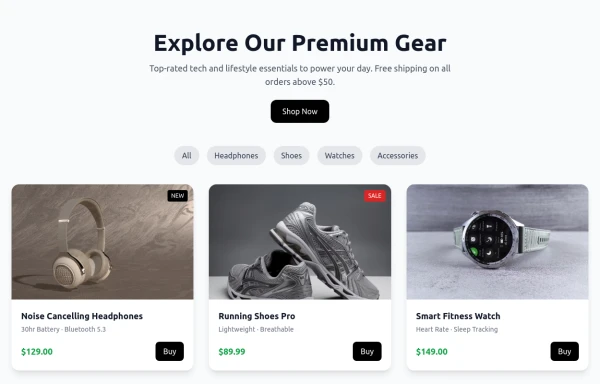 Shop Now Amazon x
Product cards
9 months ago1.4k -
 Admin dashboard cards
Card groups for showing stats/info. Change it for responsiveness for small and medium screen
2 years ago4.6k -
 myCard
card with image,title,body
1 year ago2.6k -
 10 months ago1.1k
 -
 CTA Call To Action
CTA stands for "Call to Action." It is a marketing term that refers to prompts that encourage users to take a specific action. CTAs are typically found in websites, advertisements, emails, and various marketing materials. The goal of a CTA is to guide users toward a desired action that supports business objectives, such as: 1. Encouraging Engagement: A CTA may prompt users to sign up for a newsletter, follow on social media, or download a resource. 2. Driving Conversion: It can lead users to make a purchase, book a service, or start a free trial. 3. Generating Leads: A CTA might encourage users to fill out a form, requesting more information or a consultation.
8 months ago772 -
 3d card
the Best 3D card with tailwind css
9 months ago630


Explore components by Tags
Didn't find component you were looking for?
Search from 3000+ components