Image Card
An image. Shows title and description info when hovering. Image zooms and darkens when hovering.
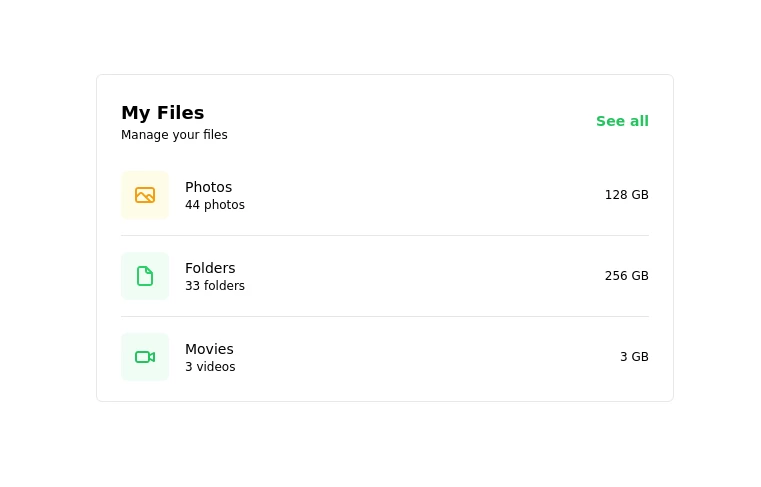
This tailwind example is contributed by Nick Girga, on 28-Apr-2025. Component is made with Tailwind CSS v3. It is responsive. It supports dark mode.

Author Nick Girga
Related Examples
-
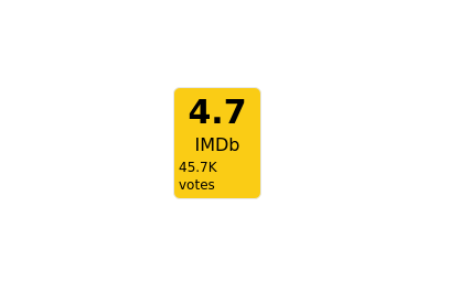 2 years ago8.8k
 -
 Card
CardCard with Likes and download Button
2 years ago10.8k -
 1 year ago2.4k
 -
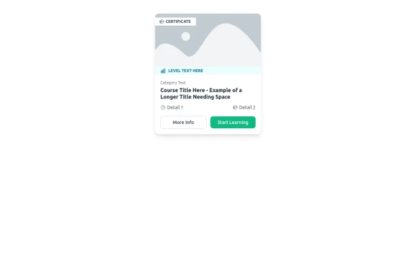 E-Learning Course Card with Badge and Level Indicator
An HTML and Tailwind CSS component mockup for displaying course information. Features include a placeholder image area with an overlaid certificate badge, a distinct level indicator banner below the image, category text, a course title, key details (like duration and learner count placeholders), and primary/secondary action buttons. Designed for e-learning platforms or course listings.
11 months ago1.1k -
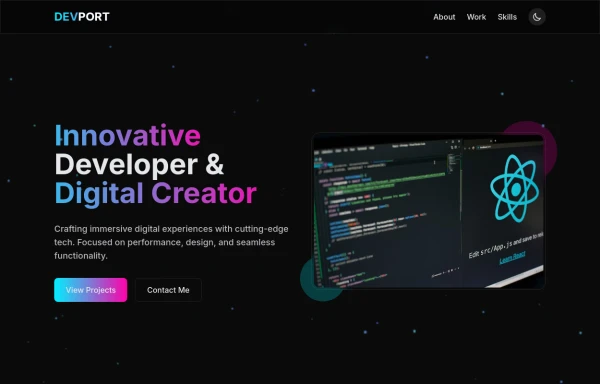 DevPort
modern portifolio by salvator
10 months ago1.3k -
 less is more
less is more by salvator
9 months ago1.1k -
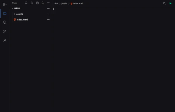 Code Editor UI
Simple code editor prototype made with HTML and TailwindCSS. A lightweight template to explore and customize.
6 months ago477 -
 Premium Gaming UI Card, Form & Animated Button (Tailwind CSS)
A modern, senior-level gaming UI built with Tailwind CSS focusing on spacing, typography, and calm visual hierarchy rather than noisy effects. This component set includes: A premium gaming card with clear content structure and outcome-focused copy A clean player signup form with accessible focus states and minimal visual noise A custom animated button using a restrained light-sweep effect for premium interaction feedback Designed to resemble real production gaming platforms rather than demo or template UI. Fully responsive, copy-paste ready, and easy to extend for real-world projects.
2 months ago228 -
 404 Error card
Error card at the center
3 years ago9.7k -
 Card
CardCard
1 year ago2.6k -
 SCROLL ABAJO
para poner que a llegado al final de la pagina
7 months ago965 -
 2 months ago220


Explore components by Tags
Didn't find component you were looking for?
Search from 3000+ components