- Home
-
Info Card with image
Info Card with image
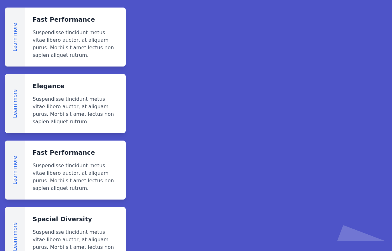
An info card with an image, a short title, and a short description.
This tailwind example is contributed by Arya, on 27-Dec-2022. Component is made with Tailwind CSS v3.
Author Arya
Related Examples
-
Chats Message Screen in neomorphism
light/dark chat screen
1 year ago2.2k -
cards
cards with background animation
1 year ago3.2k -
Responsive Tailwind CSS Listing Cards
This is a collection of responsive listing cards built with Tailwind CSS, optimized for modern web applications. The component features a flexbox layout, ensuring seamless responsiveness across mobile, tablet, and laptop screens. Each card includes an image, title, and description, styled for both light and dark modes. Perfect for showcasing products, portfolio items, or blog posts.
1 year ago2.1k -
11 months ago961
-
3 years ago16.7k
-
11 months ago1.7k
-
1 year ago1.8k
-
Card Component
This component is a simple card (without image) component with hover effect & Dark mode Supported & full responsive
2 years ago3.6k -
Fully Animated Timeline Card
It is at a 20s interval for testing purposes. Go to the <style> and change the .content-scroll class from 20s to 35s for a production ready slower animation.
1 year ago2.1k -
3 years ago12.2k
-
cards
cards with background animation
2 years ago11.4k -
Beautiful Info card
Info card with info type section on the corner.
3 years ago10.5k
Explore components by Tags
Didn't find component you were looking for?
Search from 3000+ components


