Minimal Info cards
This tailwind example is contributed by Gopi Yadav, on 18-Jan-2023. Component is made with Tailwind CSS v3. It is responsive.

Author Gopi Yadav
Related Examples
-
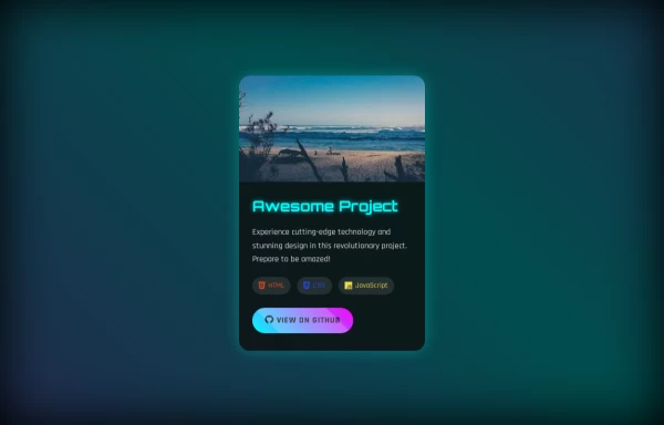
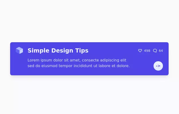 Info Card
info card with description
3 years ago13k -
 3 years ago16.7k
 -
 Custom Success Page
This code provides a clean, modern and informative look.
3 weeks ago41 -
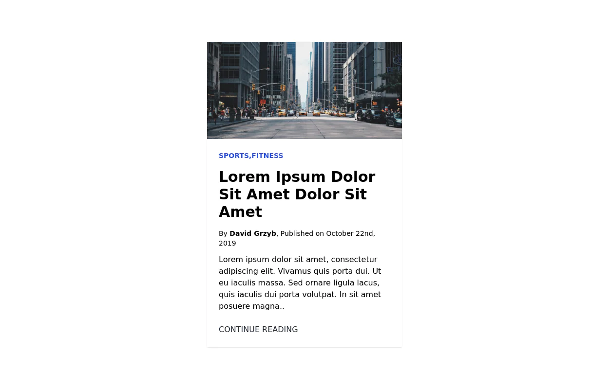
 The Future of Web Development
love my product
9 months ago887 -
 3 years ago12.8k
 -
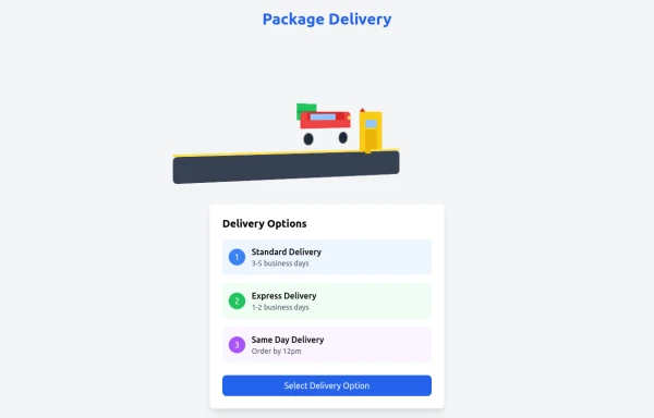 delivary
using cars and carts
8 months ago1.1k -
 3 years ago10k
 -
 1 year ago1k
 -
 3 years ago11.2k
 -
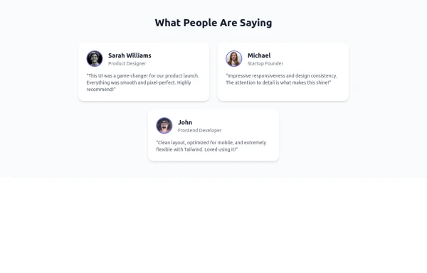 Tailwind Flex Component: Responsive Testimonial Section UI
A clean, modern, and fully responsive Testimonial Section built using Tailwind CSS and Flexbox. Ideal for portfolios, agency websites, SaaS landing pages, or any modern UI project. This reusable component includes user images, job titles, and quotes—perfect for showcasing feedback and adding trust to your UI.
9 months ago1.1k -
 10 months ago884
 -
 1 year ago2.4k


Explore components by Tags
Didn't find component you were looking for?
Search from 3000+ components