Admin dashboard cards
Card groups for showing stats/info. Change it for responsiveness for small and medium screen
This tailwind example is contributed by farisubuntu, on 28-Jun-2024. Component is made with Tailwind v3.4. It is responsive.

Related Examples
-
 1.4k
-
 ApexCodeStudios.com Signature Profile Card
Get Access to 216+ Free Premium Tailwind CSS UI Components at apexcodestudios.com. Elegant compact professional profile card with gradient banner.
-
 Créer une story
-
 Premium High-Performance Web Gaming Hub
Experience the future of browser-based gaming. I’ve developed a premium arcade hub designed for speed, clarity, and zero-latency gameplay. Built with modern web technologies, Ayyamperumal Games brings AAA-inspired visuals and high-octane mechanics directly to your browser—no downloads, no lag, just pure performance. Explore a curated library of titles ranging from minimalist logic puzzles like Sudoku Elite to fast-paced action in Neon Drift. This is where clean code meets high-level entertainment.
1.1k -

-
 YouTube Community Post UI Mockup
A static HTML and Tailwind CSS component mimicking the user interface of a YouTube Community Post. This mockup features the channel header (avatar, name, verified badge, timestamp), post content (text and optional media), engagement actions (Like, Dislike, Comment, Share with counts), and the 'Add a comment' section. It's designed to be responsive, supports YouTube's light and dark themes via custom styling, and uses accurate iconography.
1.8k -
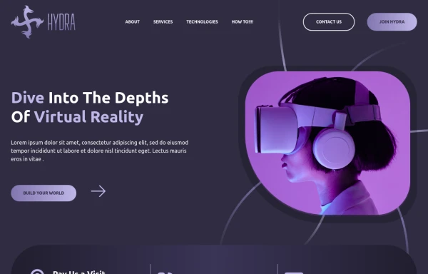 home
html , css
2.4k -
 Hover effect card with background image
Beautiful card with background image, hover effect and gradient
4.3k -
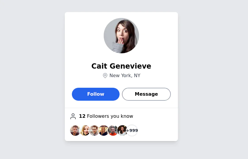 User Profile Card
The card features a user's profile picture, name, location, and options for interactions. It has a clean and modern design with rounded edges and icons for user engagement. It also has support for dark mod:
65.7k -

-
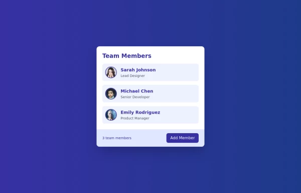 Cards - Users Card
This Users Card design includes: 1. Responsive layout using Flexbox 2. Indigo-800 and Blue-900 color scheme 3. Dark mode support 4. User list with avatars, names, and roles 5. Hover effects on user items 6. "Add Member" button 7. Card footer with team member count 8. Subtle animations and transitions 9. Accessibility considerations (proper heading structure, color contrast) Key features: - The background uses a gradient from Indigo-800 to Blue-900 - The card has a white background in light mode and dark gray in dark mode - Text colors are adjusted for readability in both light and dark modes - User avatars have a border color that changes in dark mode - User items have a hover effect that scales them slightly - The "Add Member" button uses Indigo-800 with a Blue-900 hover state - Dark mode is automatically applied based on system preferences - The entire card fades in on load for a smooth entrance - The card has a hover effect that enhances its shadow This design provides a clean, professional look for displaying team members while incorporating the requested color scheme and maintaining good usability across different devices and color modes.
2.8k -
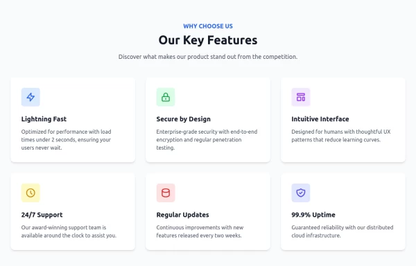









Browse by topic
Explore components by Tags
Jump straight to the UI pattern you need.
Can't find it?
Didn't find the component you were looking for?
Search across 3,000+ community-built components and grab the code in seconds.