Info card
This tailwind example is contributed by Laurits, on 22-Nov-2022. Component is made with Tailwind v3.4. It is responsive.

Related Examples
-

-

-
 Chat Bot
Simulation of a chat bot that can be used for conversations as a sketch idea
4.2k -
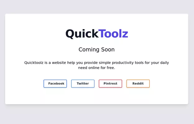 Coming Soon Section
Simple and beautiful card for your showing on your projects (in development) home screen
11.6k -
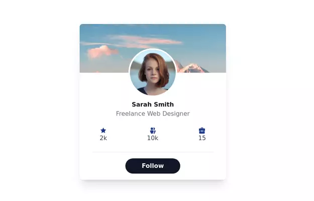
-
 Products card grid
Example of product card grid with product image and pricing
24.9k -
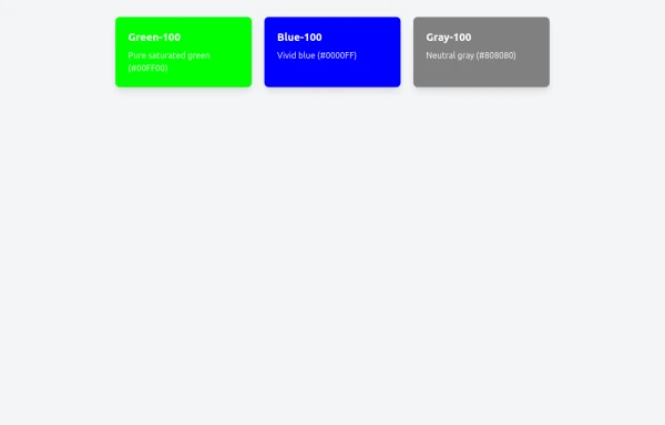 Basic US Flag Card
Here's a set of card components styled with Tailwind CSS that represent various US-themed elements:
918 -
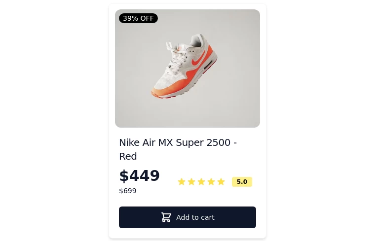 Card-Product
Item or card to show products
-
 Beautiful Info card
Info card with info type section on the corner.
10.9k -

-
-
 Gaming UI Card, Form
A modern, senior-level gaming UI built with Tailwind CSS focusing on spacing, typography, and calm visual hierarchy rather than noisy effects. This component set includes: A premium gaming card with clear content structure and outcome-focused copy A clean player signup form with accessible focus states and minimal visual noise A custom animated button using a restrained light-sweep effect for premium interaction feedback Designed to resemble real production gaming platforms rather than demo or template UI. Fully responsive, copy-paste ready, and easy to extend for real-world projects.
733





Browse by topic
Explore components by Tags
Jump straight to the UI pattern you need.
Can't find it?
Didn't find the component you were looking for?
Search across 3,000+ community-built components and grab the code in seconds.