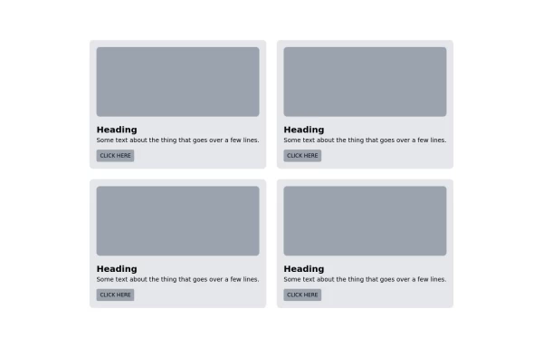
Card grid for showing features
This tailwind example is contributed by Steven Kuhn, on 25-Nov-2022. Component is made with Tailwind CSS v3. It is responsive.

Author Steven Kuhn
Related Examples
-
 Features section
Showcase your key features
3 years ago16.6k -
 Responsive Card Grid
Tailwind CSS responsive grid for feature listing. The cards have a teal background, rounded corners, and a concise display of feature titles, descriptions, and a "Learn More" link.
3 years ago52.1k -
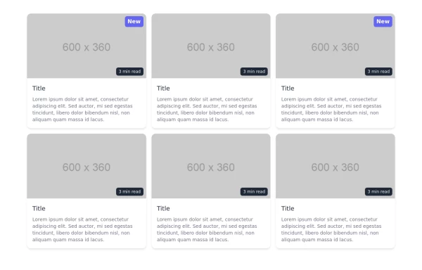
 Tailwind image gallery
Responsive grid with evenly spaced image cards. Each card has a title label at the bottom, and there's a subtle hover effect for interactive engagement.
3 years ago60.9k -
 2 years ago16.9k
 -
 3 years ago11.1k
 -
 1 year ago2.5k
 -
 3 years ago11.1k
 -
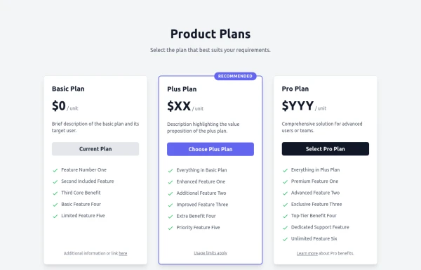 Responsive Multi-Tier Pricing Table Component
flexible and responsive 3-tier pricing table component built with HTML and Tailwind CSS. Features distinct visual styles for different plans (e.g., highlighting a recommended option), adapts to various screen sizes, and supports both light and dark color schemes. Uses generic placeholders for easy adaptation to any product or service.
9 months ago1.4k -
 2 years ago13.3k
 -
 3 months ago417
 -
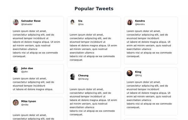 Tweets showcase grid
Responsive tweets showcase grid
3 years ago11.1k -
 3 months ago344


Explore components by Tags
Didn't find component you were looking for?
Search from 3000+ components