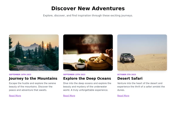
Blog items skeleton
This tailwind example is contributed by Nii Anyetei, on 13-Aug-2024. Component is made with Tailwind CSS v3. It is responsive. It supports dark mode. similar terms for this example are Content loader, Shimmer, Ghost element, Content placeholder

Author Nii Anyetei
Related Examples
-
 2 years ago11.3k
 -
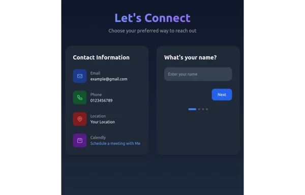 Contact Form Component
A multi-step, responsive contact form with a modern dark-themed design. The form includes four steps: name, email, phone number, and message. It features a side panel with contact information and a sleek, gradient-styled interface using Tailwind CSS.
9 months ago1.1k -
 1 year ago2.7k
 -
 1 year ago1.4k
 -
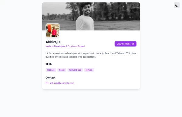 profile page
profile page
1 year ago1.9k -
 2 years ago14.4k
 -
 1 year ago3.2k
 -
 9 months ago1.4k
 -
 3 years ago10.5k
 -
 9 months ago1k
 -
 3 months ago254
 -
 Stats cards for admin panel
This Component is designed to present statistics in a tile format. It comprises a title, a large numeric value, and an icon, creating an eye-catching way to display data.
2 years ago6.9k


Explore components by Tags
Didn't find component you were looking for?
Search from 3000+ components