Responsive grid layout
This tailwind example is contributed by gmer33, on 02-Feb-2023. Component is made with Tailwind CSS v3. It is responsive.

Author gmer33
Related Examples
-
 3 years ago19.9k
 -
 3 years ago14.2k
 -
 2 years ago21.9k
 -
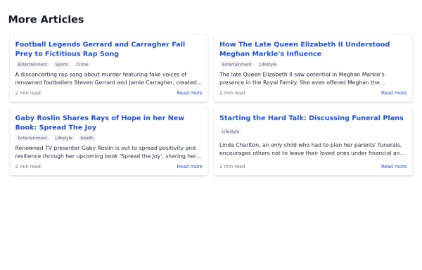 Article List Section
A section displaying a list of articles with associated information.
2 years ago7.3k -
 Food Ordering Dashboard
A responsive user interface for selecting and ordering your favorite meals. The dashboard allows users to browse food categories, view dish details, and place orders with ease.
9 months ago1.2k -
 11 months ago1.2k
 -
 3 years ago13k
 -
 Tailwind CSS Service Card Component
An HTML and Tailwind CSS code snippet for creating a responsive service card component. Ideal for marketplaces, portfolios, or listing pages. Includes sections for image/video preview, seller info, rating, pricing, and additional details. Easy to customize using Tailwind utility classes.
10 months ago1.2k -
 4 months ago132
 -
 1 year ago3k
 -
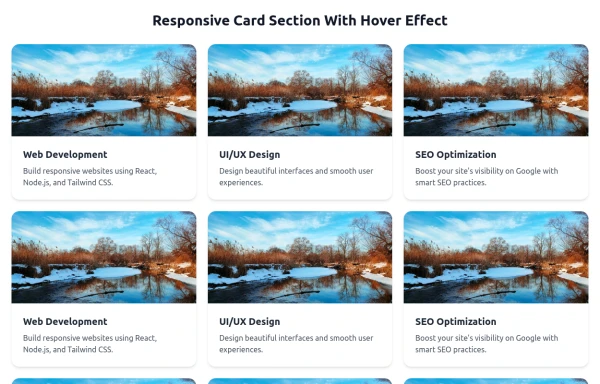 Responsive Card Section With Hover Effect
added more cards with ui friendly
7 months ago614 -
 Game Character Cards
Simple game character cards selection
1 year ago1.5k


Explore components by Tags
Didn't find component you were looking for?
Search from 3000+ components