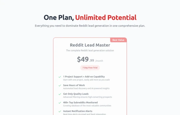
Pricing cards in pair
This tailwind example is contributed by Santiago Hernandez, on 05-May-2024. Component is made with Tailwind CSS v3. It is responsive. It supports dark mode. similar terms for this example are Service rates, Subscription plans

Author Santiago Hernandez
Related Examples
-
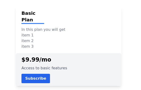 Pricing card
basic pricing card with single price
2 years ago10.8k -
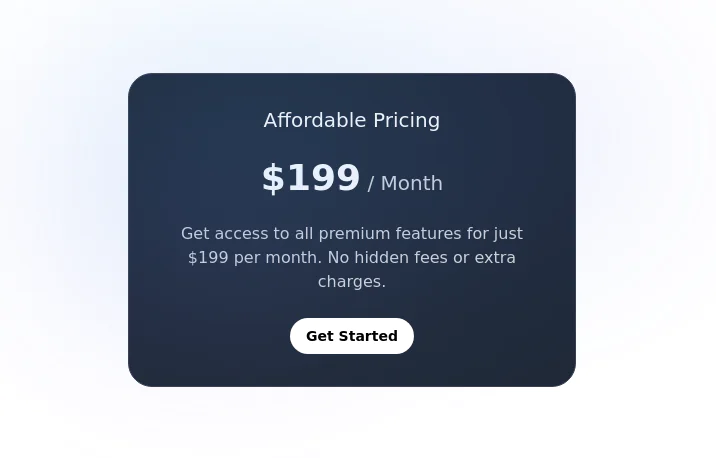 Pricing Card with gradient background
A sleek and transparent card displaying your product's pricing. It's designed to be both visually appealing and informative, helping users understand your pricing options at a glance.
2 years ago8.3k -
 Modern E-commerce Product Card with TailwindCSS
This product card is designed for e-commerce platforms using TailwindCSS. It features a discount badge, product image carousel, quick view and quick order buttons, ratings, product name, brand details, dynamic pricing with a strike-through original price, and a prominent add-to-cart button. The clean and professional layout is perfect for showcasing products on online stores.
1 year ago2.2k -
 3 years ago11.5k
 -
 Soft-Modern Dark Pricing
A sophisticated, highly rounded pricing component inspired by modern fintech interfaces. It avoids harsh lines in favor of deep "zinc" tones and subtle borders (border-white/5). The center card pops using a high-contrast white button against the dark theme, guiding user focus naturally without using aggressive gradients.
1 month ago226 -
 Pricing
Looks better with in [Line-2] with: md:w-3/5
1 year ago1.1k -
 Pricing table
Sleek and Modern Pricing Table with Hover Effects
1 year ago3.6k -
 8 months ago545
 -
 Game
Gameprayer game candle game light candles with your prayers
8 months ago803 -
 Lifetime Access — iOS 26 Style
Lifetime Access — iOS 26 Style
2 months ago165 -
 Modern pricing cards
Minimal and clean pricing cards
1 year ago1.4k -
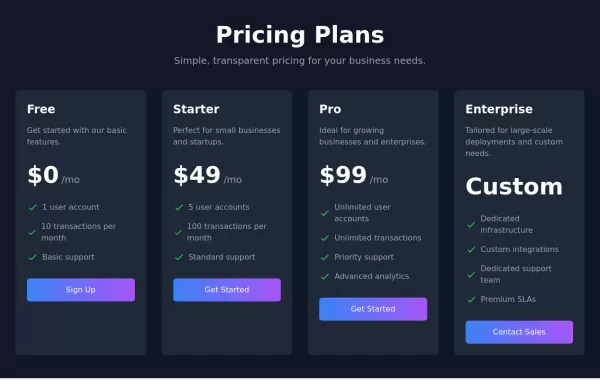
 Website Pricing List Card Component
Website Pricing List Card Component with Package Names: Basic Package → Starter Website Premium Package → Business Website Professional Package → E-Commerce Solution Pricing Structure: Increased prices significantly to reflect web development services one-time payment model FAQ Content.
10 months ago1.4k


Explore components by Tags
Didn't find component you were looking for?
Search from 3000+ components