Basic pricing card
This tailwind example is contributed by Sienna, on 06-Jan-2023. Component is made with Tailwind v3.4. It is responsive. similar terms for this example are Service rates, Subscription plans

Related Examples
-
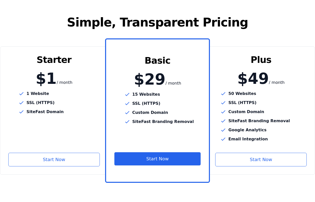 Pricing section
Service/product pricing section
13.8k -
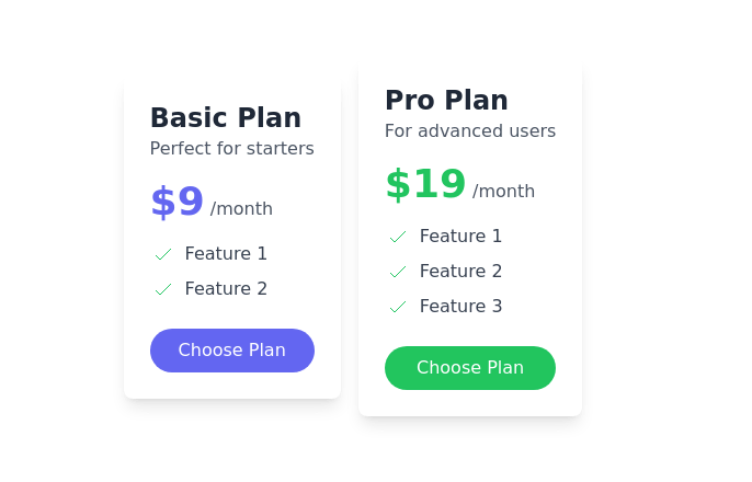
-
 Pricing Plan Selector
radio buttons for selecting a pricing plan
4.4k -
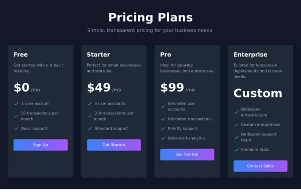 Pricing table
Sleek and Modern Pricing Table with Hover Effects
4.1k -
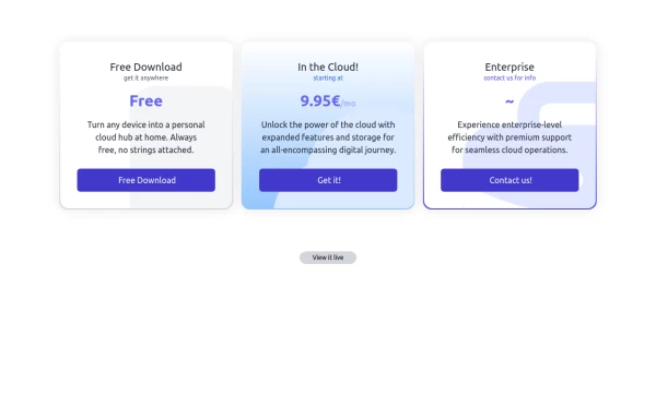 Interactive Pricing Table
This modern pricing component features a visually appealing, responsive layout with smooth hover effects, making it ideal for showcasing different plans and subscription tiers. Design and Features: ✅ Elegant Gradient Backgrounds • Each pricing card has a unique gradient overlay, transitioning from soft gray, blue, or indigo to white, enhancing contrast and visual appeal. • The rounded-2xl design ensures a polished and smooth aesthetic. ✅ Interactive Hover Effects • Cards have a subtle hover shadow enhancement, making them pop on interaction (hover:shadow-[0_0px_25px_0px_rgba(0,0,0,0.2)]). • Slight floating effect (hover:translate-y-[-5px]) gives the illusion of elevation on hover. ✅ Pricing & Plan Details • Each card presents a plan title, a short subtitle, and a bold price display (text-3xl font-extrabold text-indigo-500). • Supports free, subscription-based, and enterprise-tier pricing, ensuring flexibility for different business models. ✅ Call-to-Action Buttons • Each plan features a highly visible CTA button (bg-indigo-700 text-white rounded-md). • The buttons change color on hover (hover:bg-indigo-500) and expand slightly, encouraging user interaction. ✅ Animated Background Icons • A large, transparent icon (text-[500px] text-gray-100) dynamically moves on hover (group-hover:-translate-y-8 group-hover:-translate-x-8), adding depth and a premium feel. This pricing component is perfect for SaaS platforms, digital subscriptions, and service offerings, ensuring a modern, sleek, and engaging user experience. 🚀
2.1k -
 Swiss-Grid Dark Pricing
A brutally minimalist pricing section that relies on strict grid architecture and typographic hierarchy instead of decorative elements. Features responsive border collapsing, monospaced technical accents, and high-performance CSS-only hover states. Designed for high-end SaaS, dev-tools, or agency portfolios that prioritize data clarity and structural rhythm.
827 -
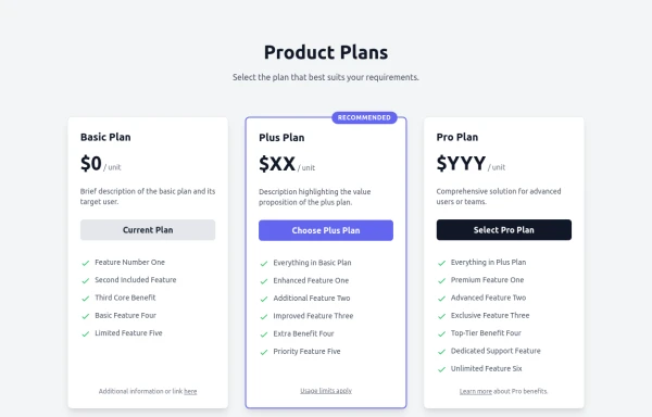 Responsive Multi-Tier Pricing Table Component
flexible and responsive 3-tier pricing table component built with HTML and Tailwind CSS. Features distinct visual styles for different plans (e.g., highlighting a recommended option), adapts to various screen sizes, and supports both light and dark color schemes. Uses generic placeholders for easy adaptation to any product or service.
2k -

-
 Card
CardCard
3k -
-
 MENU OMERLINKS
MENU OMERLINKS
725 -
 11.3k
11.3k







Browse by topic
Explore components by Tags
Jump straight to the UI pattern you need.
Can't find it?
Didn't find the component you were looking for?
Search across 3,000+ community-built components and grab the code in seconds.