Modern Responsive Footer with Tailwind CSS
This sleek and modern responsive footer is built using HTML and Tailwind CSS. It features three sections: brand information, useful links, and social media icons. The footer includes smooth hover effects, subtle fade-in animations, and a fully responsive design that adapts seamlessly to different screen sizes. Perfect for websites looking for a professional and stylish footer section.
This tailwind example is contributed by Ayyamperumal S, on 12-Feb-2025. Component is made with Tailwind CSS v3. It is responsive. similar terms for this example are Author box, User information,Product Showcase, Product card,Front page,Transitions,Social media links,,about me

Author Ayyamperumal S
Related Examples
-
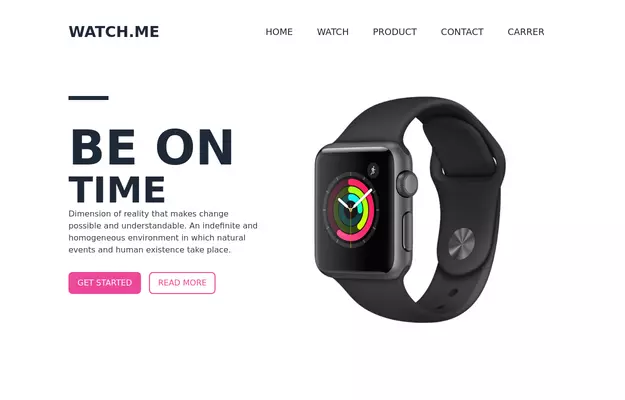 Product Page
Showcase for the product.
3 years ago32.1k -
 3 years ago12.5k
 -
 3 years ago11.5k
 -
 3 years ago21.1k
 -
 3 years ago13.7k
 -
Typewriter effect
using javascript
2 years ago41.9k -
 2 years ago25.2k
 -
 2 years ago24.7k
 -
background animation
background animation
2 years ago49.4k -
Typewriter animation effect
Build using only Tailwind CSS; no JavaScript is required. This is a continuous typing effect. If you want to stop it after the text is typed for the first time, then you can remove 'infinite' from [typing: 'typing 2s steps(20) infinite alternate, blink .7s infinite'] from the config file.
2 years ago20.7k -
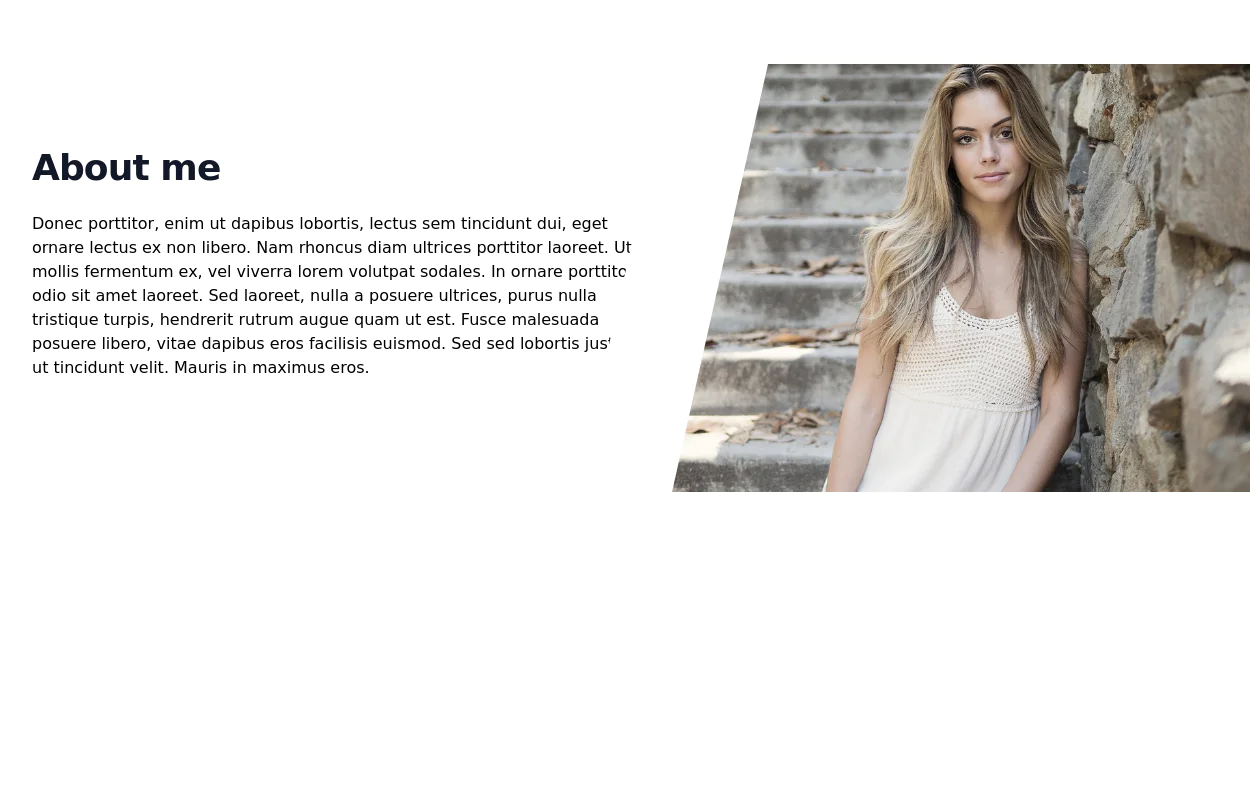
 Welcome banner for developers portfolio
A hero section welcoming visitors to a portfolio or website. It features a large, visually appealing title and an image.
2 years ago10.2k -
 1 year ago6.2k


Explore components by Tags
Didn't find component you were looking for?
Search from 3000+ components