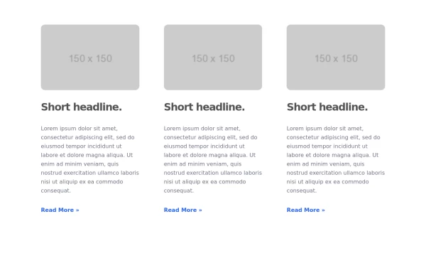
Responsive Cards with Hover Text Reveal Animation - Built with Tailwind CSS
nhance your website with these sleek, responsive cards designed using Tailwind CSS! Featuring a stylish hover animation, the text smoothly reveals when you hover over the card, adding a dynamic touch to your user interface. Perfect for portfolios, team profiles, or project showcases, this design adapts seamlessly to all screen sizes.
This tailwind example is contributed by Abdul Baset Bappy, on 26-Mar-2025. Component is made with Tailwind CSS v3. It is responsive. It supports dark mode. similar terms for this example are Transitions,Article Card, Blog page card, Article card

Author Abdul Baset Bappy
Related Examples
-
 3 years ago12.7k
 -
 3 years ago16.7k
 -
 3 years ago24.3k
 -
 Blog post cards
responsive blog post cards
3 years ago12.8k -
 3 years ago22.9k
 -
 Responsive card grid
responsive card grid for articles
3 years ago15.9k -
 Card grid section
Display article/blog grid
3 years ago29.8k -
 Card with image
Blog post card
3 years ago10.7k -
 Card with image full width
This component is a card designed for showcasing featured blog posts. It includes the post title, a captivating image, category links, and author details.
3 years ago13.9k -
Typewriter effect
using javascript
3 years ago42.6k -
background animation
background animation
2 years ago50.7k -
 cards
cardscards with background animation
2 years ago11.4k


Explore components by Tags
Didn't find component you were looking for?
Search from 3000+ components