Mobile device mockup (iPhone 14 pro)
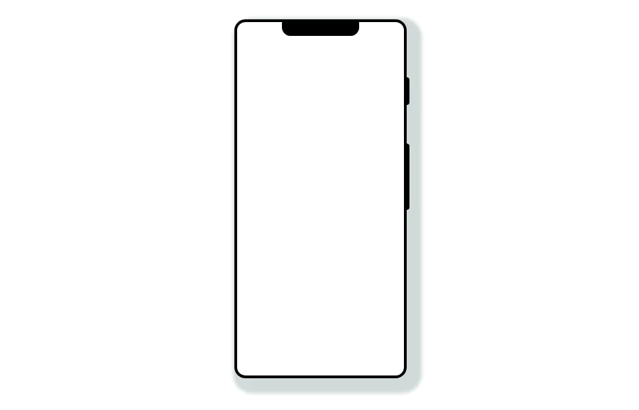
Smartphone (with dynamic island notch) mockup in tailwind
This tailwind example is contributed by Prajwal Hallale, on 17-Dec-2022. Component is made with Tailwind CSS v3. It is responsive. similar terms for this example are simulation,copy,dummy,miniature,like

Author Prajwal Hallale
Related Examples
-
 Mobile device mockup
Smartphone (with notch) mockup in tailwind
3 years ago10.8k -
 Mobile device mockup
Smartphone (with punch hole notch) mockup in tailwind
2 years ago9.3k -
 3 years ago8.9k
 -
 3 years ago8.7k
 -
 2 years ago10.9k
 -
 1 year ago1.7k
 -
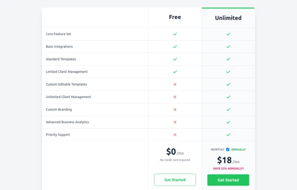 Comparison Pricing Table Component
A responsive pricing table built with HTML and Tailwind CSS, comparing two plans (Free and Unlimited) with a clear feature checklist. Includes distinct styling for the premium plan and a toggle for monthly/annual pricing display.
10 months ago1.4k -
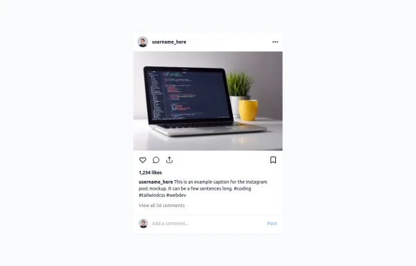 Instagram Post UI Mockup
A static HTML and Tailwind CSS component that visually replicates the user interface of an Instagram post. This mockup includes the post header (avatar, username, options), image area, action buttons (like, comment, share, save), like count, caption, and comment section. It features responsive constraints and supports both light and dark mode, closely mimicking the look and feel of the actual Instagram app. Ideal for UI prototyping, style guides, or frontend development practice.
10 months ago1.3k -
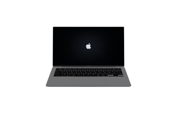 Macbook Air 13" Mockup
A gorgeous component that can be used for landing pages, hero statements and more. Interested in our UI library? Check out the discord link in my bio.
1 year ago2.4k -
 Atlas AI Analyst Workspace
A premium, document-centric AI chat interface that moves beyond standard bubbles into a professional "editor" layout. Designed for power users, it features a floating glassmorphic command bar, a dedicated "Memory & Context" sidebar with interactive widgets, and rich data visualization blocks. The aesthetic combines a deep charcoal base with luxury bronze/orange accents, making it ideal for high-end SaaS tools, financial analysis dashboards, or enterprise AI assistants.
1 month ago93 -
 5 months ago413
 -
 5 months ago371


Explore components by Tags
Didn't find component you were looking for?
Search from 3000+ components