Quiting
This tailwind example is contributed by Bruz, on 15-Sep-2025. Component is made with Tailwind CSS v3. It is responsive. similar terms for this example are simulation,copy,dummy,miniature,like

Author Bruz
Related Examples
-
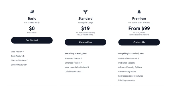 Responsive 3-Tier Pricing Card Section
A clean and responsive pricing table component featuring three distinct tiers (e.g., Basic, Standard, Premium) presented in a card layout. Built with HTML and Tailwind CSS, it stacks vertically on small screens and transitions to a side-by-side view on medium screens (md breakpoint - 768px) and up. Each plan card includes a placeholder icon, title, description, price details, a call-to-action button, and a bulleted list of features with checkmarks. The generic content makes it easy to adapt for various websites or applications needing a clear pricing comparison structure.
10 months ago614 -
 Calculator
This calculator uses CSS although it can be passed directly to tailwind
1 year ago2.2k -
 Website Mockup
An Onyx Component. This can be used for landing pages / other website mockup purposes. It's clean design will fit with most SAAS projects.
1 year ago1.9k -
 2 years ago10.9k
 -
 itskoti.com
ssdas
1 year ago1.3k -
 5 months ago387
 -
 1 year ago2.7k
 -
 YouTube Community Post UI Mockup
A static HTML and Tailwind CSS component mimicking the user interface of a YouTube Community Post. This mockup features the channel header (avatar, name, verified badge, timestamp), post content (text and optional media), engagement actions (Like, Dislike, Comment, Share with counts), and the 'Add a comment' section. It's designed to be responsive, supports YouTube's light and dark themes via custom styling, and uses accurate iconography.
10 months ago971 -
 1 year ago1.1k
 -
 Atlas AI Analyst Workspace
A premium, document-centric AI chat interface that moves beyond standard bubbles into a professional "editor" layout. Designed for power users, it features a floating glassmorphic command bar, a dedicated "Memory & Context" sidebar with interactive widgets, and rich data visualization blocks. The aesthetic combines a deep charcoal base with luxury bronze/orange accents, making it ideal for high-end SaaS tools, financial analysis dashboards, or enterprise AI assistants.
2 months ago120 -
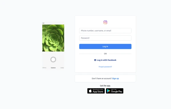 Best Log In page ever
Instagram look like but not copy right 🤗,best login and sign and even for many others
9 months ago849 -
 Mobile device mockup (iPhone 14 pro)
Smartphone (with dynamic island notch) mockup in tailwind
3 years ago10.1k


Explore components by Tags
Didn't find component you were looking for?
Search from 3000+ components