Help command
This tailwind example is contributed by Bruz, on 15-Sep-2025. Component is made with Tailwind CSS v3. It is responsive. similar terms for this example are simulation,copy,dummy,miniature,like

Author Bruz
Related Examples
-
 3 years ago10.6k
 -
 itskoti.com
ssdas
1 year ago1.3k -
 Mobile device mockup (iPhone 14 pro)
Smartphone (with dynamic island notch) mockup in tailwind
3 years ago10.1k -
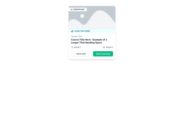 E-Learning Course Card with Badge and Level Indicator
An HTML and Tailwind CSS component mockup for displaying course information. Features include a placeholder image area with an overlaid certificate badge, a distinct level indicator banner below the image, category text, a course title, key details (like duration and learner count placeholders), and primary/secondary action buttons. Designed for e-learning platforms or course listings.
10 months ago1k -
 8 months ago863
 -
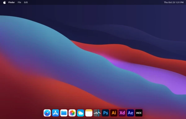 macOS Style Webpage – macOS Design in the Browser
A simple webpage inspired by the macOS interface. It recreates the clean design, dock, and desktop look of macOS using only HTML, tailwind CSS, and JavaScript. This project focuses on front-end styling and layout to bring the visual feel of macOS to the web — not a full simulation, just the look and vibe.
4 months ago1.2k -
 1 year ago1.1k
 -
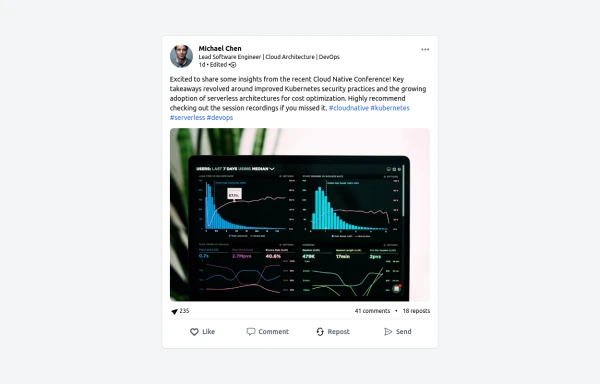 LinkedIn Post UI Mockup
A static HTML and Tailwind CSS component designed to replicate the user interface of a LinkedIn post. This mockup accurately represents the post structure including the header (avatar, name, headline, timestamp), content area (text, optional media), engagement statistics (likes, comments, reposts), and the action bar (Like, Comment, Repost, Send). It's fully responsive, supports light and dark themes, and uses appropriate iconography and styling to closely mimic the LinkedIn feed experience.
10 months ago1.3k -
 1 year ago883
 -
 3 months ago211
 -
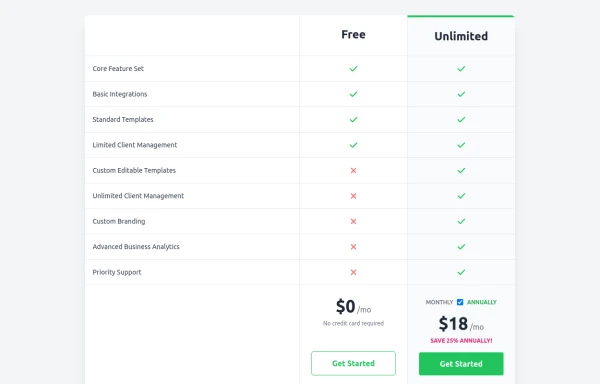 Comparison Pricing Table Component
A responsive pricing table built with HTML and Tailwind CSS, comparing two plans (Free and Unlimited) with a clear feature checklist. Includes distinct styling for the premium plan and a toggle for monthly/annual pricing display.
10 months ago1.5k -
 1 year ago1.4k


Explore components by Tags
Didn't find component you were looking for?
Search from 3000+ components