Tablet device mockup
This tailwind example is contributed by Prajwal Hallale, on 03-Nov-2022. Component is made with Tailwind CSS v3. similar terms for this example are simulation,copy,dummy,miniature,like

Author Prajwal Hallale
Related Examples
-
 Mobile device mockup
Smartphone (with notch) mockup in tailwind
3 years ago10.8k -
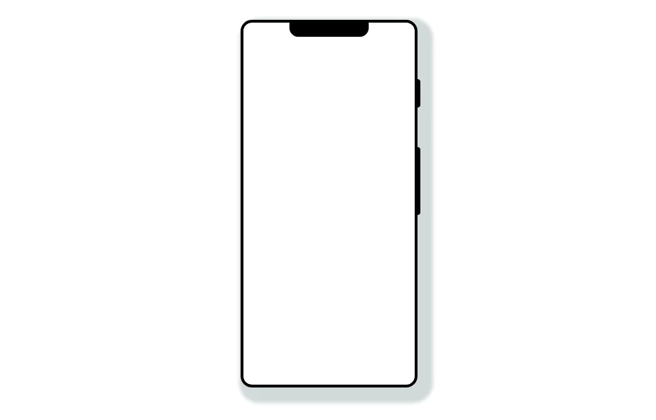
 Mobile device mockup (iPhone 14 pro)
Smartphone (with dynamic island notch) mockup in tailwind
3 years ago10.1k -
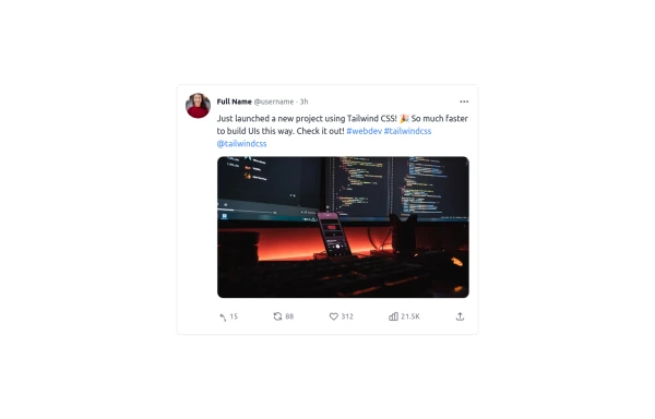 Twitter Post (Tweet) UI Mockup
A detailed static HTML and Tailwind CSS component replicating the user interface of a single Twitter post (Tweet). This mockup includes the user avatar, tweet header (name, handle, timestamp), tweet text with styled hashtags/mentions, optional media display, and the action bar with icons and counts (Reply, Retweet, Like, Views, Share). It is responsive, supports light and dark modes, and uses accurate iconography and hover states to closely resemble the real Twitter UI.
10 months ago766 -
 3 years ago12.4k
 -
 iPhone 15 Mockup
The "Screen Content" div can be manipulated to have anything inside the screen.
1 year ago1.6k -
 5 months ago627
 -
 2 years ago10.9k
 -
 3 years ago9.4k
 -
 Mobile device mockup
Smartphone (with punch hole notch) mockup in tailwind
2 years ago9.3k -
 1 year ago880
 -
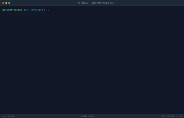
 Atlas AI Analyst Workspace
A premium, document-centric AI chat interface that moves beyond standard bubbles into a professional "editor" layout. Designed for power users, it features a floating glassmorphic command bar, a dedicated "Memory & Context" sidebar with interactive widgets, and rich data visualization blocks. The aesthetic combines a deep charcoal base with luxury bronze/orange accents, making it ideal for high-end SaaS tools, financial analysis dashboards, or enterprise AI assistants.
1 month ago93 -
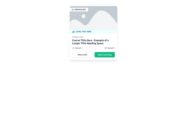 E-Learning Course Card with Badge and Level Indicator
An HTML and Tailwind CSS component mockup for displaying course information. Features include a placeholder image area with an overlaid certificate badge, a distinct level indicator banner below the image, category text, a course title, key details (like duration and learner count placeholders), and primary/secondary action buttons. Designed for e-learning platforms or course listings.
10 months ago1k


Explore components by Tags
Didn't find component you were looking for?
Search from 3000+ components