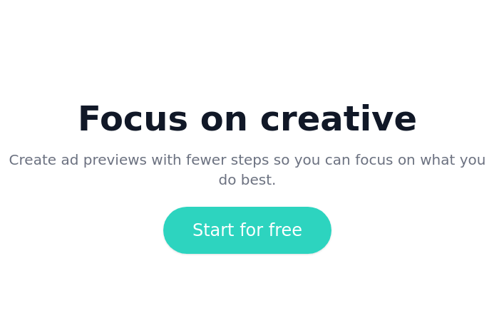
Call to action component
Start your free 7-day trial Call to action button
This tailwind example is contributed by S. Patel, on 01-Apr-2023. Component is made with Tailwind CSS v3. It is responsive. similar terms for this example are CTA,banner

Author S. Patel
Related Examples
-
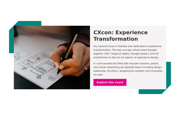
 Modern CTA section
CTA banner
1 year ago1.8k -
 Blog post card
Responsive blog post or article card. This card can also be used as a CTA
2 years ago10.2k -
 3 years ago11.5k
 -
 2 years ago9.6k
 -
 2 years ago11.3k
 -
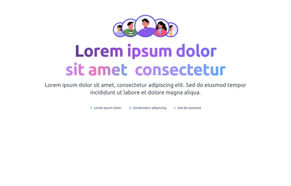 Animated Call-to-Action Section
Enhance your website with this , animated CTA section. Includes a gradient text animations, and a stylish avatar group. Easily customizable and designed to improve user engagement. Get the source code now.
1 month ago137 -
 3 years ago15.1k
 -
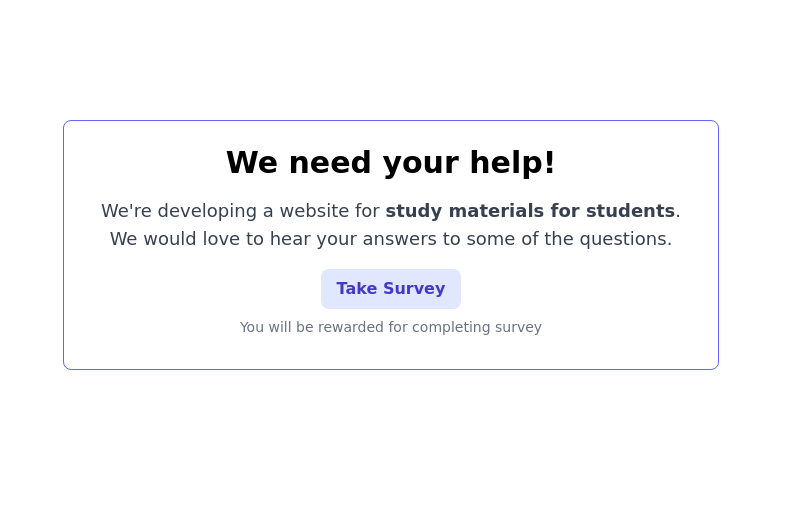 CTA block for "Take our survey"
Get users attention to he survey form
2 years ago9.6k -
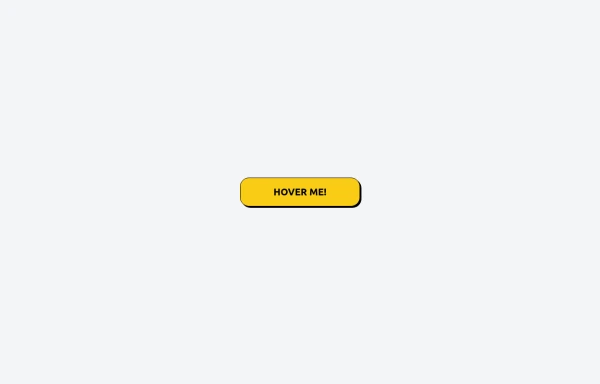 Tailwind CSS Button (Wavy Button)
The button uses Tailwind classes for size, background, border, border-radius, shadow, cursor, overflow, and transitions. The wave overlay is absolutely positioned at the bottom of the button, initially off-screen (top-full) and moves to the middle (top-1/2) on hover via the custom .wave class and keyframes. The font-poppins class isn’t a default Tailwind class. You should define it in your Tailwind configuration or replace it with font-sans if you haven't extended fonts.
5 months ago833 -
 2 years ago11.7k
 -
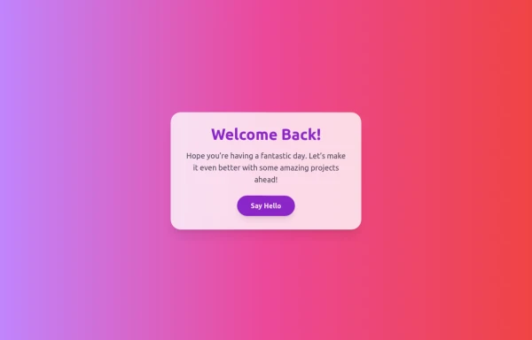 Boimator welcoming back
Boimator welcoming back
3 months ago256 -
 Responsive About Section with Tailwind CSS
Built a sleek and fully responsive About Section for my portfolio using Tailwind CSS! 🚀 Designed for smooth adaptability across all screen sizes with a modern and minimal aesthetic. Perfect for showcasing skills, experience, and a personal touch!
8 months ago1.3k


Explore components by Tags
Didn't find component you were looking for?
Search from 3000+ components