Boimator welcoming back
Boimator welcoming back
This tailwind example is contributed by Bonimater, on 09-Aug-2025. Component is made with Tailwind CSS v3. It is responsive. similar terms for this example are CTA,banner,about me

Author Bonimater
Related Examples
-
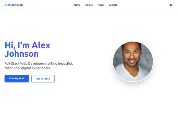
 Responsive About Section with Tailwind CSS
Built a sleek and fully responsive About Section for my portfolio using Tailwind CSS! 🚀 Designed for smooth adaptability across all screen sizes with a modern and minimal aesthetic. Perfect for showcasing skills, experience, and a personal touch!
11 months ago1.5k -
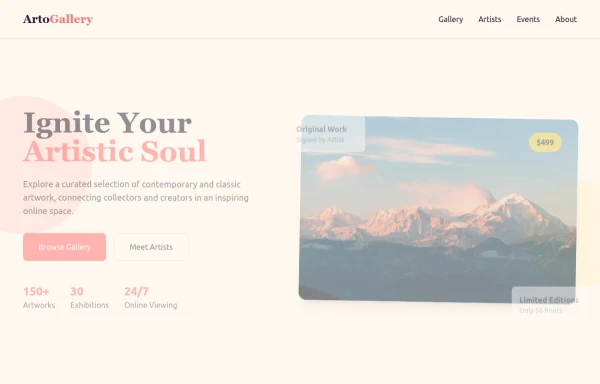 ArtoGallery
Explore a curated selection of contemporary and classic artwork, connecting collectors and creators in an inspiring online space.
9 months ago1.2k -
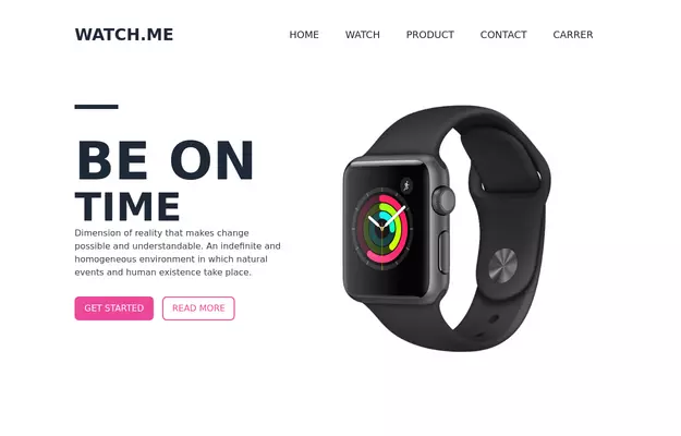 Product Page
Showcase for the product.
3 years ago33k -
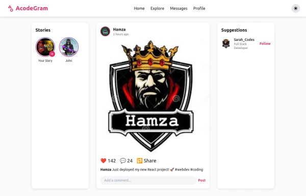 Acode master
Welcome to Hamza's official portfolio — a creative developer blending modern design with powerful code. Explore animations, projects, and innovations crafted with HTML, Tailwind CSS, and passion.
9 months ago731 -
 3 years ago10.9k
 -
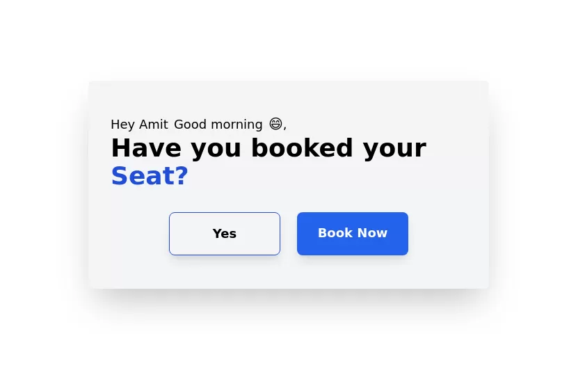 Greeting Card with CTA
card with two actions with greeting msg according to time
2 years ago7.9k -
 Responsive Hero Section
Get this professional hero section for your website. Includes a gradient text effect, stylish background blurs, and a perfectly aligned image section. Easy to integrate and fully customizable for any project.
5 months ago172 -
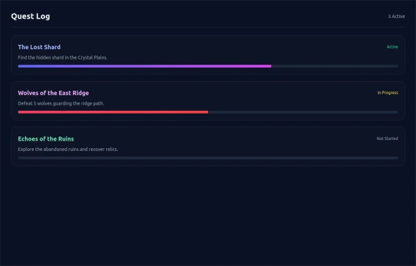 asimple game Quest Log
asimple game lay out Quest Log
5 months ago520 -
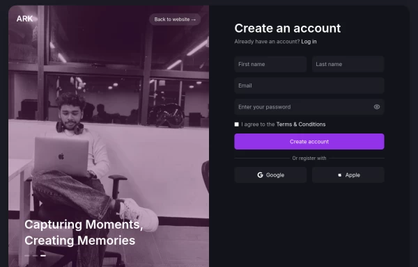 Login page
Login and register page, you can reuse both
1 year ago1.9k -
 1 year ago1.6k
 -
 Simple web portfolio
The portfolio includes all required sections (Hero, Projects, About, Contact) with professional styling, and I've added some premium touches like social media icons, a sticky navigation, and beautiful gradient effects that make it feel cutting-edge and engaging.
8 months ago1.2k -
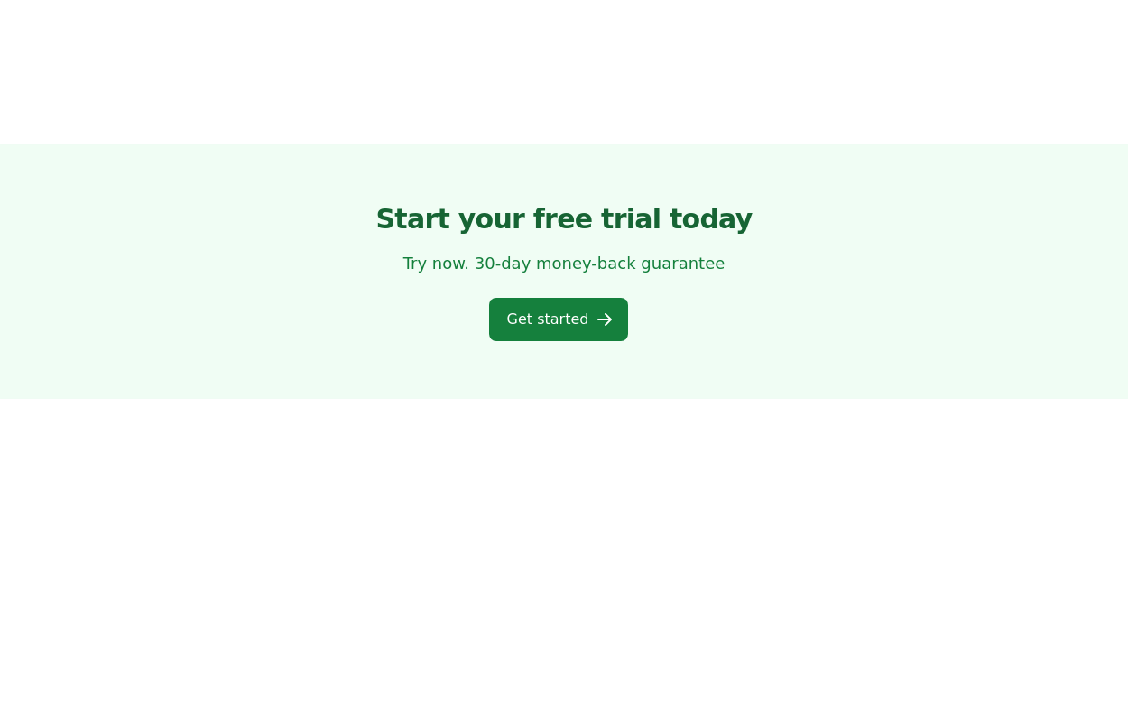
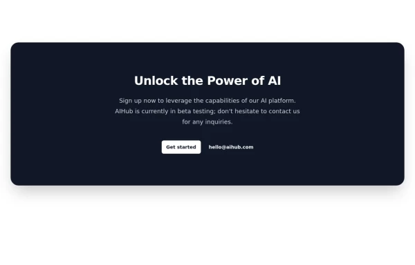 Call-to-Action Card
Early Access Signup Card
1 year ago2k


Explore components by Tags
Didn't find component you were looking for?
Search from 3000+ components