Underline Gradient
underlined gradient using background color
This tailwind example is contributed by Nikolai, on 11-Mar-2024. Component is made with Tailwind CSS v3. It is responsive. similar terms for this example are Typography, Title, h1, h2, h3

Author Nikolai
Related Examples
-
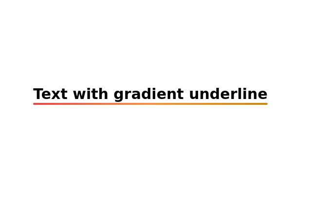 Text with gradient underline
Gradient Underline Text. Decorate your text with a gradient underline for a modern touch.
2 years ago11k -
 Text gradient
very subtle gradients for beautiful headings
3 years ago12.2k -
 3 years ago9.5k
 -
 11 months ago1.5k
 -
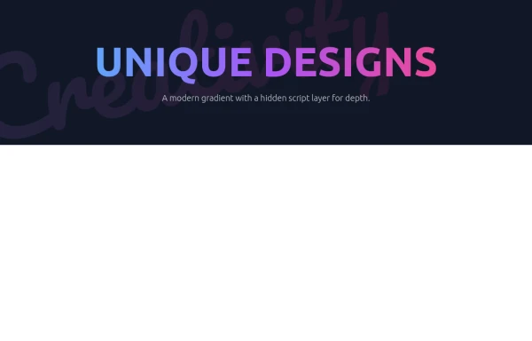 Modern Neon Gradient with Diagonal Script
(Purple/Blue/Pink Color Scheme)
8 months ago1.3k -
3 years ago17k
-
 Hover effect card with background image
Beautiful card with background image, hover effect and gradient
1 year ago3.7k -
 3 years ago12.7k
 -
 Modern Dark Footer with Overlapping Gradient CTA
A comprehensive, dark-themed website footer component built with HTML and Tailwind CSS. It features a visually distinct overlapping section with a colorful gradient background containing a prominent call-to-action (CTA) block. The main footer area utilizes a multi-column grid layout for organized navigation links, a newsletter signup form, and social media icons. A final bottom bar includes legal links and copyright information. The design is responsive and adapts its layout for different screen sizes.
11 months ago1.1k -
 3 years ago9.4k
 -
 3 years ago11.8k
 -
 3 years ago13.7k


Explore components by Tags
Didn't find component you were looking for?
Search from 3000+ components