Frorest Green Gradient
This tailwind example is contributed by Mohit Prajapati, on 05-Oct-2022. Component is made with Tailwind v3.4.

Related Examples
-
Animated Gradient Background
animates a gradient background with vibrant colors. Slowly changes colors.
28.4k -

-
 13.7k
13.7k -

-

-
 Bubblegum Button
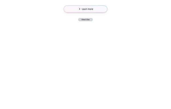
This interactive button component is designed with a sleek gradient background and smooth hover effects, making it an eye-catching call-to-action element for modern web interfaces. Styling and Features: ✅ Gradient Background & Rounded Shape • The button container has a subtle gradient overlay (bg-gradient-to-tr) that smoothly transitions from soft pink (from-pink-300) to light blue (to-blue-300), giving it a vibrant and modern look. • Wrapped in a rounded-full container for a pill-shaped aesthetic. ✅ Floating & Shadow Effects • The shadow-lg property creates a soft floating effect, enhancing depth and visibility. • Will-change-transform optimizes animations for a seamless hover experience. ✅ Interactive Hover Animations • On hover, the inner button scales up (hover:scale-105) and lifts slightly (hover:-translate-y-2), simulating a press-and-release motion. • The transition is smooth, with a 500ms animation (transition duration-500). ✅ Content & Icon • The “Learn more” label is paired with a right-arrow icon (svg) for clear visual guidance. • The icon and text are flex-aligned (items-center flex), ensuring a balanced and responsive layout. This button is ideal for call-to-action elements, product highlights, or download prompts, offering a modern, sleek, and engaging user experience. 🚀
1.9k -
 The Free AI Tools Grid Section (210+ Tools, No Signup)
A responsive and SEO-optimized grid section showcasing over 210 free AI tools. Designed with Tailwind CSS, fully responsive, fast-loading, and built for high user engagement. No sign-up required, privacy-friendly, and optimized for performance and discoverability.https://www.thefreeaitools.com/
-
 Glassmorphic Animated Searchabar
This is a sleek, animated search bar designed with Tailwind CSS using a glassmorphic aesthetic. It features a semi-transparent background with a blur effect to create a frosted-glass look. When focused, the search bar smoothly expands to enhance user interaction. It includes a built-in search icon and fully supports responsive design, making it ideal for modern, visually polished web interfaces.
1.9k -

-
 Home page
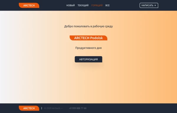
Home page для ПО, страница для входа в приложение.
1.8k -

-
 1.3k
1.3k





Browse by topic
Explore components by Tags
Jump straight to the UI pattern you need.
Can't find it?
Didn't find the component you were looking for?
Search across 3,000+ community-built components and grab the code in seconds.