Modern Neon Gradient with Diagonal Script
(Purple/Blue/Pink Color Scheme)
This tailwind example is contributed by KULDEEP, on 22-Jun-2025. Component is made with Tailwind CSS v3. It is responsive. similar terms for this example are Typography, Title, h1, h2, h3,collapsible

Author KULDEEP
Related Examples
-
 3 years ago9.5k
 -
 Text gradient
very subtle gradients for beautiful headings
3 years ago12.2k -
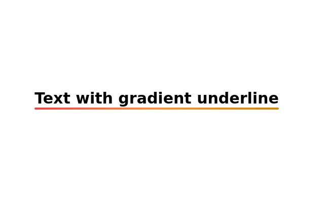 Text with gradient underline
Gradient Underline Text. Decorate your text with a gradient underline for a modern touch.
2 years ago11.1k -
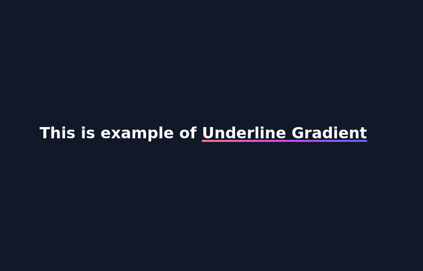 Underline Gradient
underlined gradient using background color
2 years ago3k -
 11 months ago1.5k
 -
 3 years ago19.4k
 -
 Section Heading
A gorgeous section heading with a smooth blur element.
1 year ago2k -
 Why Everyone Around the World Loves Us
"Our platform is built to serve everyone, everywhere — with speed, security, and a human touch." "From cities to remote villages, our features connect the world through technology that truly cares." "Designed with the whole world in mind — fast, secure, and made for real people." "No matter who you are or where you're from, our tools are built to empower and inspire you." "We believe great technology should be accessible, safe, and helpful to all — and that's exactly what we offer."
9 months ago1.2k -
 Image embed in a text
This example combines text and images to create visually appealing content.
2 years ago14k -
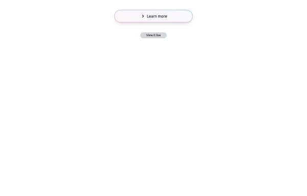 Bubblegum Button
This interactive button component is designed with a sleek gradient background and smooth hover effects, making it an eye-catching call-to-action element for modern web interfaces. Styling and Features: ✅ Gradient Background & Rounded Shape • The button container has a subtle gradient overlay (bg-gradient-to-tr) that smoothly transitions from soft pink (from-pink-300) to light blue (to-blue-300), giving it a vibrant and modern look. • Wrapped in a rounded-full container for a pill-shaped aesthetic. ✅ Floating & Shadow Effects • The shadow-lg property creates a soft floating effect, enhancing depth and visibility. • Will-change-transform optimizes animations for a seamless hover experience. ✅ Interactive Hover Animations • On hover, the inner button scales up (hover:scale-105) and lifts slightly (hover:-translate-y-2), simulating a press-and-release motion. • The transition is smooth, with a 500ms animation (transition duration-500). ✅ Content & Icon • The “Learn more” label is paired with a right-arrow icon (svg) for clear visual guidance. • The icon and text are flex-aligned (items-center flex), ensuring a balanced and responsive layout. This button is ideal for call-to-action elements, product highlights, or download prompts, offering a modern, sleek, and engaging user experience. 🚀
1 year ago1.4k -
 3 years ago12.2k
 -
 8 months ago614


Explore components by Tags
Didn't find component you were looking for?
Search from 3000+ components