Elegant Animated Drawer (Responsive)
A static sidebar when the screen is >=lg. It collapses into a drawer when the screen is <lg. Still requires no JavaScript to function (although this example uses a bit of JS).
This tailwind example is contributed by Nick Girga, on 05-May-2025. Component is made with Tailwind CSS v3. It is responsive. It supports dark mode. similar terms for this example is drawer

Author Nick Girga
Related Examples
-
 6 months ago545
 -
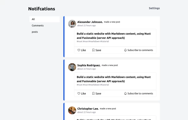 Notification
Dev Community Notification Clone
1 year ago3.2k -
 1 year ago2.1k
 -
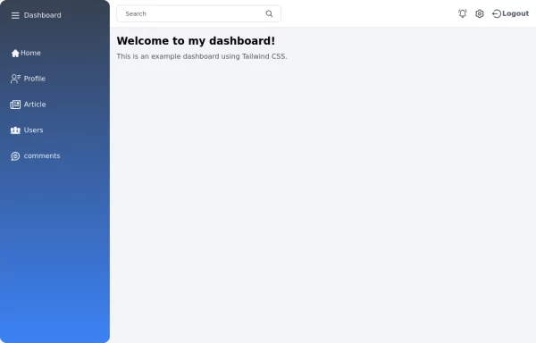 Tailwind Sidebar Layout
Place edited for the search button
1 year ago5.4k -
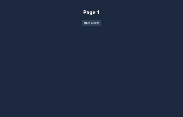 Elegant Animated Drawer
Useful Tailwind classes for constructing an animated sidebar drawer that can be controlled via labels. The component itself is pure CSS and does not require JavaScript to use (although this example uses a bit of JS).
9 months ago994 -
 1 year ago3.9k
 -
 Sidebar
This HTML file includes: 1. A responsive sidebar with 3D animation effects: 1. The sidebar slides in and out smoothly. 2. Navigation items have a 3D hover effect using CSS transforms and transitions. 2. Tailwind CSS for styling: 1. Included via CDN for easy setup. 2. Used for layout, colors, and basic styling. 3. Custom CSS for animations and 3D effects: 1. Keyframe animations for sidebar open/close. 2. 3D transform effects for nav items. 4. JavaScript for interactivity: 1. Toggles the sidebar open and close. 2. Adds 3D effect to nav items on hover using mouse position. 3. Closes the sidebar when clicking outside. 5. Accessibility features: 1. ARIA label for the toggle button. 2. Keyboard navigation support (Enter/Space to toggle sidebar). 3. Focus trapping within the sidebar when open. 6. Responsive design: 1. The sidebar is full-height and toggleable, suitable for both desktop and mobile views. This implementation provides a visually appealing sidebar with 3D animations and effects, while maintaining accessibility and responsiveness. It uses HTML for structure, Tailwind CSS for styling, and vanilla JavaScript for interactivity, as requested.
1 year ago2.4k -
 8 months ago1.1k
 -
 Sidebar
This is the sidebar that I use in my projects, I use grid to be able to manage the space issue a little better, it seems like a clean and modern design, it is more than anything for the dashboards that you want to create
1 year ago4k -
 Responsive navbar with dark mode support
Sidebar on small screen devices
3 years ago19.6k -
![Material 3 Drawer [Light]](https://tailwindflex.com/storage/thumbnails/material-3-drawer-light/canvas.min.webp?v=7) Material 3 Drawer [Light]
Material 3 Drawer [Light]A sidebar drawer that conforms to Google's Material 3 design guidelines
9 months ago613 -
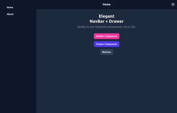 Elegant NavBar + Drawer
A NavBar, a responsive drawer/sidebar, and other useful Tailwind components to get started creating an app. Pure CSS, no JavaScript needed (although this example uses a bit of JS).
9 months ago1.3k


Explore components by Tags
Didn't find component you were looking for?
Search from 3000+ components