Notification
Dev Community Notification Clone
This tailwind example is contributed by $@(\/)(\/)¥, on 19-Nov-2024. Component is made with Tailwind v3.4. It is responsive. It supports dark mode. similar terms for this example are drawer,Toast, Snackbar,copy

Related Examples
-
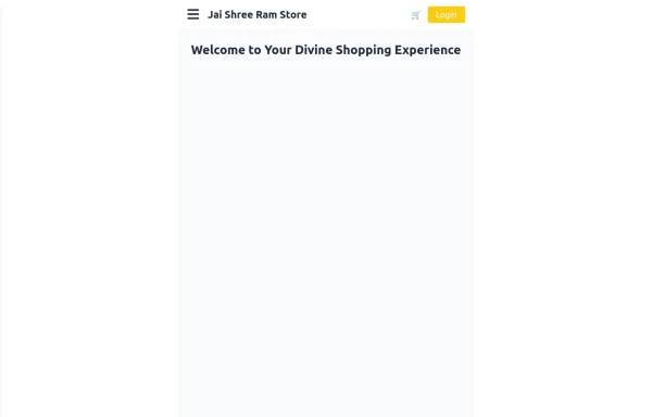 Responsive eCommerce Sidebar Layout with Hamburger Menu | Tailwind CSS UI for Online Stores
Build a clean and responsive eCommerce sidebar layout with a smooth hamburger menu using Tailwind CSS and Alpine.js. Ideal for devotional, spiritual, or modern online stores. Includes dark mode support, navigation links, cart, login, and a dynamic layout for beautiful product pages.
1.6k -

-
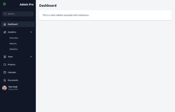
 sidebar
sidebar
220 -
-

-
 1.5k
1.5k -
 10.9k
10.9k -
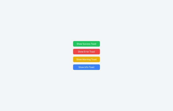 Notifications
Toast Notifications are lightweight and customizable components for displaying short messages or alerts. They are perfect for feedback on user actions, such as form submissions or system updates. Supports different types of notifications (success, error, warning, info). Automatically hides after a specified timeout. Option to include action buttons or close icons. Customizable styles, animation, and position on the screen.
2.2k -
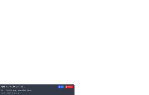
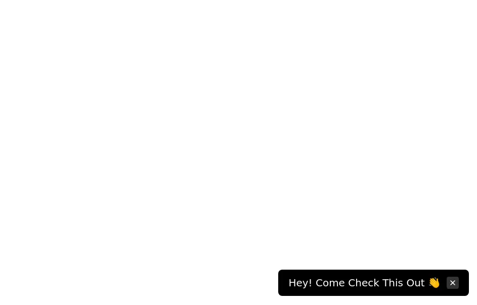 Floating dismissible notification
bottom right floating alert
14.4k -
 Reader AI – Your AI-Powered Knowledge & Thinking System
Reader AI helps you read, think, and remember better. Upload books, highlight insights, chat with AI, and build a personal knowledge system that evolves with you.
467 -
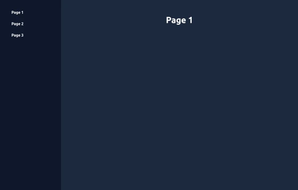 Elegant Animated Drawer (Responsive)
A static sidebar when the screen is >=lg. It collapses into a drawer when the screen is <lg. Still requires no JavaScript to function (although this example uses a bit of JS).
2.2k -
 sdebar simple
sdebar simple
417








Browse by topic
Explore components by Tags
Jump straight to the UI pattern you need.
Can't find it?
Didn't find the component you were looking for?
Search across 3,000+ community-built components and grab the code in seconds.