Tailwind Sidebar Layout
Place edited for the search button
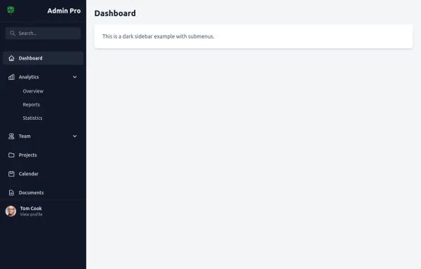
This tailwind example is contributed by Nur Pratap Karki, on 25-Jun-2024. Component is made with Tailwind CSS v3. It is responsive. similar terms for this example is drawer

Author Nur Pratap Karki
Related Examples
-
 Responsive navbar with dark mode support
Sidebar on small screen devices
3 years ago19.7k -
 3 years ago62k
 -
Animated Drawer
Collapsible sidebar navigation that allows users to access additional menu options. It is designed for efficient space utilization and can be easily expanded and collapsed.
2 years ago28k -
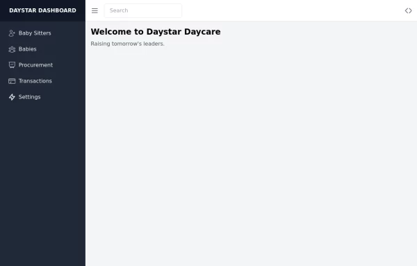 Daystar Day care Dashboard
Daystar Day care Dashboard
1 year ago10.4k -
 1 year ago8.3k
 -
 Responsive navbar with dark mode support
Sidebar on small screen devices
1 year ago2.7k -
 Responsive navbar with alpinejs
A mix of Penguin navbar with PineUI Slide-Over
1 year ago3.4k -
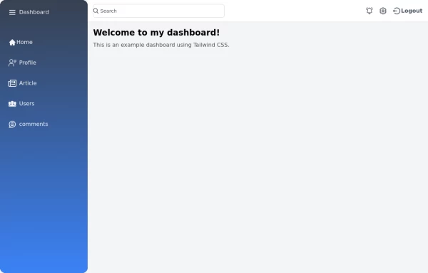
 Sidebar
This is the sidebar that I use in my projects, I use grid to be able to manage the space issue a little better, it seems like a clean and modern design, it is more than anything for the dashboards that you want to create
1 year ago4k -
 1 year ago1.9k
 -
 Tailwind Sidebar Layout (improved)
Improved Tailwind Sidebar Layout. - Responsive sidebar working - Close responsive sidebar working - Positioning menu-toggle correctly - Added some fresh icons - Added sub-items - showing on click - Added animation and swap on icons using 'peer'
1 year ago3.5k -
 1 year ago5.5k
 -
 1 year ago2.1k


Explore components by Tags
Didn't find component you were looking for?
Search from 3000+ components