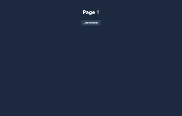
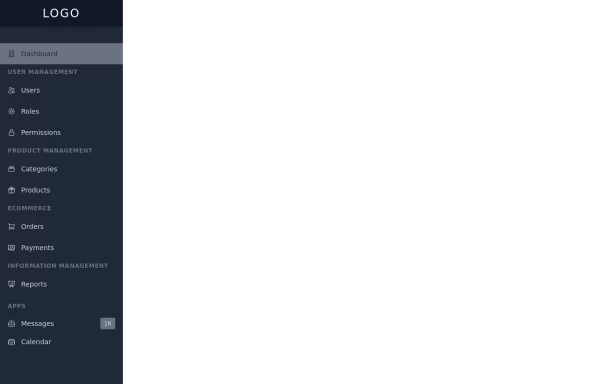
Material 3 Drawer [Light]
A sidebar drawer that conforms to Google's Material 3 design guidelines
This tailwind example is contributed by Nick Girga, on 26-May-2025. Component is made with Tailwind CSS v3. similar terms for this example is drawer

Author Nick Girga
Related Examples
-
 Elegant Animated Drawer
Useful Tailwind classes for constructing an animated sidebar drawer that can be controlled via labels. The component itself is pure CSS and does not require JavaScript to use (although this example uses a bit of JS).
9 months ago958 -
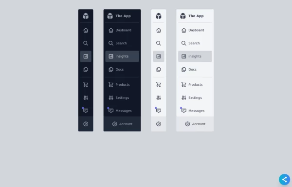 Responsive Sidebar
Fully Responsive sidebar in both color modes light & dark with mini bar too.
1 year ago9.2k -
 5 months ago533
 -
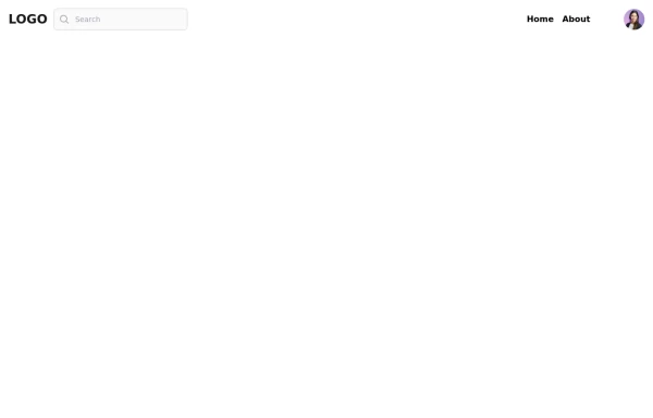 Responsive navbar with alpinejs
A mix of Penguin navbar with PineUI Slide-Over
1 year ago3.3k -
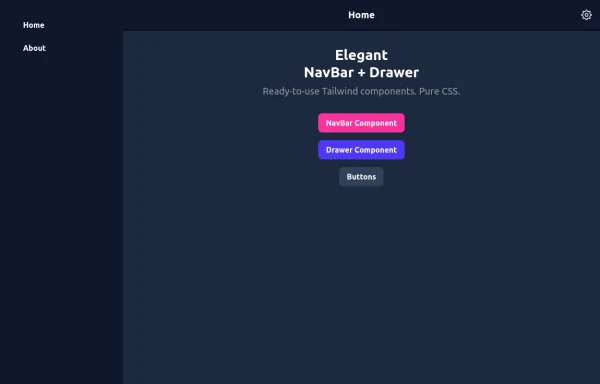 Elegant NavBar + Drawer
A NavBar, a responsive drawer/sidebar, and other useful Tailwind components to get started creating an app. Pure CSS, no JavaScript needed (although this example uses a bit of JS).
9 months ago1.3k -
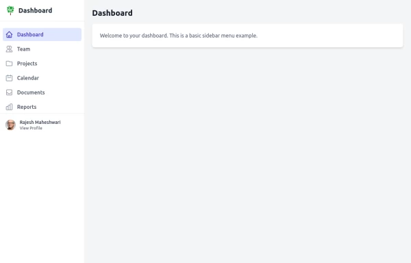
 sidebar dash
sidebar dash
1 month ago119 -
 1 year ago4.7k
 -
 7 months ago1.1k
 -
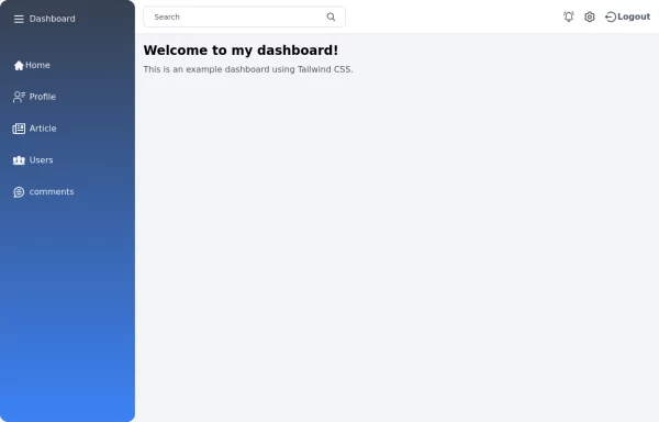
 Responsive navbar with dark mode support
Sidebar on small screen devices
3 years ago19.5k -
 2 years ago12.8k
 -
 11 months ago2.1k
 -
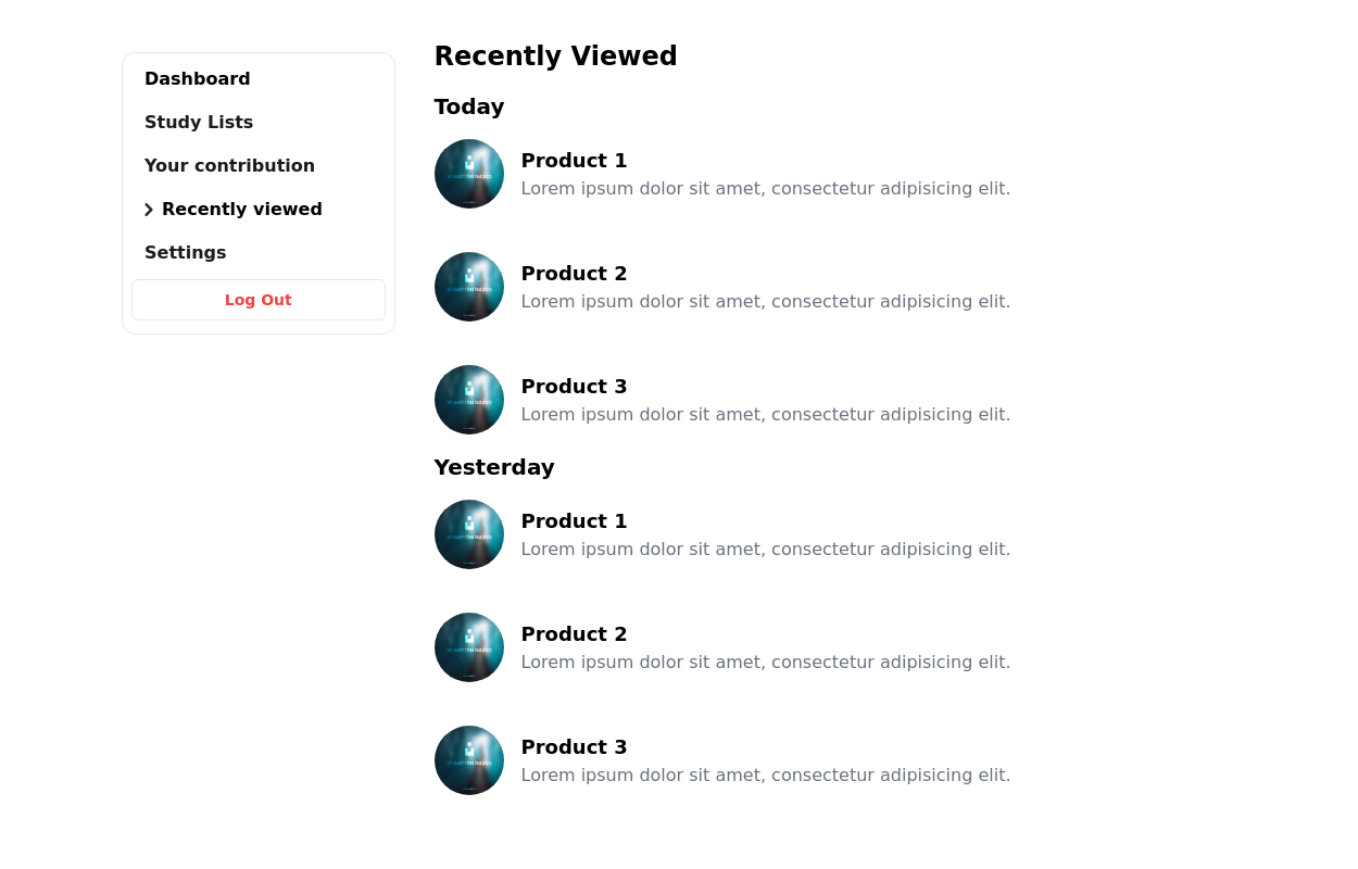
 Tailwind Sidebar Layout
Place edited for the search button
1 year ago5.4k


Explore components by Tags
Didn't find component you were looking for?
Search from 3000+ components