trusted by
1. Color Scheme:
1. Updated the background to a gradient from Indigo-800 to Blue-900
2. Changed text colors to use Indigo-800 and Blue-900 shades
3. Updated ring colors on avatar images to match the new scheme
2. Enhanced Design:
1. Added a containing card with white background (dark gray in dark mode)
2. Increased the size of avatar images for better visibility
3. Added a shadow effect to the card that changes color on hover
3. Responsiveness:
1. Maintained the responsive layout, stacking vertically on smaller screens
4. Animations and Interactions:
1. Added a fade-in animation for the entire component
2. Enhanced hover effects on avatar images (scale and z-index change)
3. Added a ring effect on hover for each avatar
5. Accessibility:
1. Maintained alt text for images
2. Ensured proper color contrast for text readability
6. Dark Mode:
1. Implemented dark mode support
2. Adjusted colors and ring effects for dark mode
7. Additional Enhancements:
1. Increased font sizes for better readability
2. Added font weight variations to emphasize important text
3. Improved spacing and alignment
This updated component maintains the original functionality while incorporating the Indigo-800 and Blue-900 color scheme and adding enhanced visual effects and interactions.
This tailwind example is contributed by nejaa badr, on 31-Oct-2024. Component is made with Tailwind CSS v3. It is responsive.

Author nejaa badr
Related Examples
-
 1 month ago427
 -
Upvote downvote buttons [alpine]
upvote and downvote buttons made as working version in alpine.js
2 years ago9k -
 Card post blog
Targetas para blog
1 month ago187 -
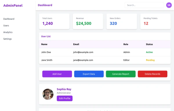 admin panel UI
Premium Admin Panel Pack including sidebar navigation, top navbar, dashboard cards, user tables, quick actions, profile section, and footer. Fully responsive with modern clean design using Tailwind CSS.
6 months ago1.6k -
 6 months ago296
 -
 rotate card
rotate card
1 year ago1.7k -
 11 months ago808
 -
 1 year ago2.6k
 -
 Checkbox
Checkbox
1 year ago2.2k -
 Hacker terminal #fake
hacker terminal tailwind css
7 months ago931 -
 2 years ago13.5k
 -
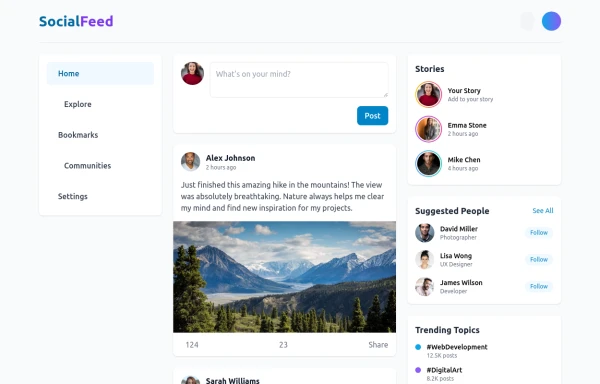 Feeds
FeedsThis is a responsive social media feed interface built with Tailwind CSS that features a clean, modern design with excellent color contrast and visual hierarchy. Here's a detailed breakdown of its components and layout:
7 months ago732


Explore components by Tags
Didn't find component you were looking for?
Search from 3000+ components