Image - Figure with figcaption design
This tailwind example is contributed by Maxim, on 23-Jan-2025. Component is made with Tailwind CSS v3. It is responsive.

Author Maxim
Related Examples
-
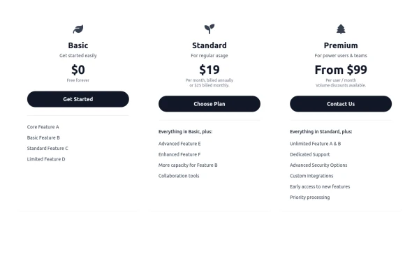 Responsive 3-Tier Pricing Card Section
A clean and responsive pricing table component featuring three distinct tiers (e.g., Basic, Standard, Premium) presented in a card layout. Built with HTML and Tailwind CSS, it stacks vertically on small screens and transitions to a side-by-side view on medium screens (md breakpoint - 768px) and up. Each plan card includes a placeholder icon, title, description, price details, a call-to-action button, and a bulleted list of features with checkmarks. The generic content makes it easy to adapt for various websites or applications needing a clear pricing comparison structure.
10 months ago613 -
 about video
about kelaplus video
7 months ago828 -
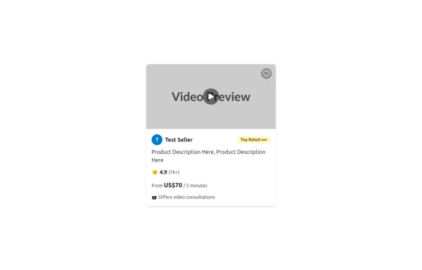 Tailwind CSS Service Card Component
An HTML and Tailwind CSS code snippet for creating a responsive service card component. Ideal for marketplaces, portfolios, or listing pages. Includes sections for image/video preview, seller info, rating, pricing, and additional details. Easy to customize using Tailwind utility classes.
10 months ago1.2k -
 Maintenance page template
The site is under maintenance placeholder page
2 years ago10.6k -
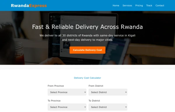 delivery
It will help us get our stuff delivered to your home in a way that your ordered items are delivered to your home.
9 months ago403 -
 Forgot password?
you can change password an time
9 months ago641 -
 To-Do List with Tailwind CSS
A simple and responsive to-do list built with HTML, JavaScript, and Tailwind CSS. Features task addition, completion, and deletion. Perfect for beginner projects or component demos.
8 months ago1.1k -
 Linear infinite brand scrolling with hover effect
Beautiful lineat brand scrolling partner with hover effect
1 year ago2.5k -
 1 year ago3.3k
 -
 2 years ago12.4k
 -
 Responsive About Section with Tailwind CSS
Built a sleek and fully responsive About Section for my portfolio using Tailwind CSS! 🚀 Designed for smooth adaptability across all screen sizes with a modern and minimal aesthetic. Perfect for showcasing skills, experience, and a personal touch!
11 months ago1.6k -
 3 months ago208


Explore components by Tags
Didn't find component you were looking for?
Search from 3000+ components