Services
This tailwind example is contributed by $@(\/)(\/)¥, on 30-Dec-2024. Component is made with Tailwind CSS v3. It is responsive. It supports dark mode. similar terms for this example are Services,Why choose us

Author $@(\/)(\/)¥
Related Examples
-
 Modern Testimonial
A simple and easy to use component for reviews and testimonials.
11 months ago988 -
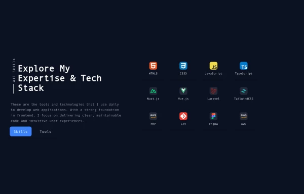 Reusable Skill Showcase Section With Pure Tailwind CSS
A fully responsive and modular "Skills & Tools" section, perfect for any developer portfolio. Built with static HTML and Tailwind CSS, this component can be easily integrated into any project and made dynamic using any frontend framework (Vue, React, Svelte, Angular) or vanilla JavaScript. Customize it to highlight your unique tech stack and create engaging portfolio pages.
10 months ago1.9k -
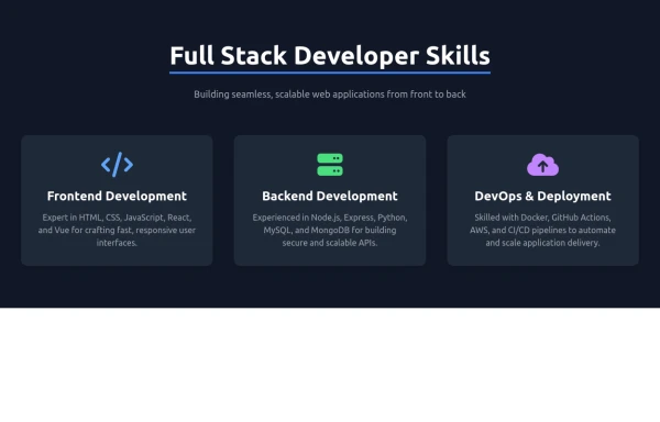
 Feature Card
Shows off a feature, great for homepages and grid layout, or can be used in dashboards for "example use" grids. Enjoy! Part of the Coastal UI collection.
9 months ago401 -
 7 months ago1.1k
 -
 Attractive Feature Section
With Gradient Color 6 Features
6 months ago825 -
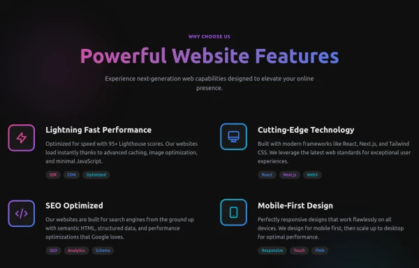 Powerful Website Features
Open Layout Design: No traditional boxes - content flows naturally Gradient Accents: Vibrant color gradients for visual interest Animated Icons: Subtle floating animations on feature icons Hover Effects: Soft glow backgrounds appear on hover Tag System: Color-coded tags for each feature's attributes Dark Theme: Sophisticated dark background with perfect contrast
6 months ago1.1k -
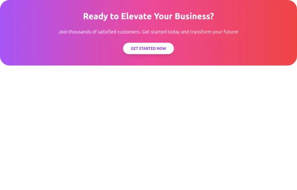 CTA Responsive
Gradient Style CTA
6 months ago439 -
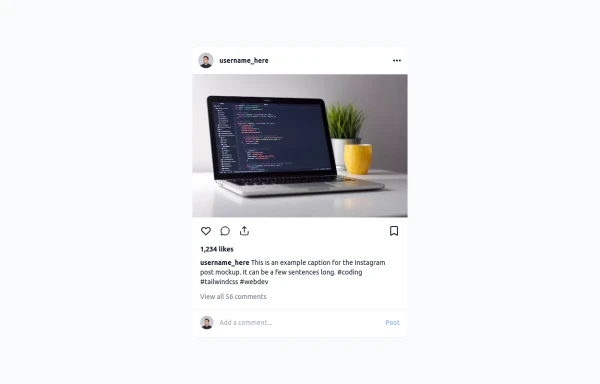 Instagram Post UI Mockup
A static HTML and Tailwind CSS component that visually replicates the user interface of an Instagram post. This mockup includes the post header (avatar, username, options), image area, action buttons (like, comment, share, save), like count, caption, and comment section. It features responsive constraints and supports both light and dark mode, closely mimicking the look and feel of the actual Instagram app. Ideal for UI prototyping, style guides, or frontend development practice.
9 months ago1.2k -
 3 years ago13.4k
 -
 To-Do List with Tailwind CSS
A simple and responsive to-do list built with HTML, JavaScript, and Tailwind CSS. Features task addition, completion, and deletion. Perfect for beginner projects or component demos.
7 months ago956 -
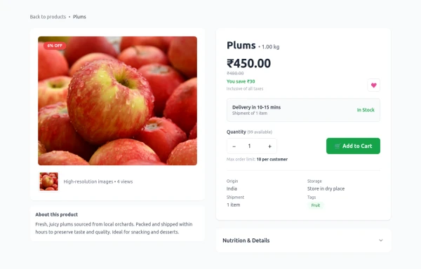 Product Details Page
This section will show all the information about a selected product, including its title, description, price, images, and specifications.
4 months ago932 -
 2 years ago12.3k


Explore components by Tags
Didn't find component you were looking for?
Search from 3000+ components