Responsive eCommerce Sidebar Layout with Hamburger Menu | Tailwind CSS UI for Online Stores
Build a clean and responsive eCommerce sidebar layout with a smooth hamburger menu using Tailwind CSS and Alpine.js. Ideal for devotional, spiritual, or modern online stores. Includes dark mode support, navigation links, cart, login, and a dynamic layout for beautiful product pages.
This tailwind example is contributed by Rajesh Pandey, on 16-May-2025. Component is made with Tailwind v3.4. It is responsive. It supports dark mode. similar terms for this example are Register, Sign in,drawer,Toast, Snackbar

Related Examples
-
 Responsive navbar with dark mode support
Sidebar on small screen devices
20.6k -

-
Animated Drawer
Collapsible sidebar navigation that allows users to access additional menu options. It is designed for efficient space utilization and can be easily expanded and collapsed.
29k -
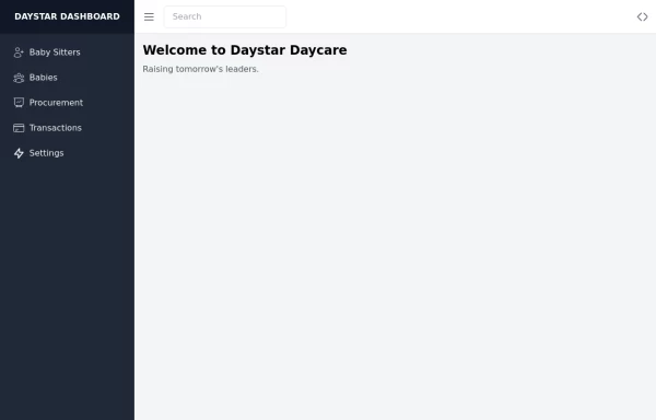 Daystar Day care Dashboard
Daystar Day care Dashboard
11.4k -
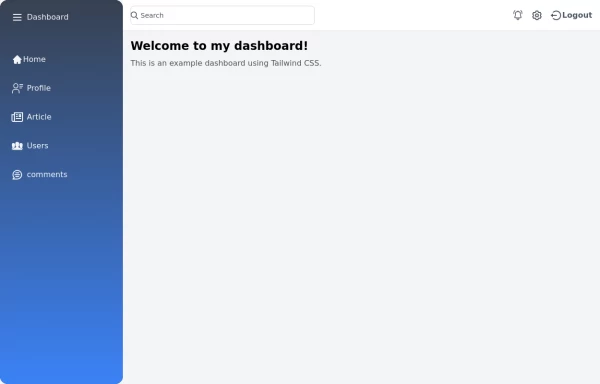
-
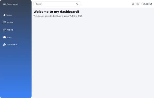 Tailwind Sidebar Layout
Place edited for the search button
-
 Responsive navbar with dark mode support
Sidebar on small screen devices
-
 Responsive navbar with alpinejs
A mix of Penguin navbar with PineUI Slide-Over
-
 Sidebar
This is the sidebar that I use in my projects, I use grid to be able to manage the space issue a little better, it seems like a clean and modern design, it is more than anything for the dashboards that you want to create
4.7k -

-
 Tailwind Sidebar Layout (improved)
Improved Tailwind Sidebar Layout. - Responsive sidebar working - Close responsive sidebar working - Positioning menu-toggle correctly - Added some fresh icons - Added sub-items - showing on click - Added animation and swap on icons using 'peer'
-
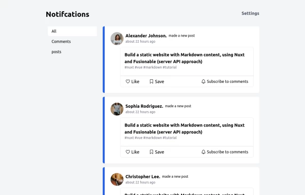 Notification
Dev Community Notification Clone
3.8k



Browse by topic
Explore components by Tags
Jump straight to the UI pattern you need.
Can't find it?
Didn't find the component you were looking for?
Search across 3,000+ community-built components and grab the code in seconds.