Notifications
Notifications
This tailwind example is contributed by $@(\/)(\/)¥, on 23-Mar-2024. Component is made with Tailwind CSS v3. It is responsive. It supports dark mode. similar terms for this example are Toast, Snackbar

Author $@(\/)(\/)¥
Related Examples
-
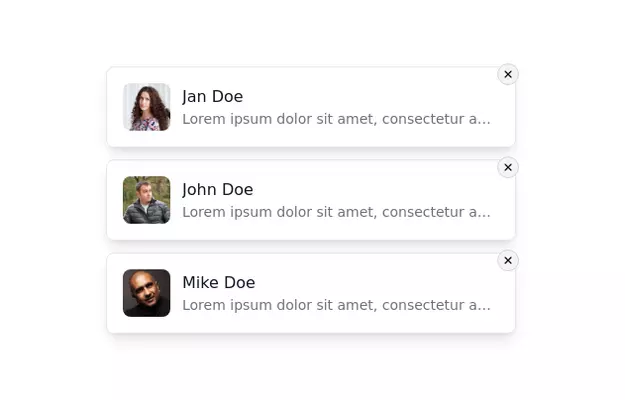 Notification Alert Section
Notification card with close button
3 years ago13.5k -
 Tailwind Card Components
A collection of 20+ copy-paste ready card components built with pure HTML and Tailwind CSS. Includes product cards, profile cards, article cards, pricing cards, testimonials, and notifications.
5 months ago576 -
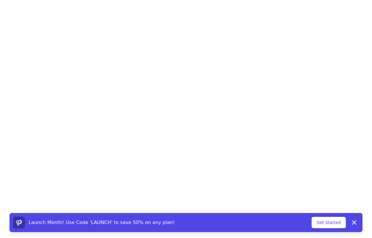 Promotional notification
sticky bottom promotional banner
3 years ago10.3k -
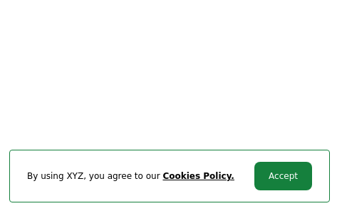 Cookie consent
Sticky Bottom Cookie Consent Notification
3 years ago10.9k -
 Game Live Score
A live score game layout design perfect for your live scoring application
1 year ago1k -
 3 years ago14.5k
 -
 3 years ago11.3k
 -
 Notification - Htmlwind
Simple notification
8 months ago611 -
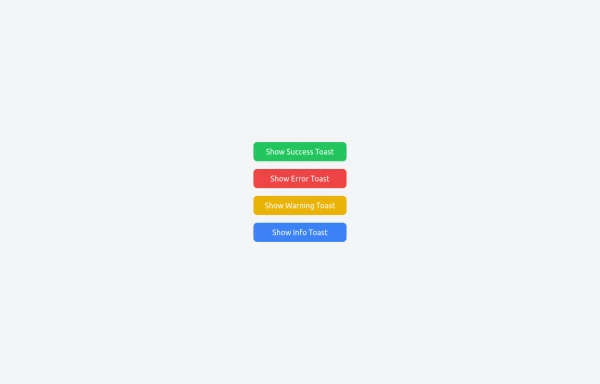 Notifications
Toast Notifications are lightweight and customizable components for displaying short messages or alerts. They are perfect for feedback on user actions, such as form submissions or system updates. Supports different types of notifications (success, error, warning, info). Automatically hides after a specified timeout. Option to include action buttons or close icons. Customizable styles, animation, and position on the screen.
1 year ago1.3k -
 Scooby’s Hello – A Tailwind CSS Cartoon Animation
A playful animation built with Tailwind CSS and minimal custom CSS, featuring a cartoon-style Scooby-inspired dog sliding in from the left, wagging its tail, and cheerfully saying "Hello!"—perfect for adding personality to a fun web project.
9 months ago707 -
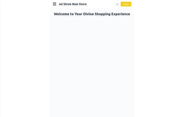 Responsive eCommerce Sidebar Layout with Hamburger Menu | Tailwind CSS UI for Online Stores
Build a clean and responsive eCommerce sidebar layout with a smooth hamburger menu using Tailwind CSS and Alpine.js. Ideal for devotional, spiritual, or modern online stores. Includes dark mode support, navigation links, cart, login, and a dynamic layout for beautiful product pages.
9 months ago1.1k -
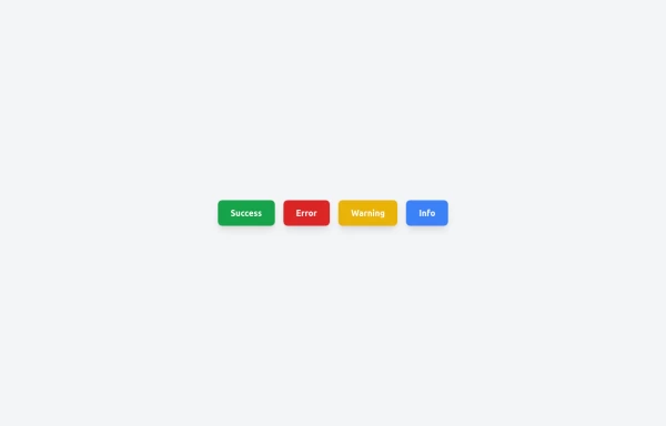 Toast Notifications
Visually appealing toast notification component designed with Tailwind CSS
1 year ago1.2k


Explore components by Tags
Didn't find component you were looking for?
Search from 3000+ components